Proper content and information design are important for traditional publishing and user-generated content sites, whether it’s the front-end experience or the underlying systems (ex: content management systems) that keep them operational.
As users are able to interact with and edit more more parts of their applications, every piece of information (i.e. location data, timestamping, profile info, mutual connections, etc.) and content (profile images, user-generated content, business listings, etc.) must be designed with that in mind.
In this article, we dive deep into 18 different UI patterns for data and content management.
You should also have a look at Exploring Social Design Patterns For the Web and The Importance of Navigation Design Patterns.
1. Favorites & Bookmarks
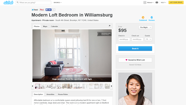
Examples: Airbnb, Medium
Problem: The user wants to save and highlight content they like.
Solution: Let users save and bookmark content for their reference. This UI pattern is more about personal organization rather than promoting content, and many web apps like Facebook, Gmail and Airbnb let users “star”, “favorite”, “save” or “bookmark” content privately, giving the user a way to come back to any place in the app that they might need later.
As opposed to liking or sharing content that tends to get lost in the timeline as the user’s activity progresses, Favorites and Bookmarks can be used to mark content that the user would need to come back to, for example neighborhoods a user is researching in Airbnb or a particular email that the user wants to mark as important. This UI pattern gives users a private way of highlighting important content as opposed to taking an action on it like sharing or liking it.
2. Stats / Dashboards
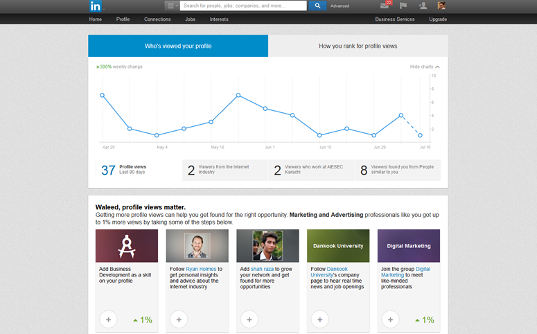
Examples: LinkedIn, Medium
Problem: The user wants to easily keep track of their activity and status.
Solution: Present important information and statistics to summarize user activity and status in terms of numbers. Twitter and Quora show users the number of followers and tweets or answers they have for an indication of activity. While some web apps only show number of likes, shares or followers, others like Medium, LinkedIn and Quora also show users more detailed statistics about their activity using Dashboards that used to be limited to business applications.
With the extensive tracking and analytics data available for user interactions, this pattern will become even more popular as users want to track their activity on the system and even analyze how they’re doing in comparison to others.
3. Contextually-Aware Content
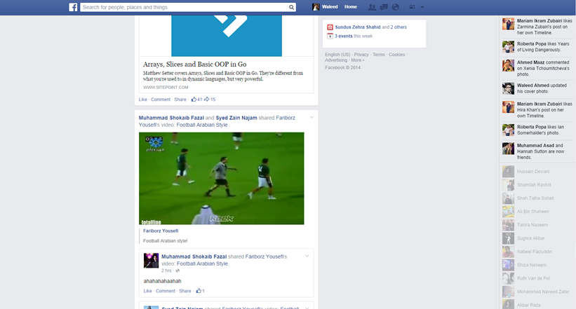
Examples: Facebook
Problem: The user wants to interact with content in different ways based on the context without having to take additional actions.
Solution: Change the state of content based on other settings in the application or it’s sizing, positioning, or other attribute. For example, you can auto-play multimedia content as the user scrolls past. This makes the consumption of user content much smoother by eliminating the step where users stop and hit the play button.
In terms of making things easier for users, this pattern makes sense but at the same time it is worth considering the annoyance it can cause. For that reason alone, this pattern is worth considering only for sites and networks that feature a lot of multimedia user-generated content where the user is browsing with the explicit intention of consuming that media. The user would probably not browse through a Vine timeline for any other reason than to watch the videos, so it makes sense. Facebook‘s implementation is a little suspect for the same reason.
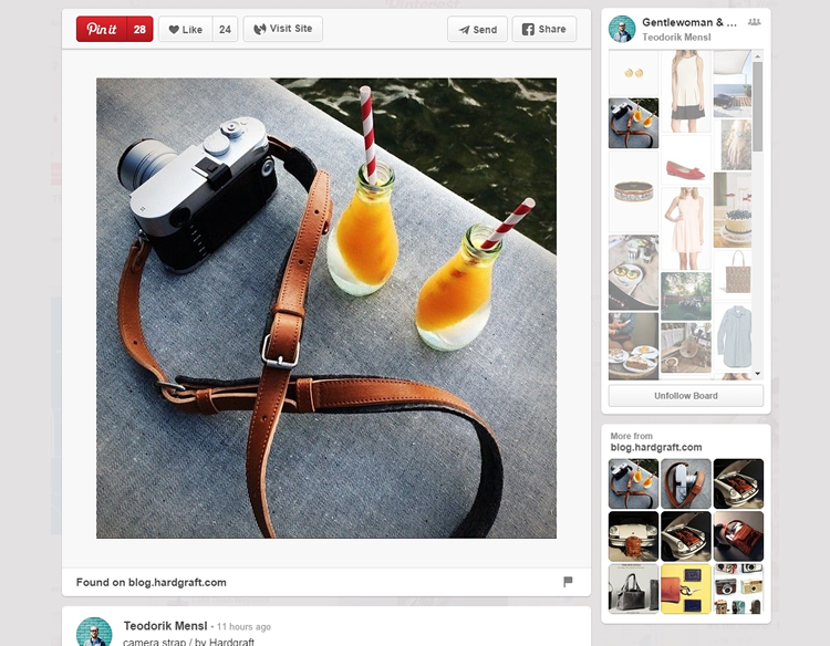
4. Hover Controls
Examples: Pocket
Problem: The user wants to have access to controls without cluttering the content view.
Solution: Hide actions and control buttons until a user hovers over the item they relate to. It’s always good to give the user complete control over content, but when an interface has a lot that can be acted upon, each button steals focus away from the content. This UI pattern hides these contextual controls until the user hovers over the content with their mouse, keeping them out of the way until needed. Pinterest puts all focus on the photos, so the “heart”, “send”
and “pin” buttons are invisible until you hover over the photo.
As discussed in Web UI Design Patterns 2014, this fits well with the modular cards UI pattern. Since the buttons appear over the image itself, there’s no confusion about which item they will act upon.
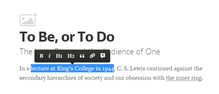
5. Context Menus
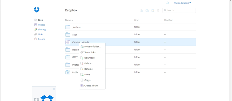
Examples: Dropbox, Medium
Problem: The user wants to have access to controls without cluttering the content view.
Solution: Put contextual action buttons in a menu that pops up when the user selects an item or right-clicks somewhere in the UI. A context menu opens up to show essential actions that can be taken in the current view or upon the selected content. This makes things faster for users. Instead of having to scroll up to a toolbar, users can simply perform their desired action in place.
The traditional context menu is triggered by a right click, and applications like Word Online, Google Drive, Evernote and Dropbox that emulate a desktop UI use them mostly for CRUD controls. Another implementation of context menus is a menu that pops up when users select text on the page. Medium puts the “notes” button and “share as a tweet” button behind this kind of context menu, and Quora puts an option to quote the text in an answer.
6. WYSIWYG
Examples: Gmail, Medium
Problem: The user wants to add formatted text and preview what their content looks like without having to worry about markup languages.
Solution: Implement a WYSIWYG text editor that lets users format their entered text without having to go into Markdown formatting or HTML code. This gives users a clear preview of how their content will look once published and can be a great way of lowering the barrier of entry for novice users. In the spirit of direct manipulation, this pattern is widely implemented in most blogging and email web apps, allowing users to edit and preview formatted multimedia content as they would in a text editor on their desktop.
7. Autosave
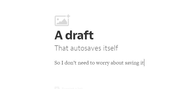
Examples: Gmail, Medium
Problem: The user wants to protect their data and continue working without having to remember to do so.
Solution: Prevent accidental data loss by implementing an autosave feature in your app. Gmail and Google Docs does this flawlessly, auto-saving your work every few seconds and preventing any “oh, no!” moments. The autosave pattern is an unobtrusive way of doing that without forcing the user to remember to save every few minutes.
Browser crashes, power or connection failures, or even accidentally closing the browser tab are major annoyances that can be soothed when the user is assured that their work hasn’t been lost. With cheap data storage and other UI patterns like User History, it makes sense to preemptively save user data rather than risk losing it by mistake. Of course there needs to be a clear indication that the app is autosaving, and perhaps even an additional “Save” button to provide a greater feeling of control.
8. Lightbox Photo Slideshows
Examples: Facebook, Pinterest
Problem: The user wants to browse through multimedia content.
Solution: Show multimedia content in a lightbox overlay. This modal window creates focus on the image or video content and breaks it free from the confines of the page’s design. It also puts users in a better position to simply browse through the gallery without being distracted with the surrounding “chrome” in the page.
Most implementations of this pattern also dim the background page behind the modal window and that prevents the user from losing their place in the main content view. This can come in handy particularly when paired with an infinite scroll pattern, as in Facebook and Pinterest. It’s faster than loading a new page for each image and also preserves the user’s flow when the want to back out of the multimedia gallery. For photo galleries, a modal lightbox slideshow is an essential UI pattern.
9. Full-Screen Modes

Examples: YouTube, Medium
Problem: The user wants to focus on content instead of being distracted with the UI
Solution: Design a full-screen mode that hides or minimizes the UI clutter around content. This helps users focus on what matters, rather than being distracted by the clutter of the UI. While multimedia web apps like YouTube and Vimeo let users view videos in full-screen mode, other web apps like Medium and Facebook are using the full-screen concept to eliminate unnecessary “chrome” when the user wants to perform particular actions.
For example Facebook lets users browse photo albums in a Lightbox Photo Slideshow (above), which is another pattern that we cover, but this expands to the entire screen. Medium removes all distractions when the user is writing, effectively achieving the same immersive effect as an otherwise traditional full-screen mode.
10. Interactive Content Layers
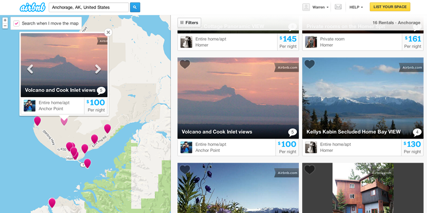
Example: Airbnb, Yelp
Problem: The user wants to know which items within a content view they can interact with in further detail.
Solution: Layer interactive items to provide an “augmented reality” approach to your content. Yelp and Airbnb provide classic examples of this pattern: Next to the search results for different locations, these sites include a map that highlights each search result with a corresponding location ‘bubble.’
When users hover over the search result, the corresponding location bubble in the map becomes highlighted so that users can immediately see where each result is located. Additionally, users can interact with the map itself, e.g. by dragging to different locations – both Airbnb and Yelp have a ‘Search when map is moved button’ that automatically shows new location bubbles in the new areas of the map.
11. Maps As Backgrounds
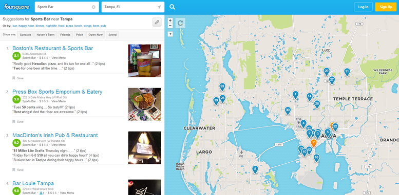
Examples: Airbnb, Foursquare
Problem: The user wants to spatially place content on a map to see what’s going on around them.
Solution: Provide maps as backgrounds when the user is browsing for information that’s local in nature. Web apps like Foursquare and Airbnb layer their listings onto the map view, transforming the user’s search and browsing activities into an immersive experience. This makes sense for most location-based web apps which provide users information about localized content because it helps them place it according their own location on a map in a way that’s more intuitive than just browsing a list.
12. Group Friends & Content
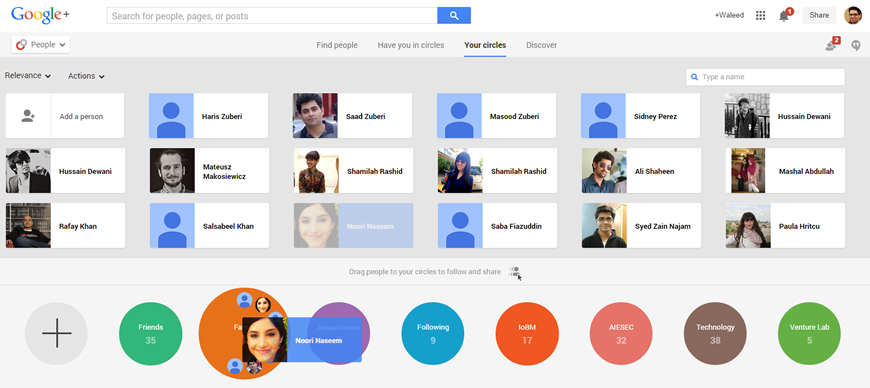
Examples: Google+, Google Play Music
Problem: The user wants to organize content according to their own groupings
Solution: Allow users to sort and organize friends and followers inside the app. Google+ and Facebook among others allow users to group friends and content alike. Besides allowing users to sort their friends, web apps like Google Play Music and Ebay allow for content to be categorized into playlists and collections that not only help them organize the huge amounts of user-generated content for their own convenience, but also create a way for them to share these collections with their friends and followers.
As content of all forms – including friend profiles – continues to proliferate, the ability for users to curate and organize things in a way that makes sense to them becomes more important.
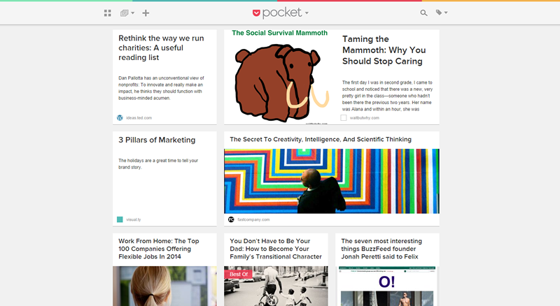
13. Grids
Examples: Pocket, NYTimes
Problem: The user wants content to be organized.
Solution: Show snippets of content in a grid. Spotify and Google+ present all their content in a grid, as do Pinterest and Digg, effectively separating each item from the other while maintaining a structure. Grids are a great alternative to the simple list views and work extremely well for content that can be represented visually, making it much more enjoyable for users to scroll through lots of content.
Other sites that are content heavy, like NY Times or CNN can also benefit from a grid layout to help provide some visual structure to the various pieces of content. Some like Pocket and Groupon also allow users to toggle between the grid and list views depending on their preferences.
14. Cards
Examples: Twitter, Google+
Problem: The user wants to browse through content quickly and interact with it, without the detail views cluttering up the UI.
Solution: Present snippets of information in bite-sized cards that can be manipulated to show more information if the user wants it. Popularized by the likes of Pinterest to show large image thumbnails in a compact layout, we see “card” views now being implemented in a variety of web apps beyond video and photo galleries on the web, and often this is combined with a Grid pattern.
This pattern works best for “modules” of data that can be viewed or manipulated individually, like posts on Tumblr or Facebook. Cards are a way to allow users to browse and discover all kinds of content in a more engaging way while accommodating responsive design trends, as well as social feed patterns.
15. Hidden Information
Examples: Medium
Problem: The user wants quick access secondary information that’s not usually necessary to show.
Solution: Hide contextual information that’s not essential behind the UI but make it accessible for power users. Medium hides comments behind a number, subtly showing users that there’s additional information available.
This keeps the user’s focus on the primary content without distracting them with extra clutter in the UI. As users become familiar with the system, the visual shortcuts become easier to spot. Google+ achieves the same effect by hiding multiple tags on each post and marking it with a colored bar to indicate extra tags other than the first one that is always visible.
16. Empty States

Examples: Airbnb, Pinterest
Problem: The user needs to know why a section of the application is empty and what to do next.
Solution: Make sure your UI provides a good first impression by designing for the “blank state,” that is the condition when there is no user data. This is the natural state of your UI and the first thing a user sees. It is also the point where many users decide whether its worth it to continue, so designing the empty state is very important. This is a great place to show some examples that will help users get started or simply to show them instructions on how to proceed.
Airbnb shows a mockup of how a particular section would look like once it’s populated by the user’s content, while Pinterest takes the opportunity to guide the user through what next steps they should take; other sites like Tumblr and Medium give users hints on what the empty area is and what it should be once the user takes a certain action.
17. Direct Manipulation of Content & Data
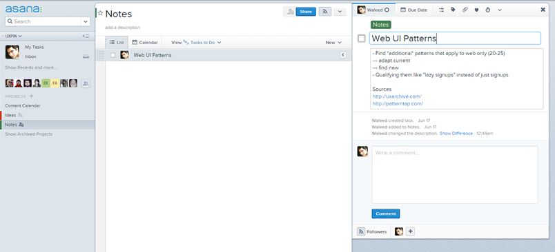
Examples: Asana, Facebook
Problem: The user wants to interact with entered content or data in a direct and intuitive way.
Solution: Allow for content to be edited directly without having to transition between editing or deleting modes. Letting users work with data directly on the screen can make your UI more engaging by eliminating the extra layer of interaction provided by a button or context menu. Instead of selecting the item and then toggling between individual CRUD (Create, Read, Update, Delete) states, users of Asana for example can directly tap on task names to edit or delete them.
Other sites like Tumblr and Medium follow the same principle however they do include a toggle which moves the user into an editing mode. This pattern is an alternative to the WYSIWYG pattern discussed earlier but goes ahead of just giving users a preview of what their formatted content will look like, showing them also how it looks in context of the surrounding content as well.
18. Draggable Objects
Examples: Asana, Google Play Music
Problem: The user wants to sort and organize items in a way that makes sense to them in the current view without pogo-sticking between master and detailed views of content.
Solution: Content can be picked up and rearranged, or simply dragged across to perform an action. One great example of this pattern is when you’re arranging items on the homescreen, but we see this being implemented in a lot of web apps as well.
Google Play Music lets you drag and drop songs in a playlist to rearrange the order in which they’re played. Since this is a very interactive action, you should make sure the UI provides visual feedback in the form of animations or color changes to clearly indicate that something is happening. For example, items being dragged in Asana are highlighted with a shadow. Another visual cue is highlighting the drop target, that is the location where the item will fall when the user lets go.
Keep Your User Organized
Keep track of where your users are supposed to be interacting with data and content, whether they ever view those sections of the application, how often they interact with them, where they’re coming from and going to in the application (i.e. the user flow) and so on. Keep rearranging, re-sequencing, re-sizing, and tweaking those controls until you get more of the desired actions. And, of course, think deeply about how the user is actually using your mobile application when they’re viewing and engaging with the data and content – make sure you’re new and existing not missing something obvious when designing your app.
Related Topics
Top