Branded website design is ultimately centered around two things: product and audience. Meaning, the site’s design needs to effectively showcase products in a way that will resonate with the target audience. Once a designer identifies where a brand’s product and audience meet, the visual problem-solving process becomes streamlined and simplified, and the site’s design becomes clear, focused, and targeted.
Below we take a look at a handful of sites that effectively showcase their products through the overall design.
Expressive Visual Elements in Men’s and Women’s Fashion Sites
The world of fashion websites is a great place to start in this discussion, because the industry is intrinsically linked with creativity and expressiveness. In other words, unlike some other types of ecommerce sites, the design can be more abstract and loosely associated with the products. As you can see from any number of fashion illustrations or collages, supplementary visual elements are not only a welcome addition, but often an essential component of many fashion sites.
Women’s Fashion
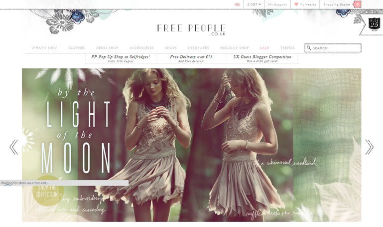
For example, Free People is a retailer that specializes in bohemian, feminine clothing and accessories. So a simple or minimalist design would hardly be expressive of the right atmosphere, no matter how beautifully their products are photographed. Instead, the site hits just the right note on its homepage by using an atmospheric and evocative style of photography that is more about an idealization of the target audience’s lifestyle than it is about featuring specific pieces of clothing. Handwritten typography and floral illustrative elements top off the look, adding both depth and texture to the design.
Men’s Fashion
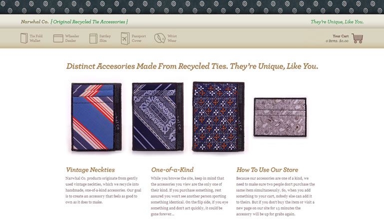
In comparison to the previous example, Narwhal Co. has a fairly straightforward website design that features their merchandise more prominently. This makes sense; as a purveyor of “distinct accessories made from recycled ties,” their unique products are more in need of an immediate explanation than the average fashion site. But the combination of a subtle background pattern, iconography in the navigation panel, and rounded typefaces help to create a sense of friendly, playful style that doesn’t take itself too seriously.
Edible Products: High-End Versus Casual Design
Depending on the target market, webstores with an edible inventory can span the visual range between practicality and simplicity (for an audience looking for quality ingredients at good prices) and luxurious opulence (for a customer looking to indulge). This makes for an intriguing diversity in sites with similar products but completely different goals. A good example can be found in the comparison between tea and fine wine stores; while they both lie in the category of life’s little luxuries, tea is more of an everyday, simple, and cozy drink, while wine culture is more exclusive and high-end.
Tea
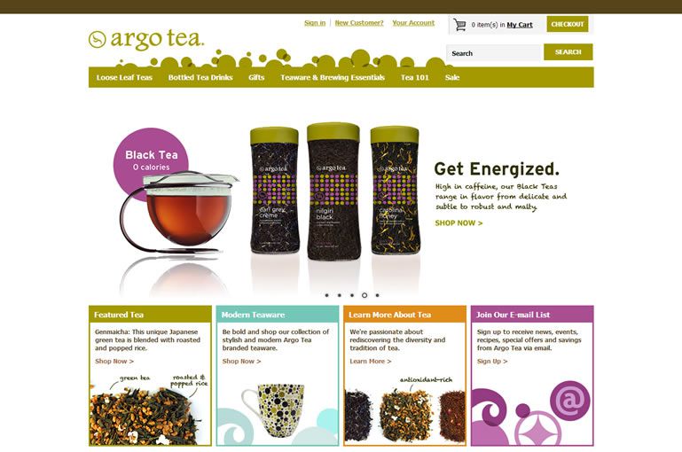
Argo Tea’s everyday simplicity is perfectly reflected in its light, bright, and clean aesthetic. This site expresses its friendly, straightforward brand through its warm and colorful palette, clean imagery, and simple type. The only decorative element to be found on the homepage is the vector bubble effect rising above the navigation bar, which helps to add a touch more of the whimsical approachability the site is going for.
Wine
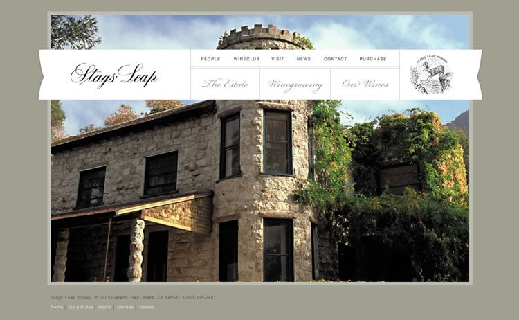
Stag’s Leap Winery has quite a different visual philosophy, which presents a strong contrast to Argo Tea. The muted color palette, elegant script typeface, and quiet simplicity of its homepage make it clear this brand is positioning itself as a more luxurious label. These elements come to a peak in the traditional and intricate logomark, which adds just the right touch of historical authenticity to a company that is hoping to evoke a sense of timeless quality.
Divergent Brand Positioning Between Two Audio Webstores
There are also often significant differences even between sites that sell the same type of product. The target audience can and often does vary widely within a specific market niche, and stores need to cater to these different types of customers.
The two sites discussed below give very different impressions on a glance, but they’re actually more similar than the previous examples. A little more time spent on each shows that both have a sleek, simple navigation, organization, and typography. A few more commonalities between sites makes sense when the product is the same; both are selling technological devices, so it’s crucial that they offer as streamlined a user experience as possible, no matter who their audience is.
Crafted Minimalism
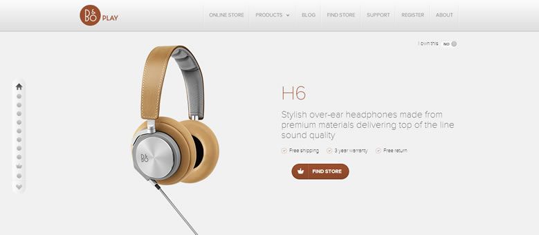
The light, sans-serif typeface, quiet color scheme, and crisp photography used on BeoPlay all give customers a sense of neutral elegance. These elements are combined with a complex and varied navigation style that keeps the site from feeling stale as you move through it.
Edgy Modernism
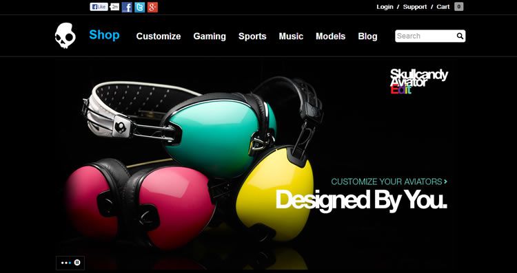
Instead of going after the same refined crowd that BeoPlay appeals to, SkullCandy uses its design to appeal to a younger, edgier audience. The dark background color and contrastingly bright imagery and effect-laden text offer a different visual experience from the previous example, but the transitions are similarly flashy and well-executed.
When comparing the design styles of various online stores, it becomes quite clear that the combination of product and audience is an essential component of web design; in fact, if you narrow down your target audience as successfully as these examples, your design decisions will, in many cases, almost be made for you.
Related Topics
Top