After 20+ years in the web design industry, I’ve found that the web is still far from perfect. There are a number of things I’d love to see change for the better.
Sure, there have been plenty of positive developments throughout the years. Some of them even a bit revolutionary. But I also see things that have remained stagnant or new trends that are probably more of a pain than they’re worth.
So, today I’m wearing my “Grumpy Designer” cap once again. It will put me in the proper frame of mind as I take you through some things that I’d like to see either evolve or just go away.
FTP
The good old File Transfer Protocol (FTP) is one of the few items that have been in my toolbox for every single one of my years as a designer. Back in the day, it felt like being in some sort of futuristic hacker movie (Sneakers, anyone?). Now, using FTP feels very antiquated.
While web hosts usually offer a web-based file transfer tool, the ones I’ve tried aren’t all that convenient. What I’d love to see is a more Dropbox-esque type of UI that is both attractive and easy to use.
One thing I will say is that, even though it’s not all that sexy, at least FTP is still useful. It just needs a makeover.

Editors That Write Bad Code
At one time, I shied away from desktop WYSIWYG tools because the code they produced was often bloated and proprietary. Thankfully many have made real strides in helping us generate standards-compliant code. We can choose one that does things the right way.
But when it comes to WYSIWYG tools inside of a content management system (CMS), it seems like anything still goes. One I recently used (I won’t name names) still employs tables for multi-column layouts and produces HTML font tags, rather than CSS. And no, this wasn’t a system that hadn’t been updated in years – it actually receives frequent updates.
Seriously, there is no excuse for still using font tags this far into the 21st century. What’s next, a return of the blink tag?

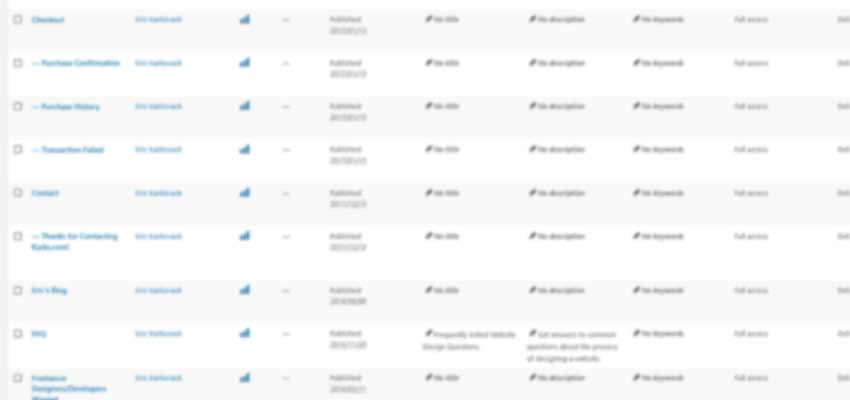
Page Management in WordPress
Those who know me well know that I love WordPress. But my biggest pet peeve is attempting to find content in the back end. On a site with more than a few dozen pages or posts, scrolling through the listings of entries is a pain. Not that I don’t expect scrolling or pagination – it’s that the layout leaves something to be desired.
Child pages are prefixed with one or more dashes (-), which is fine for really small listings. But the longer the list, the more of a blur it all becomes to this old curmudgeon. And, while you can use the search field to narrow things down, that is a tool that could stand some improvement as well.
It would seem like a simple layout change would do the trick. For one, instead of alternating gray and white backgrounds for each item in the list, keep child pages the same background color as their parent. It’s a small visual cue that could really help. Then, perhaps some indentation and/or icons could make things easier to process.
There are plugins that provide various types of changes, but should we really need extra software to create a more legible content listing?
Designing for a Notch
I will admit that I have great admiration for Apple’s design credentials. Over the past two decades, they have pretty much single-handedly dragged both the computer and mobile device industries into utilizing more handsome aesthetics. But this whole “notch” nonsense of the iPhone X is going a bit too far.
Do we really need to design around this thing? As if trying to get things looking great on the plethora of mobile devices out there wasn’t difficult enough. In some ways, it reminds me of the proprietary code and loose standards Internet Explorer used to stuff into their browser.
I mean, if you want to plunk down a small fortune to buy the phone – more power to you. Just don’t expect me to cater to it. The phone will be considered outdated in a few months anyway.
Subservience to Big Data
To some degree, web design has been guided in part by large companies since the very beginning of the web becoming a commercial medium. For example, it made sense for designers to only adhere to standards that were supported by browsers. It seemed rather pointless to do otherwise.
But over time the influence of big players has gained a stranglehold on various aspects of our work – and we’ve voluntarily let them do it. Just take a look at how much responsibility we’ve put into the hands of companies like Google. We use them for code repositories, fanciful fonts and statistical analysis. And they’ve gotten to the point where any change they make to a search algorithm has us all scrambling to keep up. And recently, their browser has started informing us when sites don’t use SSL.
I’m not saying it’s inherently evil or that they’re going to turn around and do something hurtful. But should Google, along with a handful of others, really have so much influence over the web? It seems to defeat the purpose of a decentralized network.

Improve or Remove
None of the items above constitute a life-or-death crisis. But in one way or another they either make a web designer’s job more difficult or are just generally disappointing.
Of course, many of my complaints are meant to be a bit tongue-in-cheek. The “problems” designers face today often pale in comparison to the limitations of the early days of web design. But at least one of the above is a pretty serious issue that all of us should think about (I’ll give you a hint – it’s not the “notch”).
The good news is that things do evolve over time and usually for the better. So the next time I decide to list my grievances, there’s a good chance that there won’t be many repeat offenders. The only exception may be FTP – I just can’t see that changing.
Related Topics
Top