There are thousands of established patterns, with more and more being created everyday – but not all of them will work for you.
In order to narrow down which patterns will work best for you, I recommend a four-step process:
- Identify your site’s problems.
- Research which patterns other sites use to solve the problem.
- Examine how other sites use these patterns
- Dissect the patterns and choose the elements right for you.
By taking a problem-oriented approach to selecting UI patterns, you prevent yourself from choosing a layout simply because it’s the hip thing to do. While many UI patterns deserve their popularity, you should never base your web designs simply on what’s trending.
Think about how you can help users better accomplish certain goals on your site, then start digging into the most effective patterns.
A Step by Step Practical Framework
Let’s see the process at work with an example: you notice that a lot of your users aren’t signing in when browsing your site.
1. Identify your site’s problems:
Because the users are still coming to your page and spending an appropriate amount of time there, you can deduce that the problem stems from the login and signup processes. The solution, then, would be a way to simplify both processes so that your users don’t mind doing them.
2. Research which patterns other sites use to solve the problem:
You decide to do a little detective work and visit some popular sites similar to yours. Some use a lazy signup, but that doesn’t solve your problem of enticing your users to signup or login. Some others use incentives like extra features or more content, but that doesn’t fit in with the style of your particular site.
Finally, you notice that some sites use a social login, which allows them to login or signup with their pre-existing social media accounts. This sounds like a good solution for your problem and fits the site’s easygoing style.
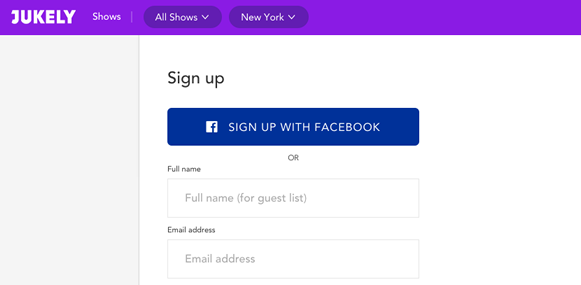
Source: Jukely.
(Notice that lazy signup, signup incentives, and social login are all different patterns. Which you choose will depend on your site’s specific needs.)
3. Examine how other sites use these patterns:
You take a deeper look at big sites like Spotify, Pinterest, Wunderlist and see how they utilize the social login. You even check sites unrelated to yours to see how they handle the pattern, just in case they inspire you.
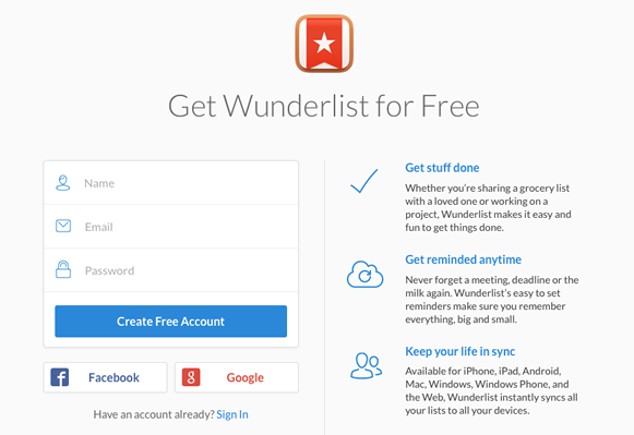
Source: Wunderlist.
4. Dissect the patterns and choose the elements right for you:
You notice that different sites offer different social media outlets like Twitter, Google, or LinkedIn – but every site includes Facebook. Sometimes the options are spelled out with text (“Sign up with Facebook”) while other times they just have the social media’s icon situated nearby the login form so you know its purpose.
Remembering the Gestalt principle about how proximity suggests function (which you can learn about in Web UI Design for the Human Eye), you decide only a button with an icon is enough – after all, social login is a popular pattern and your users will likely know these buttons mean they can login with their social media accounts. You decide to include Facebook, Twitter, and Google because those were the most frequent on the sites you checked, and you put Facebook in the top position as the most popular option.
Once you’ve found an effective UI pattern, don’t feel too attached. While UI patterns are great for consistency, you don’t want to be stuck in your local maximum. For example, you might be designing a viral content site and decide that infinite scroll is the best way to make all your content accessible. After all, you’ve seen plenty of other sites use it to great success.
While infinite scroll may produce a better experience than forcing users to click “Next Page” every ten entries, it may not be the best solution. You can only determine that through free-minded brainstorming, wireframing, prototyping, and testing.
Treat UI patterns as a “safe zone” for consistency, then venture outside it one creative step at a time. Know the patterns, respect the patterns, but start your design with a fresh outlook each time. That will ensure your design remains familiar, but still has room to blossom into something new.
My Favorite UI Pattern Libraries & Resources
Because no one person can keep track of every pattern available, it helps to check in with pattern libraries from time to time. These resources collect and compile the most useful patterns available, and organize them for quick reference.
- UI Patterns – A very popular pattern library run by designer Anders Toxboe featuring excellent explanations and hand-picked visual examples.
- Pattern Tap – Fantastic collection of design patterns run by the designer community from acclaimed design agency ZURB.
- Patternry – A subscription-based app of UI patterns for CSS and HTML. Allows customization.
- Capptivate – Mostly animated patterns show the layered interactions for mobile UI patterns.
- Web UI Design Patterns – Free e-book compiling 63 of the most effective web UI patterns along with their use cases.
- UseYourInterface – Uses GIFs for more comprehensive browsing of mobile UI patterns.
- Inspired UI – Pattern library for Android, iPhone, and iPad that’s very easy to use thanks to the simple dropdown menu.
- pttrns – A cleanly organized pattern library that catalogues the hottest mobile UI patterns from 2012 to the present day.
- Mobile UI Design Patterns – The companion piece to our compilation of web patterns, this ebook features 46 of the most successful UI patterns for mobile devices along with detailed explanations of use cases.
- Site Inspire – While this is more of a traditional web design inspiration gallery, it is an excellent resource for making your own UI patterns more unique. The categorization feature is simple to use, and all the examples are visually stunning and highly usable.
If you’d like to explore even more pattern libraries, Smashing Magazine created this list of over 40 of their favorites.
Conclusion
Good design makes your users happy and eager-to-return, gives a feeling of familiarity, and can be used mostly by intuition. But these seemingly natural aspects are anything but – they must be crafted with effort and know-how to give them that “natural” feeling. Patterns are the tool to this ends, and knowing how to use them is knowing how to create the illusion of “natural.”
Top