In the world of web design, what you don’t see can hurt you. Worse, it can damage your brand reputation, bottom line, or both.
Specifically I’m talking about images. Images can consume a lot of bandwidth (upwards of 70% of it for some sites). You get charged to send them. Your users are are charged to view them. In fact, you’re both probably getting charged for images that are never seen because website visitors never scroll down far enough to view them.
In this article, I’ll share three popular solutions that will help to eliminate the bandwidth challenges associated with website images, and discuss the merits and pitfalls of each. It’s also worth noting that images don’t just affect the actual performance of the site, but the perceived performance as well. They can have a major impact on how fast your site feels, which may have a greater impact on conversions than the actual loading time.
Use Cases
Let’s take a quick look at a few use cases that cause small headaches for front-end developers:
- Images below the fold: This is a major issue.. Sites ranging from galleries, to stores, to landing pages sometimes load assets that their users never see or interact with. Why should users pay the toll if they don’t scroll? (See example).
- Hero images: They’re big, bold, and they’re right at the top. They’re also bulky and can take a while to load. What are your users supposed to look at in the meantime?
- Image carousels: Depending on their size, carousels can combine the issues of hero images with those of images below the fold. They can be large a nd your users might not stick around long enough to see them all.
The bigger and more popular the site, the more acute these issues become. Waiting for tons of images to load on slow connections is annoying. Waiting for them to load and finding out that you’ve run out of data on your mobile plan is frustrating.
Popular Solutions
To ensure your site isn’t bloated, and your users can quickly download the images they want to see, there are some popular solutions for developers:
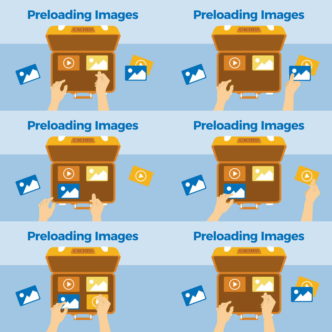
- Preloading Images: Load the images before your users get to see any of them. Look here for an example.
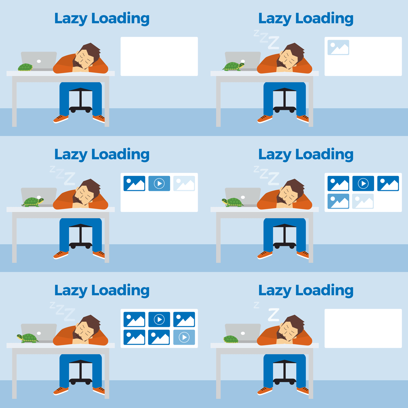
- Lazy Loading: Load the images only as needed, such as when the user scrolls down far enough to see them. Here’s a great example. The downside: This approach can result in flashes of missing content.
- Progressive Images: Load a small (often blurred) preview image first, then load the larger hi-res image later. Medium does this, as does Facebook.
Now, which solution is the “best”? You can probably tell from my use of quotation marks that there is no “best.” Often you have to use what is best for the job at hand. Naturally, I have some opinions on that. If you disagree, or just have a somewhat different perspective, I encourage you to discuss this in the comments below.

Preloading
Let’s talk about preloaded images first, as it’s the most situational. You’ll see them used a lot in highly creative designs, especially ones that have video backgrounds, or many large images, such as artists’ and designers’ portfolios.
Does your site have one of those big image carousels I mentioned? Maybe the carousel spans the entire width and height of the page? Then preloading makes sense…kind of. It’s best, when at all possible, to build a user experience that can finish loading as-needed. Forcing your users to wait for a preloader wasn’t cool in the days of animated splash screens, and it’s still not that cool now.
But life isn’t perfect, and sometimes you just need that big carousel. It could actually be the best solution for the problem at hand , or more likely a client request. The point is, if you have to do it, you may as well do it with a preloader. Carousels that show images still loading slowly are worse than carousels with a progress bar.
The preloader… reloaded
Up to this point, we’ve discussed preloaders as they relate to UX and UI design. We’ve discussed them in terms of progress bars and loading screens. But that’s just one approach. You can preload content without ever making the user wait.
Mark Meyer has a fantastic method for preloading images in a way that makes sense, especially for image sliders and galleries. It involves using a preloader to download the images that the user is most likely to want to see next, resulting in a much more seamless experience. This approach is achieved through a healthy mix of both parallel and sequential downloads.
Keep in mind that this solution relies heavily on JavaScript, and so can break down a little more easily on bad connections and slow devices.
You also might consider using <link rel="preload"> for some assets instead of pure JavaScript. It’s currently only supported in Chrome, Opera and the Android browser, so it might be best used in internal projects. But it is one more option available in the preloading arsenal.
Dynamic Loading
And now we get to the meat of this discussion. Lazy loading and progressive images are far more flexible options than preloading, and could potentially be used in almost every website.
The more images you have, the more you’ll want to consider using one of these techniques. This is true not just for image galleries, but for newspaper sites, blogs, eCommerce, and more.

Lazy Loading
Lazy loading is by far the most byte-efficient technique on this list. What never gets loaded will never cost you in terms of bandwidth. It’s that simple. If traffic is your biggest concern, lazy loading is the way to go.
The potential complications in the implementation of lazy loading. Currently, it almost always requires a lot more JavaScript than other methods. More JavaScript means more complexity, more development time and more chances for something to go wrong.
That leads us to the last major complication: Lazy loading is an all-or-nothing game, most of the time. If not all the JavaScript is downloaded over a slow 3G connection, or if not all of the JavaScript is executed, your images might not show up at all. If it doesn’t work, none will be able to see the pictures below the fold…or above the fold either, depending on how you implemented it.
When to use/not to use
Lazy loading is ideal for those situations where your target demographic is known and well understood, and they mostly use devices with good connections and decent processors. We’re talking about mid- to high-end smartphones on fast networks, and laptop or desktop devices on broadband connections. If you cannot rely on most of your users to have these things, you’re better off depending on JavaScript as little as possible.
Lazy loading non-essential images in a blog post is a great idea. This approach will work in your photography portfolio too, most of the time. Lazy loading product shots in an online shop might backfire, if someone who needs to order your product can’t find it. This is especially true if they’re on a mobile device with a bad connection.
Images that are essential content should remain small when possible, and loaded as normally as possible. Non-essential images are always fair game for lazy loading.
Fortunately, there are workarounds for the potential pitfalls of this approach. In this article, Robin Osborne presents a lazy loading solution with a non-JavaScript fallback.
If you’re already depending on JavaScript, you can use a library like lazysizes. It will take care of the lazy loading and generate responsive images on-the-fly.
![]()
Progressive Images
Progressive images, sometimes called “image previews,” or “low-quality image placeholders,” are coming into their own. As mentioned before, we’ve seen the rise of progressive images on sites like Medium, Facebook and others where images are at least as important as the text, and not showing the image is simply never an option.
Progressive images scratch a different itch altogether: perceived performance. As I mentioned earlier, websites can’t just be fast, they have to feel fast. In this era of the microsecond-long attention span, you need to keep people around long enough for your images to load in the first place. On sites where images make up a majority of the content, that means letting people know there are images to see, if only they’ll wait a moment.
They usually do this by taking a much smaller, blurry version of the image, and showing it first. Once the high-resolution version loads, it fades into place. If your user got caught up reading the text of, say, a Medium post, they may be none the wiser. The first impression is the one that matters, and progressive images can help you to optimize that impression.
Other benefits of this approach include:
- Progressive Images can be all handled via the back end of a website or app. Very little JavaScript need be used to make this work, and even then, you don’t have to use it unless you really want to make it fancy. HTML and CSS are a great start on their own utilizing low-quality image placeholders. Here’s an example.
- Progressive image previews are always displayed at the same size as their originals, which means that the page layout will load with everything at the right dimensions, simplifying things dramatically.
As mentioned, progressive images are used primarily for sites where you need visitors to know that images are coming. Consider the eCommerce example again: When a page full of product shots first loads, you want people to wait around long enough for them to load. Social networks are another good example: You want visitors to see their news feed actively loading, and if parts of it look empty, they may get frustrated and leave.
Still worried about the bytes? Use this technique with responsive images, and you’re pretty much good to go. All you’d have to do is load up the image preview first, and then use an image tag with the srcset attribute. It’s an extra step, and requires generating the different sizes for every image, but that can all be automated.
Putting it All Together
Being lazy (when loading images) is a virtue when bytes are all that matter, and you know your users can handle the problems that come with lazy loading. Progressive images might make a better first impression, though.
I recommend using lazy loading non-essential images, mostly. You could do it with every image, so long as you have a fallback. It’s best for users that you know are on good connections, and for situations where saving bandwidth is paramount.
Progressive images should be used for all sites where images are a non-negotiable part of the experience. Examples include product shots, social news feeds, articles where the photos are necessary for context, and tutorials.
Preloading your images is best used when you have no other choice, as it has all of the potential drawbacks of lazy loading, and uses more bandwidth by default.
In the end, there’s nothing actually stopping you from preloading the first three images in a carousel, and lazy loading the rest with blurry previews just in case. Well, nothing except perhaps the overbearing complexity of that solution. My point is that you don’t have to stick with just one. Evaluate your approach to every situation, as well as to different elements of the same project.
You might be surprised by what you discover. And when you do come up with something cool, let us know in the comments.
Related Topics
Top