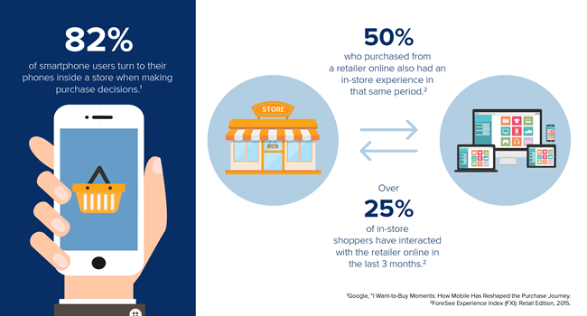
Web design for mobile platforms is not about cramming all of your site’s content onto a smaller screen. You may have worked for years to optimize your content, but the long and short of it is this: mobile web design is a whole different animal.
The goal is not to shrink your current website, but to redesign it for a mobile platform.
Do: Understand Responsive Web Design
Responsive web design aims to create an optimal experience for users across a wide range of devices. From easy reading to navigation control, responsive web design should respond to the user’s behavior. Users expect a responsive site to offer an interactive experience where the size, layout, and orientation match the device they are using and respond to touch.
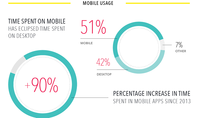
As the number of mobile users continues to outstrip the number of desktop users, we need to understand responsive web design fully to stay relevant.
To master responsive web design, you need to readjust your priorities. The goal is to show site visitors the content they want to see, not all the content on your website – at least not at first. You need to provide mobile-optimized content that adapts to the user’s touch. Users should be able to navigate your site easily, bringing up the content they want – such as your “Contact Me” page, their shopping cart, or your list of services. Mobile optimization is about putting the right content in the right places.
Don’t: Bury or Abandon Your Content
Discarding or hiding website content to make it fit on a smaller screen is not a great idea. Your users expect to see the same content you offer on your desktop website, just in a different format. Many responsive websites choose to hide content in a hamburger menu – the three-tiered menu icon typically found at the top of a screen. The hamburger menu is effective in keeping your site clean and minimal, but it’s not your only option.
![]()
You don’t want your responsive site to appear cluttered, but you also don’t want to make navigation more difficult than it has to be. You may have only a few seconds to give users what they want before they decide to click away. Don’t waste it by making them hunt for information. The goal is to achieve content and feature parity – a responsive site delivers the same content and functionality across every device. Losing most of your screen space forces you to narrow the focus of your content, but it shouldn’t compromise quality.
Do: Provide Adaptive Images
You might understand how important your website’s images are; did you know that for mobile shoppers, imagery tops the charts?

The ability to see product pictures is of utmost importance, but it’s even more important to optimize images for a responsive site. Once you achieve website scalability for mobile use, you have to focus on adjusting your images. Include image management in your responsive web design strategy, such as techniques that detect and adapt to a user’s screen size automatically.
Adaptive images use one line of JavaScript, one PHP file, and one .htaccess file, allowing you to drag and drop files into your root directory easily. The need for your responsive site’s images to replace themselves depending on screen size disappears, leading to less work and faster load times. You can customize your images to pretty much anything you want, and your users will see them perfectly on whatever screen they’re using. Your images should be of the highest resolution for ideal optimization.
Don’t: Ignore Designing for Touch
Most mobile users are on touch-screen devices, and expect your site to adapt from a mouse and keyboard to fingers and thumbs easily. This extends beyond responsive design and into designing for touch. You need to provide full functionality for mobile users as if they were on a desktop.

Dismissing touch altogether will frustrate users, as they don’t want to have to return to your website from a desktop. Make links in a mobile site simpler, larger, and more easily pushable. Use touch targets that account for the imprecise touch of the human finger versus the more exact click of a mouse. Finger-friendly mobile design should size to the average human finger. Too small makes it look like you didn’t optimize your site for mobile, but too large will make them inadvertently tap another target.
Do: Leverage All Things Mobile Is Capable Of
It’s not enough to get the perfect layout for mobile and call it a day. The best responsive websites utilize all things a mobile device can do. For example, your site should initiate a phone call when the user taps your phone number or a “Call Now” button. It should also use the user’s location, autofill features, barcode scanning, and image recognition. Think outside of the box and come up with features you’d want to use as a customer on a mobile site.

Image Source
Get the most out of your responsive site by creating fluid layouts. You cannot control which device consumers use to access your site. Therefore, design a layout that will automatically change depending on the device. Keep your layouts flexible using dimensions measured in percentages instead of in pixels. By ditching pixels, you don’t have to think about the screen width or device size, and can find a solution for every device.
Don’t: Inflate File Size
We understand you want to make your content larger so people can see it on a smaller screen, but this does not mean puffing up your file size. You need to include the same content as your regular site, but slim it down to fit nicely on a mobile site. If your responsive site has large file sizes, the load time will be sluggish, causing most users to click away before they even see your site. It should take under five seconds to load the site – the faster, the better.
You can’t assume users will access your site through a strong Wi-Fi connection. Instead, balance delivering the same experience as your regular site while maintaining fast download speeds. Your responsive mobile site should be lighter than your desktop one, with less to load per page. Realize that you don’t need to put as much content into your homepage as a desktop site. Users don’t mind clicking on menu items to see more content, as long as the menu is easily accessible.
Do: Get Creative
Understanding the nitty-gritty technical aspects of web design is undeniably important, but it’s your brand’s own sense of style that grabs users’ attention. Don’t be afraid to get creative with your mobile web design. You may encounter pitfalls along the way, but you can learn from them and create better responsive design solutions in the future. Your main goal should be to satisfy users. Go above and beyond general web design techniques to give them an experience they’ll remember.
Mobile site design may at first appear restrictive, since you have to apply many new rules to old web design. However, once you understand the basics of responsive web design, you have more room for creativity than on a typical desktop. You can use touch, GPS, and countless other tools users only have on mobile devices. This opens the opportunity to wow the user with something unique. Think outside the box, and give your user a mobile experience they’ll remember.
Related Topics
Top