Odds are you’ve seen the “hamburger menu” in the top corner of many of today’s mobile websites. It’s three lines stacked together to roughly form the shape of a hamburger. It was created as a website design feature to incorporate a site menu without taking up too much room.
While the hamburger menu serves its purpose of condensing information, achieving a minimalist aesthetic, and keeping a site uncluttered, it may have significant drawbacks.
Whether you call it a side menu, navigation drawer, or hamburger menu, it may be time to replace it with something that’s better for user engagement. Many people debate the advantages of using a hamburger menu in web design, using the “out of sight, out of mind” adage to claim that hiding your site features decreases user involvement with your site, and doesn’t bode well for conversion rates.
The idea of a menu that accomplishes the goal of preserving precious interface space spread like wildfire throughout web design and was adopted quickly by nearly every website and app across the board. It may be too late for a change now, but it’s still worth mentioning the cons of the hamburger menu as users begin to seek a change.
Hamburger Menu Lacks Efficiency
One of the most basic pitfalls of the hamburger menu is its prominent location on mobile apps – the top left corner. This is the hardest place to reach on a mobile device for a right-handed user, and doesn’t exactly encourage engagement.
The user also has to tap the menu once before being able to see what their options are, and then tap again when they’ve found the right option. They also have to swipe, or “back” through multiple screens to get back to the hamburger menu before continuing their site navigation.
It may not seem like a lot, but this doubles the amount of time it takes for a user to access the correct page. Users are growing savvy to this fact and complaining about the efficiency of the ever-present hamburger menu.
In today’s ultra-competitive market, what makes your site stand out from others needs to be front and center to hook users immediately upon arrival. When your site crams all of its content into a hamburger menu, you risk your users never seeing what makes your brand special. This hurts overall brand awareness and conversion rates and doesn’t do anything to promote your product.
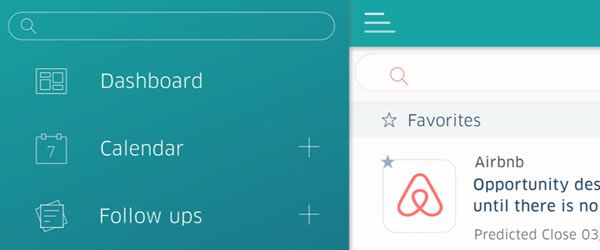
Image Source: Hamburger Menu by Christina Beard.
People Might Prefer Hotdogs
While web designers were quick to embrace the hamburger menu as a revolutionary way to minimize site design in a fresh, aesthetically pleasing way, user needs were ignored completely. Many users don’t know what the hamburger menu has to offer and don’t bother clicking it. Instead, they roam around your site searching fruitlessly for the information they need.
Meanwhile, sites that have stuck with other functional menu designs grant their users easy access to all the information on their site at first glance. Users don’t have to hunt down hidden options, and there’s no risk of them completely missing information. Many companies have opted for the less-trendy route and reverted to previous menu types – such as menus that line the top of the page horizontally – and are enjoying better user results.
Hamburger menus ultimately make content less discoverable, and in an era where average users decide if they are going to stay or leave in the first 10 seconds of viewing the page, quick discoverability is critical. While the hamburger design may look more appealing, its actual level of appeal for users is lacking.
Users often find it difficult to comprehend a hamburger menu, while traditional menus cannot fail to be immediately understandable. When grumblings about the hamburger menu were heard, websites tried to alleviate user grievances by altering the menu to include a back button or other options, such as putting the word “Menu” on top of the hamburger icon to make it more user-friendly.

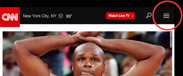
Image Source: Sidebar Menu Design by Andy Stone.
However, these alterations only managed to increase user confusion surrounding the menu. Now there are many hamburger menu types and users have to figure out which hamburger your site is using before they can navigate it correctly. Instead of assuming that the hamburger menu is the end-all and be-all of website navigation, you should consider other options.
How to Break the Mold
In many situations, you can optimize the hamburger menu for greater usability or replace with a different navigational option. Sometimes, simply moving your hamburger menu to the right side of the screen is enough to make your site unique and increase user engagement, since the right side is easier to tap for right-handed users.
Within your hamburger menu, you can also optimize the way options are laid out once it’s been clicked. On a top menu, users focus their attention on the first and last elements – this is where your most important information should be located. If your menu unfolds into a sidebar, you need to arrange the elements from most important to least important as the user scans options vertically.
You can also revert to pre-hamburger days with user-friendly top menus or create your own twist on a classic, such as this example:
Image Source: The Hamburger Menu Doesn’t Work.
GameStop uses animated icons to enhance usability while avoiding the hamburger menu altogether. They’ve prioritized what their users require the most from their app, and only included these in their top menu. The site still attains a clean, fresh look without the need for hiding information in a side drawer.
This icon and the text structure allow you to condense text while still keeping the button large enough to promote being pressed – large thumbs notwithstanding. However, if you can’t possibly narrow down your site’s navigation to a few options, you can consider a text-only menu or design your site so that a menu isn’t needed. Either way, approach your navigation technique with the user in mind.
Your menu should be glance-able for users who want to minimize wasted time, while still being easily understood. This may be a difficult compromise to achieve, but it’s a necessary combination if you want maximum user engagement. If you’re having trouble prioritizing your menu options, think from the perspective of your users. For example, you may pride yourself on your blog, but if users are visiting your site primarily to browse your products, the blog shouldn’t be top priority.
Follow Your Intuition
If the hamburger menu or some variation of it has been working for you, don’t feel pressured to change it by those who are seeking a new menu option. There are still users who vouch for the usability and appeal of the hamburger menu, especially when it comes to developing a website for mobile use, where space is limited.
Even though the hamburger menu is at the center of current controversy, if your site is best navigated via a hamburger menu, keep it that way – just make sure the components within your menu are up to par and designed for optimal user engagement. However, if you opted for the hamburger menu out of laziness, you may want to rethink your choice.
Start thinking of your menu as more than something that needs to be tucked out of sight, but rather something that has the power to increase conversion rates – if executed correctly. Users rely on your menu to navigate your site, and if their needs aren’t met, they’ll bounce. Whether you choose the hamburger or another menu option, remember that the end goal is the same – enhancing the user experience.
Related Topics
Top