A bad mobile app can make or break a company’s image and revenues. In fact, Google reports that 79% of surveyed respondents indicated they would turn to a competitor’s app after a bad mobile experience.
Mobile commerce is steadily increasing with some brands such as JackThreads reporting 50% of sales from mobile. Brands that are excelling at m-commerce have done so by implementing UX that creates engagement, increases conversion rates, and decreases user frustration.
In this post, we’ll take a look at what design decisions and best practices are responsible for the most successful mobile commerce apps.
1: Strive for Visual Clarity
Use Clear High Quality Images
One of the most frustrating aspects of shopping on a smartphone is the inability to get adequate details about products. The best way to present this information is often through the use of high resolution, clear images. Both Android and iOS platforms now encourage developers to use the whole screen as much as possible.
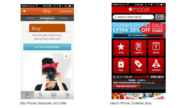
Eliminate Clutter
Pictures are great, but when there’s too much of everything else going on, it can make it hard for users to focus. To decrease possible frustrations eliminate excess wording and opt for a simple and uncluttered design.
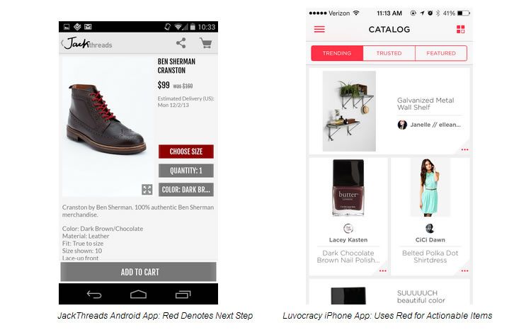
Implement Key Colors
The use of a key color can help guide users through their shopping experience, indicating which actions should be taken next and which information is most important.
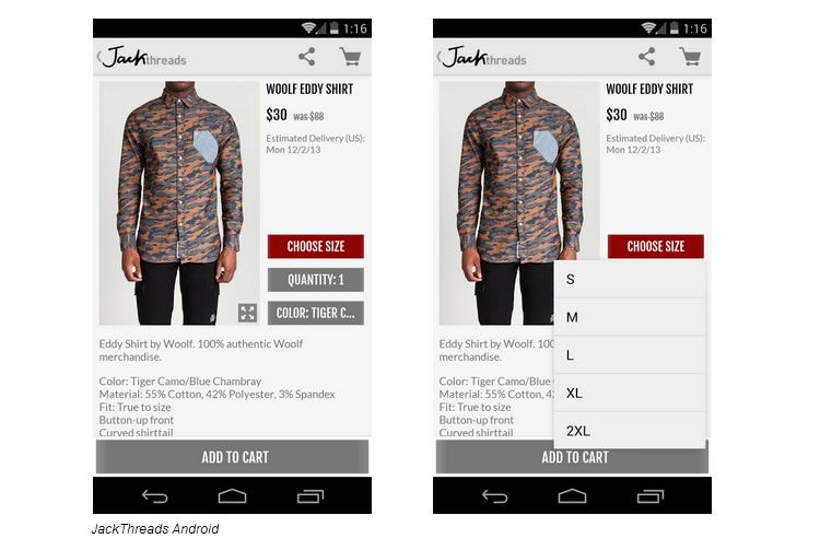
Clarify Product Options
Lastly, and as equally as important as the other points mentioned, is the way you present product information to users. It should be clear what size and color options are available and easy to input desired specifications. Usually, if not too cluttered, you’ll want to include all options on the product screen.

Using a pull-down menu can sometimes reduce clutter. The JackThreads app opted for the use of a spinner (pulldown menu) allowing for a neater and less cluttered looking screen.
2: Create Intuitive Search and Browsing Filter
Encourage Browsing
Browsing should not be a chore. Instead the browsing pattern should nurture discovery and make it easy for users to drill down to their desired category. One way ModCloth eliminates frustration when browsing a site with numerous categories and subcategories is through reductive navigation.
If the traditional expanding design for Android had been used – that is where tapping shows all children categories until tapped again – you would end up with dozens of items shown at once. This many options at once can cause the user to lose context of where they are. The reductive solution hides the parent’s siblings, so that the users ends up with a sort of visual breadcrumb trail showing where they are in the category tree.
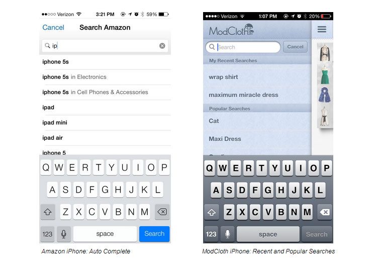
Searching for Items
Let’s just go ahead and put this out there – you want to let users search for items. Now that we’ve established that, how can you go the extra step when helping them find an item? The use of auto-complete can make the process quicker, a plus when shopping on the go. Another option is the use of popular searches. This reminds people of items they might not have thought of initially.
Use Product Carousels
Product carousels are a great way to show off a collection of items without a user having to leave the current screen. Carousels are especially useful on the homepage for special collections or on a product page for similar suggestions.
3: Encourage Social Interaction and Favorites
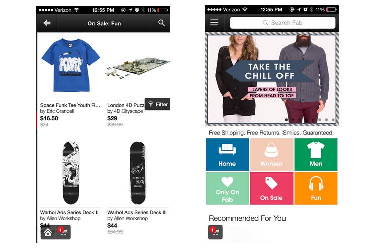
“We want people to want to take their mobile out of their pocket hourly just to see what’s hot on Fab right now. We believe that if people enjoy browsing and discovering on Fab, plenty of sales will happen over time.” – CEO of Fab.com
Create a Community
Fostering a community that is eager to share their favorites with others is perhaps the most important aspect of a commerce app. Although Fab.com has traditionally been a flash sale company, they have done an exceptional job at getting users to browse when they have a few minutes to spare. How have they done so? By including something as simple as a popular tab.
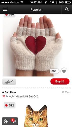
Fab iPhone: Popular Feed
ModCloth reports mobile users doubling this year alone due to “the integration of the style gallery, and full sharing capabilities with other social networks”. The style gallery is a great feature that encourages customers to upload pictures of themselves wearing ModCloth garb. User photos help shoppers imagine the item in a real context. If you consider taking a route similar to ModCloth’s style gallery, go the extra step and make it easy for users to take a photo by integrating the camera in the app.
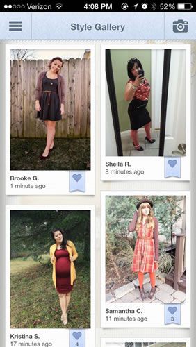
ModCloth iPhone: Style Gallery
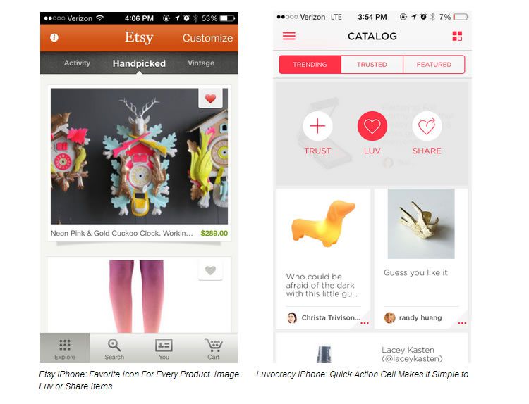
A common theme you’ll see in the most successful mobile apps is a feed with large high quality images and a one click ability to favorite items. This allows users to quickly scroll through items and save favorites to look at later.
Include Reviews
One of the biggest hurdles to overcome when purchasing an item online is not knowing how an item will fit or appear in person. A great way to remedy uncertainty is by encouraging customers to review purchased items. At the very least, be sure to let users access reviews. If you want to go the extra step, let them write reviews from within the app.
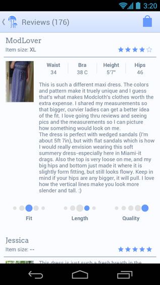
ModCloth Android: Indepth Reviews Help Users Pick the Right Size and Item
4: Personalize the Experience
An experience is more powerful when a user feels like they have control over the situation. And with the mass amount of information they are GIVING you, why not do something useful with it? Here are some nifty examples of how mobile savvy brands are going the extra step:
ModCloth:
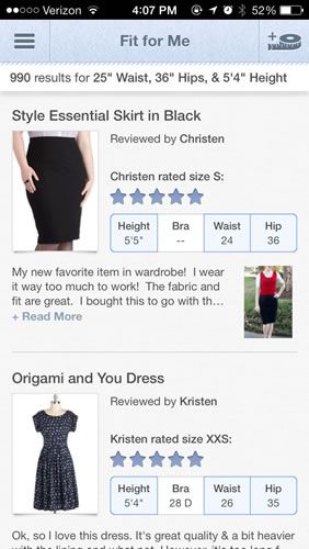
ModCloth recently introduced Fit for Me in their iPhone app. Fit for Me allows users to find items that customers with similar measurements rated highly.
Amazon also does a great job at sharing recommendations based off of past searches and purchases. They facilitate these recommendations through the use of a recommended for you list easily found by clicking the more tab.
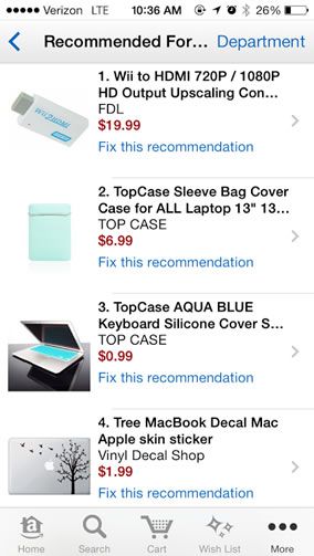
Amazon.com iPhone
5: Streamline the Checkout Process
Perhaps the most important component of a mobile app is the checkout process. In fact according to Jumio “66% of shoppers have abandoned a mobile purchase at checkout, and 47% reported they failed to complete a transaction because the checkout process was too difficult”. What can be done from a design standpoint to eliminate this abandonment?
Make Shopping Cart Accessible From Anywhere
Users should be able to access their cart from virtually any screen in the app.
Save Important Information
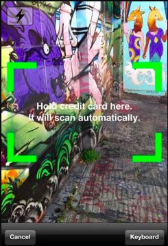
Users should be able to store information such as shipping addresses and credit card numbers. This allows them to make a simple purchase with as few clicks as possible. Another option is integrating credit card scanning abilities. This takes out the burdensome step of manually entering in credit card information (check out card.io).
Also check out Braintree which enables one touch payment in apps ranging from Fab to Airbnb.
Concluding
Next time you start designing a commerce app keep these five key goals in mind:
- Visual clarity
- Intuitive search and browsing
- Encouraged social interaction
- A personalized experience
- A streamlined checkout process.
Remember, all of the apps included in this piece come from companies experiencing a high percentage of revenue from mobile sales. Needless to say, there’s a lot to be learned from their success.
Related Topics
Top