Thank goodness for web browsers keepings themselves up-to-date. For so many years, we had to rely on users to make the effort to download new versions as they were released. Now, even Microsoft’s Edge has joined the always-in-date party.
This was not only a stroke of genius for security’s sake, but also a boon for designers looking to use the latest CSS3 features. It has undoubtedly led to more of us who feel safe in using features like Flexbox, knowing that the majority of users have updated browsers to support it. And it’s already helping to push CSS grid into production environments, as well.
But we also know that there are still users out there who are running older software. Amazingly, according to NetMarketShare, Internet Explorer 11 was still third on the list of most-used browsers for the year 2017. IE 8 placed sixth, while IE 9 came in tenth. IE still accounts for about 13% of desktop device usage.
Sure, the numbers are nowhere near what they used to be when it comes to IE. But they’re still high enough that they need to be a consideration when building a new website. The question is how do we continue to support old browsers while still using new features? And, how far back should we go?
Stuck in the Past
In a perfect world, designers would love to see the likes of Internet Explorer simply fade into history. But it looks like its demise is still a few years off. Cheaper PCs and the sheer amount of mobile web usage would seem to indicate that IE will eventually fall off the map. At least that’s the case in the consumer category.
Corporations are still hanging on to older versions of Windows, and that often means sticking with IE. Edge is only available for Windows 10. So if large companies stick with Windows 7 or 8, IE will remain the default choice. Granted, Chrome and Firefox can be used on these systems. But that doesn’t necessarily mean that users in these environments are allowed to install them.
But it goes beyond IE. The latest version of Apple’s Safari won’t run on some older Macs or iOS devices. It would seem that the effect here would really be on mobile design, as there are still a number of old iPhone models out there. Safari is the second most widely used mobile browser.
Taking this into account, it means that we do need to take older browsers seriously. However, it doesn’t mean that we should hesitate to use the latest features.

Using the Latest and Greatest – With Fallback Support
So, how can we implement new features while still making designs usable in older browsers? When it comes to CSS, using fallback methods can be a big help. In general, a fallback is code that will allow an outdated browser to use an acceptable alternative to what we’re trying to achieve.
For example, if you’re using Flexbox, there are some available browser prefixes that will enable limited support in older versions of Chrome, Safari, Firefox and IE. Not every CSS feature will have this type of fallback, but usually there is always a way around whatever problems you run into.
The further back you go in terms of providing an alternative, the trickier it can get. But as you test on various browser versions and devices, you can make tweaks as needed.
Your job can also be made easier with the help of tools like Modernizr. It’s a script that will detect browser support for specific features and adds a CSS class to a page’s body accordingly. You can then leverage that class to provide alternative styles if a feature isn’t supported in the user’s browser.
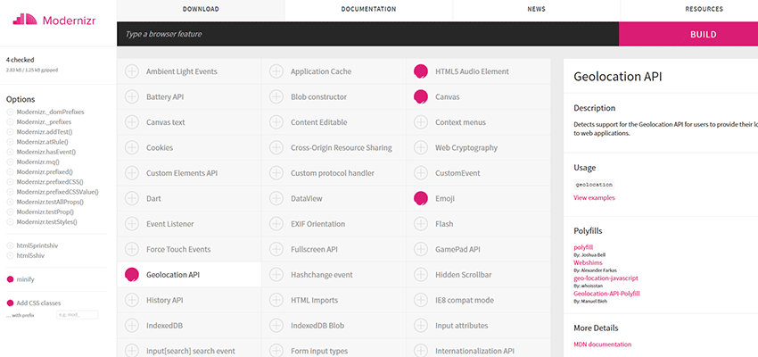
The great thing is that, before you download the script, you can pick and choose which features you want to detect. For example, you can choose to look for features such as canvas, HTML5 Audio/Video or even emoji. This keeps things as light as possible while providing a big help in ensuring backwards compatibility.
How Far Back?
We know that we can support legacy browsers. But how far back should we go? If you ask 100 different designers, you may get 100 different answers. That’s because there really isn’t a hard-and-fast rule about backwards compatibility.
Personally, I think part of the equation should be about the features you’re using. Features like Flexbox or CSS Grid that affect layout are vital to the usability of a website. So, it’s important to provide some sort of fallback for older systems. Things like layout and navigation should be thought of as “too big to fail”.
When it comes to items that are more for aesthetics than functionality, they can often be left as-is. If you’re using CSS3 goodies like shadows and rounded corners, it’s probably not worth the time to provide alternatives. Your site should be just as usable with or without them.
If you’re hoping to find out which browser version should serve as a cutoff point, it makes sense to reference those usage numbers mentioned above. And, if you have this type of data for the site you’re working on, even better. So, if you know that there are still visitors to your site that use IE8, then it’s worth ensuring that they can access your content.
As for my own routine, IE8 is actually as far back as I test for desktop browsers. I’ll also check out Safari 6, along with a random version of Chrome and Firefox. On mobile, I generally go back to Android 4.x and iOS 7 devices. Of course, your needs and preferences may vary.

The Evolution Continues…
It probably isn’t too surprising that legacy browsers are still in use. Web designers have been hacking their way through this problem for years. But the situation is much better than it was in the past. Anyone who had to deal with IE6 can attest to that.
Over time, we’ll see the older desktop and laptop systems move to the recycle bin. And even corporate users will have to upgrade eventually. Since modern browsers are always being updated, newer systems should keep pace with the evolution of web design.
It seems like the more interesting challenge will be support of older mobile devices. While we see users on a continuous upgrade cycle in many areas of the world, some will still utilize vintage hardware and software. So perhaps our fallback focus will be moving more to the small screen.
Regardless, the main focus should be on keeping content accessible to as many people as possible.
Related Topics
Top