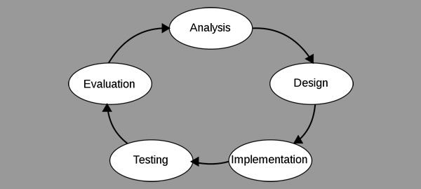
User interface, or UI, is a consideration in the design of anything created to be used. Although industrial and graphic designers also use UI design principles in their work, UI is increasingly important in the digital environment. Elegant UI design assures the success of apps and websites by making the user experience positive and engaging. With intense competition for user attention, UI is one of the best tools for capturing and satisfying an audience.
For web designers, successful UI design starts with basic design elements, such as color and font choices, and extends to every component of the design. Here are some tips covering how to make UI design effective and attractive, while ensuring that users have an excellent experience.
UI Design Process

When it comes to UI design, there’s a lot in the name: The most obvious component of such a design is the user. A UI designer’s Number 1 priority is to understand what a user expects from an interface and to anticipate how the user will use it.
The process therefore begins with a careful analysis of potential users. This may involve formal or informal research and will likely include plenty of brainstorming. Defining clear goals for the interface is also crucial in the initial stages.
Questions that designers may ask at this stage include:
- What would a user want the interface to accomplish?
- How comfortable is the user with technology?
- How would a user engage with the interface in the normal course of activities?
Once an interface has been designed to suit the user and accomplish a task, it relies on real user testing to determine whether the theory holds true in application.
Prioritize Clarity
Clear, specific features are crucial for creating an engaging UI. One fundamental tendency of human beings is to ignore things that we don’t understand. This habit allows us to prioritize essential information and not waste time on things that don’t directly pertain to our survival. In the context of UI, “survival” can be interpreted to mean getting what we want or need out of a website.
The application of this is that users will typically ignore icons and other elements they don’t immediately understand. If a feature has a vague purpose, users will assume that they don’t need it and move on.
An example of the importance of clarity to UI is Google’s decision to collapse the Gmail menu under a general grid icon. While the visual design may be clean and appealing to look at, the change created a number of problems for users who didn’t even notice the new icon and couldn’t find the features they needed.

Make Page Layouts Intuitive
Users should be able to find what they’re looking for without thinking too hard. Intuitive design means that the design immediately and invisibly tells users how to navigate the site and use the site’s features. This enables users to focus on completing tasks without needing to stop and figure out how to do so.
Of course, non-intuitive design is the exact opposite of UI design, in that it doesn’t focus on the user at all. This is an example of what happens when designers create a site without considering the real-life end user. Imagine an online slideshow where the forward button is on the left rather than the right. Users would immediately gravitate toward the right-hand side, become confused, and spend unnecessary time looking around the page.
Navigational tools, such as sidebars and menus, should be clear and easy to use. Consistency is an important contributing factor to intuitive page layout. Interface features should be consistent across pages, so that users intuitively understand them. When users see the same feature more than once, they’ll understand how to interact with it.
Provide Instant Feedback
Because the goal of any interface is to be used, instant-feedback messages help keep users in the loop about their actions. Instant feedback messages can inform users about the state of the interface – loading icons, error messages, and instant updates about new developments. When users get instant feedback, they don’t have to guess about what’s going on.

Image via UXPin
As we’ve already established, people tend to ignore things they don’t understand. If users try to perform actions and are left staring at an empty screen, they’ll likely go elsewhere.
Make Defaults Pleasant and Productive
Many users don’t bother to change default settings and features on interfaces. A clear example of this is the omnipresence of the iPhone default ringtone. It’s an amusing social experiment to see how many people reach for their phones when one person’s iPhone rings. In this example, the default setting is neutral. If the defaults are objectionable, however, users are negatively affected. An example of UI-friendly default settings can be found in auto-fill forms that save users time by filling in basic information.
Offer Guided Actions
Rather than leaving users to guess how they should use a feature, showing them what to do encourages users to successfully complete actions. Guided actions can be overt, such as LinkedIn’s endorsement feature. When the endorsement feature was first launched, LinkedIn asked users to endorse their connections’ skills with a prompt that asked “does [this person] know about [this skill]?”

Rather than assuming that users would find the new feature and figure out how to use it, LinkedIn guided people to engage with it productively, making for an excellent UI. Designers can also more subtly guide actions through design decisions, such as emphasizing a feature through color and size. For example, the Spotify home page guides users to the “Premium” option:

Don’t Neglect Basic Design Elements
In the rush to be fresh and innovative, interface designers can forget to consider fundamental aspects of design that have a big impact on how users experience the interface. The following basic design components comprise the foundation of your interfaces usability.
- Contrast: Contrast should be such that all elements are easy to read and engage. This is especially true as designers work to make interfaces accessible to more people; those suffering from even minor vision loss often struggle with low-contrast visuals.
- Distortion: Any distortion or disruption of visuals is bad for UI. Not only does distortion impede users’ ability to engage with an interface, it’s also frustrating and may cause them to avoid the interface altogether.
- Text Size: Text size is an especially important consideration in web design, due the unique way that people read online. People looking for something online, whether it be information or items to buy, often skim more than read, making the size and weight of text very important for shaping UI. If users will access an interface on different size screens, designers also need to consider how this will affect UI. Static text will require mobile users to zoom in, which creates a less user-centered experience.
- Screen resolution: For optimum UI, many applications and interfaces need to work on screens with varying resolutions. Poor resolution impacts readability and usability, making the UI negative.
Moving Forward
As more of our lives are tied to online experiences, UI becomes increasingly important for many people’s daily activities. Focusing on UI design gives designers a chance to impact people positively in most aspects of their lives.
Related Topics
Top