Identifying user goals and helping them accomplish those goals through your product – that’s the key objective of all organizations that build digital products. There are various elements that influence the usability, desirability and reliability of a digital product.
The most common ones that we hear today are UI & UX. These fields, even though significantly different in nature, sometimes tend to misguide people down a path which says “UI=UX“. But, we as designers know that it’s not true. So, let’s try to bust this myth today.
Job seekers and professionals all over the globe are facing quite a lot of problems as a result of this myth. Job listings for UI design positions have been found to be asking for “user research” skills, and job listings for UX design positions have been found to be asking for skills like visual design, iconography, etc.
It is taken for granted that a UI designer should possess skills like user research, information architecture, etc, and likewise, a UX designer should possess skills like visual design, iconography, etc. Yes, there is an overlap of skill-sets, but the interface is not the ultimate solution to a UX problem.
UX has a much broader scope. If we were to define both in one line, UX could be defined as the feeling that the user gets by using a product, and UI could be defined as a tool which lets the user interact with the product.
Metaphorically speaking, let’s consider the case of a grilled cheese sandwich. The feeling that we get when we dig into it can be considered to be UX, whereas, the ingredients that go into the sandwich (the bread, mayonnaise, cheese, butter, etc.) can be considered to be a part of the UI.
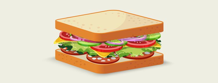
The feeling that we get when we eat a sandwich can be considered to be UX, the ingredients can be considered to be the UI.
A sandwich made with white bread, high fat cheese and mayonnaise would taste almost the same (read: equally delicious) as the one made with whole wheat bread, low fat cheese and eggless mayonnaise, but people who have a tiny bit fear of putting on weight, will by no means go for it.
We have good UI in both cases, but due to lack of user research (which again is a part of UX), we are not aware of the kind of users who will use our product, and as a result, our target audience reduces by a massive amount.
The UX design process encompasses user research, information architecture, interaction design, UI DESIGN, interactive prototyping, and usability testing. UI designers need to possess skills like visual design, iconography, typography, etc, but not necessarily user research or information architecture.
UX designers on the other hand need to possess skills such as user research, information architecture, interaction design, etc. However, it certainly does help to be competent enough to possess a larger skill-set, and be a bit of a hybrid.
The differences between UI and UX lead us to the conclusion that it is better to strive for UX rather than just UI. Making our product look pretty does not really solve the problem. We should try to make it look less rude. That solves the problem.
It was very recently, and in fact very rightly tweeted by @Useagility that – “Your website may be beautiful but people will leave if they are unable to figure out how to navigate your site quickly.” Making the content on our website/digital product navigable/locatable is an essential part of establishing good UX. The user should find value in our product.
There are many live examples of products with good UI and bad UX all over the internet. The most common ones are those long online forms. Some forms look really good. They follow all the current UI trends – proper padding, top aligned labels, beautiful use of the whitespace, aesthetic fonts, etc, but what’s the problem with them? They are insanely long.
When we ask a user to fill out a form, we’re actually starting a conversation with them. Let’s face it, when we personally start a conversation with someone, we don’t expect them to go on giving their personal details, contact details, address, educational details, etc all at once. That just does not happen. Then why do we, as designers who are supposedly capable of empathy, give the user the agony of filling such forms?
Instead we should group related fields together under one heading, and make life easier for the user, so that the reaction of the user goes from “OMG! That’s a long form.” to “Ok, so first my personal details, then my contact details…” I mean isn’t that the reason why we were introduced in the first place? Making life easier for the user. There are examples of good UX and bad UI as well, and you already know what I’m talking about – ATMs. Yes, they top my list in this category.

You put your card into an ATM, type in your pin, and choose your task, accomplish your goal. A decent UX altogether.
Their interactions are simple, and pretty much similar everywhere. You put your card in, type in your pin, and choose your task (say cash withdrawal), accomplish your goal (get your cash in this case), and walk out satisfied, a decent UX altogether. But when it comes to their UI, need I say any further? The point I’m trying to make over here is that a product that has a good UX and bad UI always trumps a product that has a good UI and bad UX. Here are few examples demonstrating the fact that there can be products that can have bad UI & good UX and vice versa:
Bad UI & Good UX Examples:
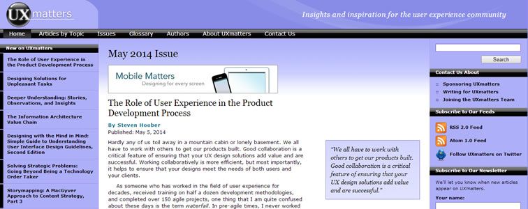
Ironically, some websites that provide valuable information/literature on UX & UI have the worst UI I have ever seen. They do not follow the current UI & Visual Design trends, and to be honest, do not please the eye (read: are a bit rough on the eye). By the looks of it, they seem to be stuck in the dark ages. But, can you find exactly what you’re looking for? Is the website navigable? Is the website usable? The answer to all those questions – YES. They follow every known principle/theory of UX. If that hadn’t been the case, people like us would have given up educating ourselves ages ago. UX Matters stands out as a winner here.
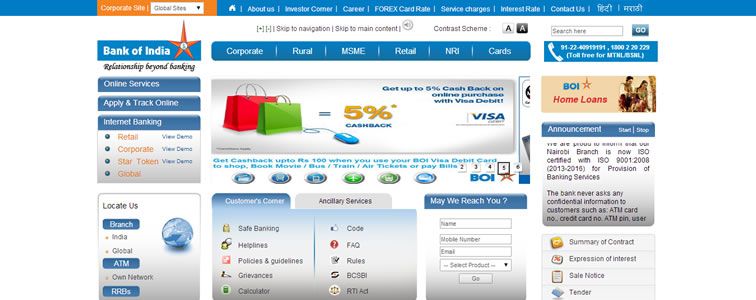
If a non-designer wants a firsthand experience on what bad-UI-good-UX looks like, I would advise them to go visit a bank’s website. Any bank. People who code these websites do not seem to be aware of CSS (Cascading Style Sheets). These websites lack proper padding all over, have images as buttons, do not have use typography properly (even after Google gave us a gift called Google Fonts), content is not aligned properly in grids, and worst of all, have a bizarre choice of colors (and I mean bizarre), etc.
The list could go on and on for these guys. But yes they most certainly are usable and have a pretty straightforward user interaction; otherwise, no online transaction would have been possible through these websites. Check out Bank Of India’s website. You’ll know what I mean.
Good UI & Bad UX Examples:
There are certain websites/apps that give a glimpse of their content (e.g. journal/article) and then ask the user to create an account in order to view the complete content. Why? I mean, is a short glimpse (5-6 lines of an article) enough for a user to know whether the content you are providing is useful to them?
Some of these sites/apps indeed have an uber cool user interface. They follow all the current trends of visual and interface design, but the experience that they provide is a bummer. It’s like forcing the user to do something. Would you not rather have the user read/view your content, and then happily register at their free will? Glassdoor is a perfect example. You never get to know what salaries are on and after the 2nd page under the salary tab, etc without logging in.

Then there’s my favorite. E-commerce sites that have you glued onto your computer screen with their stunning interfaces (and products obviously), and then, ask you to click on certain products to view their prices. No, I don’t want to navigate to a different page to view the price of the product. Show them on the same page just like the others. Check out American Golf’s page. You are required to click on “Buy Now” to view the price of certain products.

Guide To Establishing Good UI & UX
Well, it certainly does make our product stand out if it has both, a good UX and a good UI as well. Here’s a short and sweet guide to how we can establish both (and not just good UI or good UX):
- Present information according to its measure of importance, i.e. showcase your content in a way that the primary and more important information stands out.
For Example: Use pop-ups to display a success message (say ‘Deleted’ or ‘Liked’) instead of shoving it up somewhere in the main body of the content. - Use visually engaging graphics. Use motion graphics and subtle animations. Users respond very nicely to that.
For Example: Make the sliding menu in your mobile application more appealing by giving it easing/transition effects. - Reduce effort required from the user’s end. Use design elements that the user is familiar with.
For Example: Use the three bar icon (which is in fact the standard menu icon) as a trigger for the menu of your application. Users are familiar with that. They have seen the same kind of icon as a trigger for the menu for countless mobile applications. - Make use of the whitespace. It’s all about eliminating the unnecessary, so that the necessary may speak.
For Example: Always display information that is relevant, rather than putting up clusters of irrelevant information all over the place just to show that yes, we know a lot of stuff. And, didn’t our teachers insist on us being neat and clean right from the days of kindergarten? - Reduce the number of clicks/taps to the target function to as low as possible. Remember: The user is using your product to get their job done quickly and with ease.
For Example: Well, reduce the number of clicks/taps to the target function to as low as possible. - Make the content on your product navigable and locatable.
For Example: Use internal links within your page if you want to provide more information on a particular topic. Organize and manage the information architecture of your website. Card-Sorting is the name of the game. - Keep in mind the words of Thomas Mann – “People’s behavior makes sense if you think about it in terms of their goals, needs, and motives”. Design accordingly.
For Example: Match the needs of users with technical feasibility and economic viability, and not the other way round. Design for the user. Conduct usability tests, see how users behave and react to every aspect of your product and implement what you observe to the best possible extent.
Concluding
In the end, I’d like to conclude by saying that people should see UI and UX the way they actually are, and get rid of the myth “UI=UX“, because, UX is a problem that designers/architects need to solve, and like I said earlier, the interface is not the ultimate solution.
Related Topics
Top