Have you ever found yourself gazing at a finished design, thinking something’s missing? More specifically, have you ever come to the conclusion that a design is ‘too empty’ or ‘too busy’?
For us designers, it’s difficult to spend any appreciable time in our craft without running into this scenario.
This really shouldn’t come as a surprise, either. After all, the most basic principle of our work revolves around the creative removal of whitespace. Yet, despite it being at the very core of what we do, it always remains one of the more challenging aspects of design.
How do you use whitespace effectively?
Is it Really Empty?
Have you ever thought of whitespace as ‘spaces between design’? While that’s a prevalent line of thought when it comes to the barren spots of our designs, it’s an entirely incorrect perspective.
White space isn’t just the filler between design elements. It’s a crucial design element in its own right!
Whitespace is like the mortar between bricks or the adhesive in a stained glass mosaic. Though our eyes are trained to admire the content –bricks / colorful glass– it’s the stuff in between that holds the content together and helps shape the overall flow of the design.
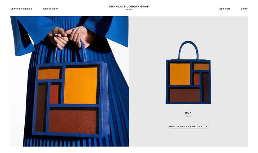
Effective Use of Whitespace on Graf Paris.
Just like a beautiful mosaic sans glue, our designs without the whitespace would simply be a colorful mess. Once you recognize the significance of the so-called empty elements of your designs, you’ll then be better equipped to leverage this white space to its fullest extent.
Focus
Now that we’ve established the importance of whitespace in our designs, how do you use it?
Let’s start with a little exercise. Open a new tab in your favorite browser and point it to google.com. What’s the first thing you see? I’ll wager it was the brightly colored Google logo, right? Where was this logo?
It certainly wasn’t at the top edge of the window where your eyes naturally start. So how’d your attention get drawn immediately to the center of the page?
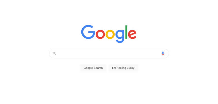
Effective Use of Whitespace on Google Search.
You guessed it. Whitespace. Google uses an abundance of white space to naturally tune your focus to the center of the page where the meat of its minimalistic design resides. Whitespace is one of the most simple methods of guiding the eyes of your audience.
We can use this design tool to create natural hotspots in our layouts. With the focus and attention of our audience drawn to these areas, we can then place important content within to more effectively convey our message.
Organization
Going hand in hand with directing the audience’s focus, whitespace affords designers an easy way to organize different elements of design.
Just like we use whitespace to break up walls of text into more manageable paragraphs, it’s exceedingly effective at creating clean organization of the content in our designs.
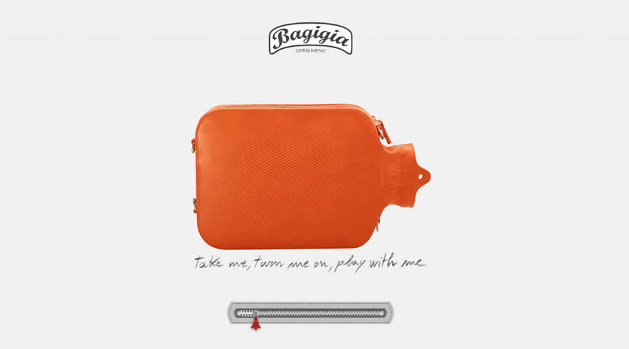
Effective Use of Whitespace on Bagigia.com.
A useful tip when organizing with whitespace is to be consistent. It’s helpful to think in terms of content groupings when using whitespace this way. Do your best to come up with a uniform measure of whitespace for margins, sections, text, and graphic elements.
One of the best aspects of whitespace organization is that it’s both easy to adjust and can have far-reaching effects on design. So feel free to experiment!
Emphasis
Owing yet again to its remarkable ability to guide the eye of your audience, whitespace can help certain elements of your design stand out. Building on the previous theme of consistency for organization’s sake, breaking the continuity in creative ways can quickly grab attention.
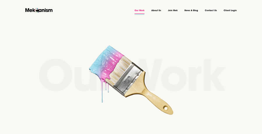
Effective Use of Whitespace on Mekanism.com.
When you create a steady theme of white space use in your designs, it creates an instant familiarity in the eye of your audience. As they continue to navigate the design, any hiccup in that continuity, even subtle ones, will naturally stand out.
A great example of this, which you can easily implement, is changing the letter spacing on titles you wish to emphasize. With that mastered, try using it in more subtle ways by experimenting with the spacing of section elements within your designs.
It Doesn’t Have to Be White
The above tips all revolve around guiding the eye of the audience. That is, after all, what whitespace is best suited for. That being said, just because we call it white space doesn’t mean it has to literally be white!
There’s no unwritten law of design dictating the color — or lack thereof — of the space between the prominent pieces of your designs.
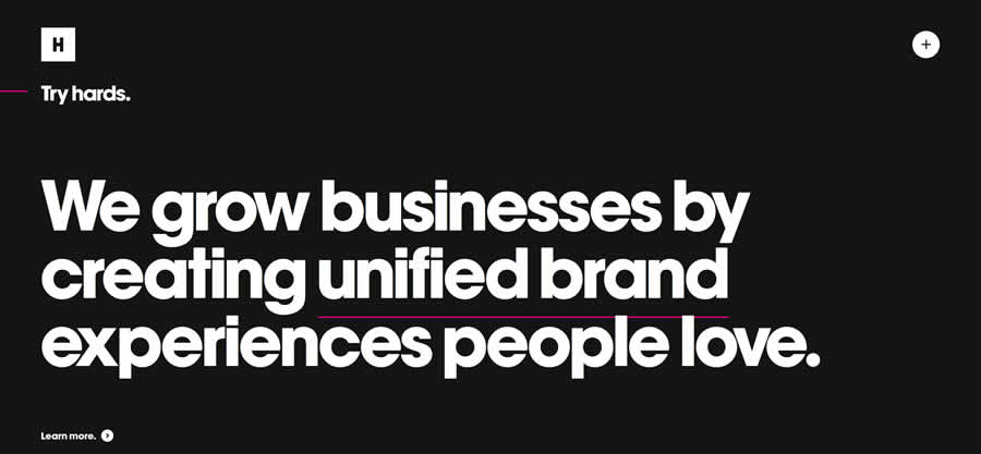
Effective Use of Whitespace on Huge Inc.
A fantastic example of this in practice can be seen with the single-page design trend. When you’re relegated to only one page for content, effective whitespace use is critical to maximizing focus, organization, and emphasis.
Blocks of content are often designed to be continuously flowing in these scenarios. In such cases, simply changing the color of white space in these blocks helps maintain all three areas of design we’ve talked about while also providing breaking points for content in tight spaces.
With these tips, I hope you look at the whitespace in your designs from a fresh, new perspective!
Related Topics
Top