Web design does not have to be limited to a typical grid-structured layout. It sometimes feels like we are locked in an endless cycle of header, content, sidebar, and footer. That is it. It would be great if we could tear away from convention sometimes and also force ourselves to break some usability rules. Just imagine what we could create.
Today, we have for you a selection of sites that do exactly as described above: they break convention and the result is that they have built some amazingly creative web layouts which, in most cases anyway, are a little unusual as well.
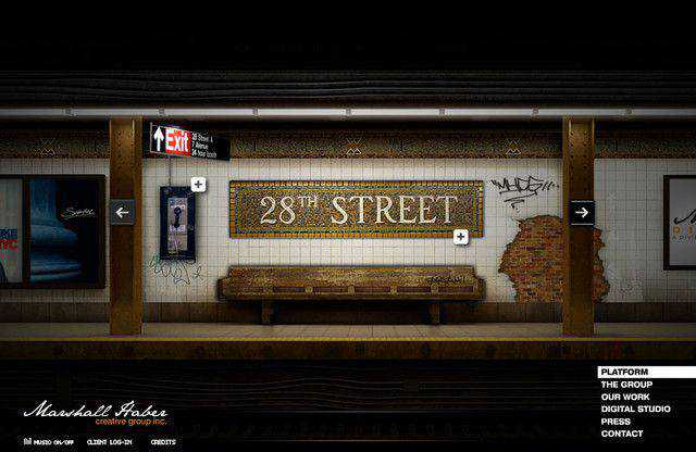
Marshall Haber
This Flash site uses a subway map as a preloader and once it has loaded you’ll be amazed at the detail and creativity of its design and highly original navigation.
Grzegorz Kozak
Very intriguing and interactive layout that presents a beautiful background image of a tower. Clicking on the top menu will take you to the relevant section on the page.

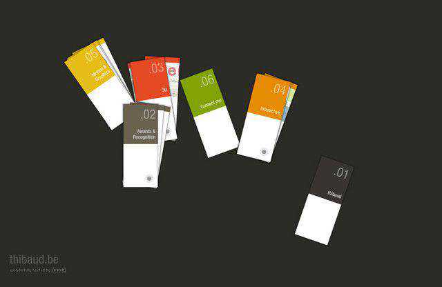
Thibaud
I love this website. The carefully placed navigation elements have a beautiful mouse over effect and sound. You can drag and drop the elements and can click on each to further explore the site.
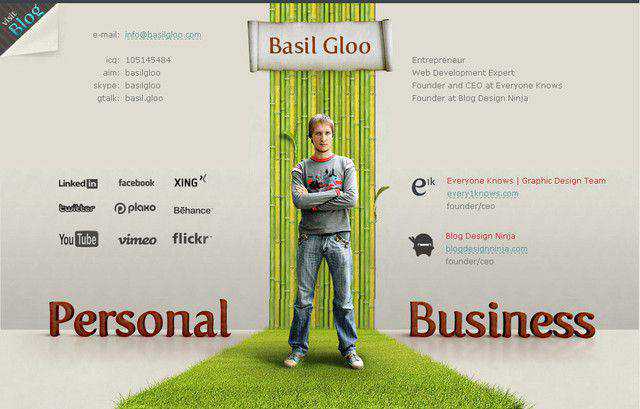
Basil gloo
The center part of this website is what that make it stand out from the rest. The eye-catching green carpet looks terrific.
Pretty Production
A very unusual, colorful and creative layout with horizontal scrolling.

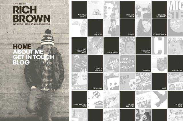
Rich Brown
This website is equally divided into two parts. One is completely static with a very nice background image while the other part is scrollable with different tiles where you can click on to browse further.
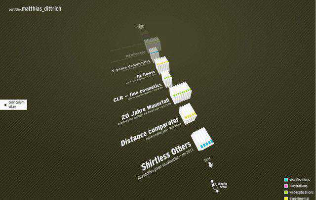
Matthias Dittrich
You will love browsing through this truly interactive design portfolio site. Simply drag in to scroll.
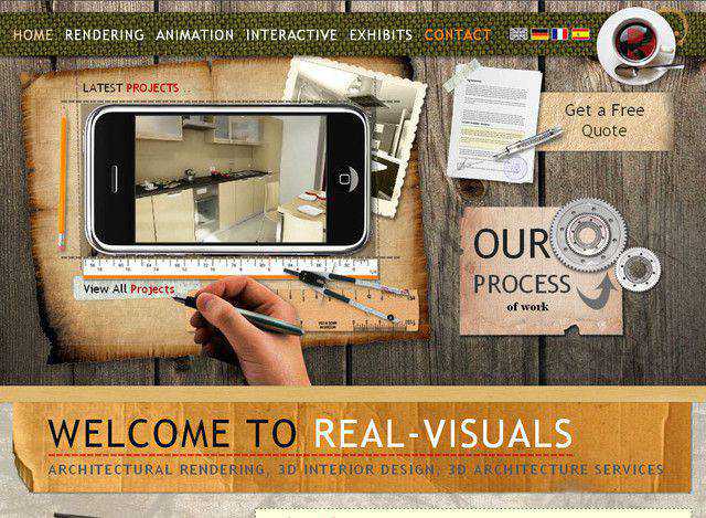
Real Visuals
With this site, you will discover lots of interactive design elements that add beauty and originality.
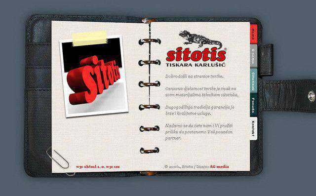
Sitotis
This website has been designed to give you the impression that you are flipping through a personal diary.
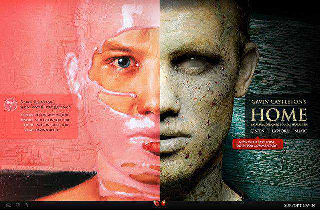
Gavin Castleton
This site has been designed to highlight the split personality of each of the musicians albums. Simply choose the album or personality you would like to explore.
Alexbuga
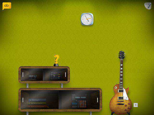
This is a fantastic site with creativity brimming from all angles. The navigation is hidden behind the glass panels of the entertainment center.
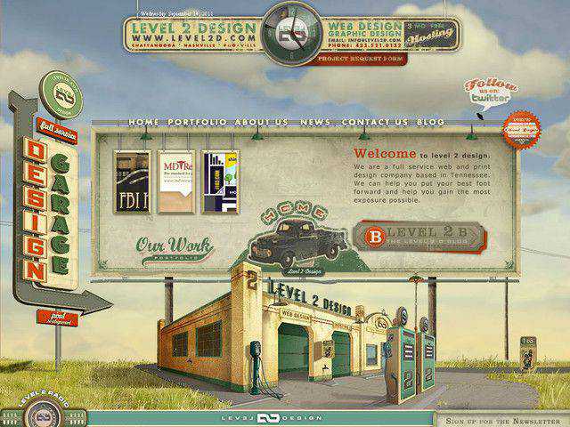
Level2
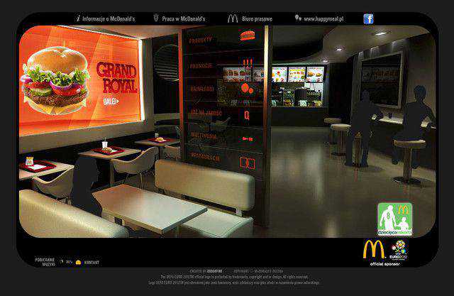
McDonalds
This site has been designed to give you the impression you are walking into a generic McDonalds outlet.
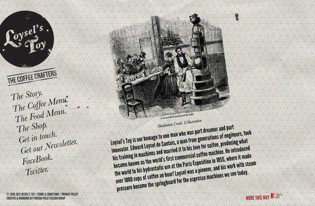
Loysels Toy
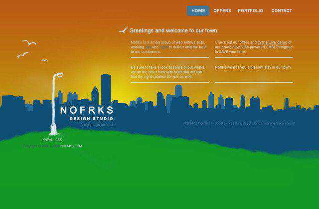
Nofrks
Tri Win
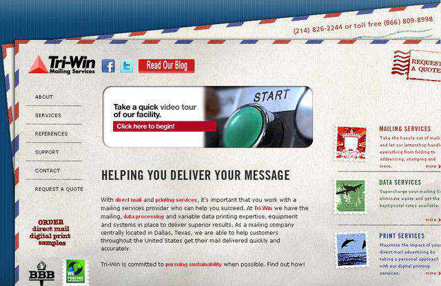
The background image of this site completely fits the company, which offers mailing services.
Classicwfl
Typically the navigation is positioned in either the sidebar or at the top of a site. Classicwfl takes a different route. The non-linear layout breaks past a typical boxy structure and offers something completely original.

Team Viget
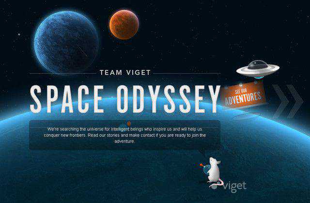
Viget Labs uses a sliding navigation and a horizontal scrolling effect to make the user interaction more vibrant and interesting. However, even more outstandingly, the layout itself stands out: the layout is indistinguishable and resembles interactive Flash-interfaces.
Kamil Gottwald
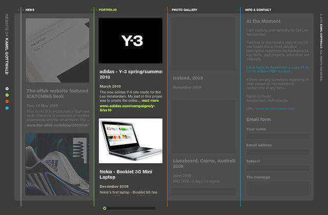
In his layout Kamil Gottwald allows users to determine the width of the sites columns. To navigate vertically users require scrolling horizontally. Consequently no vertical scrollbar is needed. Multiple site views are possible.
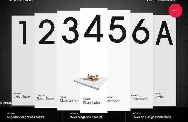
Jeremy Levine Design
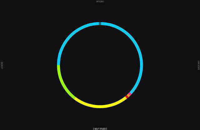
Self Titled
Self Titled presents a single big circle at the center of the page. Clicking anywhere on the ring will reveal the actual component and clicking on the plus sign will further reveal content.
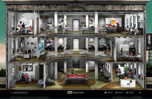
Agency Net
A very interesting site to browse. Simply click on the section you want to browse.
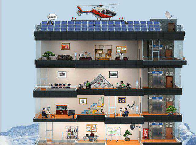
Elite Webmaster
A somewhat similar approach to that of Agency Net above. You can scroll up and down and click on each section for further information.
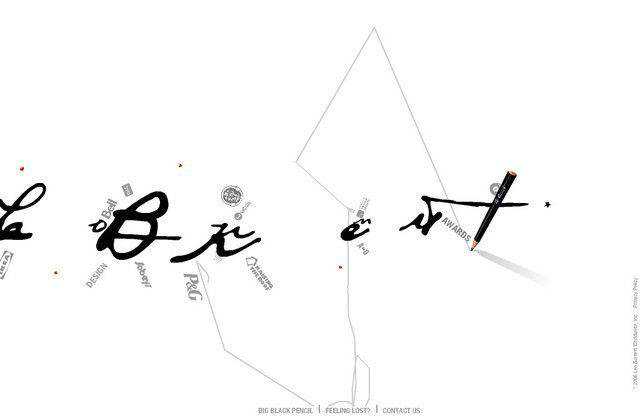
Leoburnett
Here you will come to see a very different style of navigation. The mouse over effect is as though you are moving a pencil on a paper. Simply click on the sub-menu to explore further.
Related Topics
Top