Think about that reassuring vibration that occurs after you flip your iPhone’s ringer switch to “off” – so you know the action you intended took place successfully. What about the infamous intercept voice: “If you’d like to make a call, please hang up and try again.” when you’ve left a phone line hanging or dialed an incorrect number?
The welcoming “You’ve got mail” from an AOL message. The shrill dinging when you’ve left a car door ajar. Even the cascade of digital cards filling the computer screen after you’ve won a game of Solitaire.
All of these are examples of user feedback, without which many everyday digital actions would be very confusing.
As overly-methodic as some of these may seem to us, the ability to provide constructive, relevant feedback is vital to fostering a positive user experience in website design, no matter how subtle. In any situation, the application of bad feedback, or lack of useful feedback, can escalate into unnecessary confusion.
Feedback Principles
When providing feedback to a user, it’s important to consider the context in which they’re receiving feedback. This includes the physical context – where on the screen are you giving feedback? – and the emotional context – are you providing positive or negative feedback?
Physical Context
Since we expect websites to respond to our input, it is important that this feedback is provided in a place where it’s obvious. If an item is added to a shopping cart, for instance, any relevant input (1 item added to your cart!) should be provided near the place where their action took place. Quietly updating a cart total in an entirely different part of the page is much less useful.
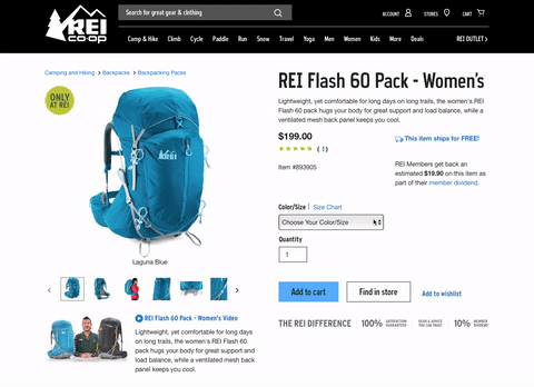
REI.com provides physical feedback that your “add to cart” action was successful by providing a drop down message.
Another useful application of user feedback in context is if someone made mistakes while filling out a form. Providing a clear visual label and explanation for each necessary correction is much more helpful than simply providing a list of all their errors at the top or bottom of the form.
Errors have ramifications that extend beyond the physical context, and appropriate use of emotional context is just as important to create a positive user experience and leave a lasting impression of a brand.
Emotional Context
Creating content for a website can sometimes be an emotional rollercoaster. While oftentimes we’re providing good news, in other situations we are forced to give feedback about something that didn’t go as planned.
Error states, particularly credit card declines, downtime notifications and legal policies all require some degree of empathy – you wouldn’t inform a customer that their flight was canceled with the same tone that you’d use to congratulate them on winning a sweepstake, would you?
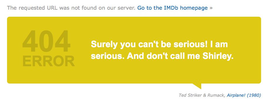
The IMDB 404 page provides a series of movie-themed quotes that helps you understand what happened.
Feedback Implementations
Here are a few feedback implementations that our web development team find most useful to include in our projects. So useful, in fact, that each is applied to the framework on which we build our websites. They are integral not only to user experience, but also to retaining customer attention, trust in an organization’s brand, and a positive number of conversions.
The Load Status Indicator
The frustration of not seeing a reaction after clicking on something is most apparent on slower connections and addressed efficiently by designing a load status indicator (LSI) which animates while you wait, to indicate the request is in progress. Even better, an LSI can be customized for each web project.
We’ve made it a standard practice to design an LSI for each of our projects, one that is unique to the brand’s colors and overall website style. The design also encourages its use as an emotional feedback tool, a smooth animation that will induce a sense calm during the user’s moment of transition.
As with all user feedback, it is important to take some care with the application of an LSI. If a load status indicator shows up before any significant time has passed, it can be distracting or lead to an impression that things are progressing more slowly. Because of this, we only show an LSI after a few hundred milliseconds have passed.
Progress Bars
In cases when a file may take upwards of a few seconds to process, we apply progress bars. The progress bar would update as the file loads and then alert the user if there was an issue by providing an error state if the upload was, for some reason, unsuccessful.
To provide better user feedback, we progressively enhance the progress bars on our sites. For users on older browsers that can’t detect progress of your upload, we provide a striped bar (also known as a barber pole) to show that something is happening – essentially an LSI catered specifically for file uploads.
When our users are on a modern browser we provide more information such as updating the actual progress of the upload, providing thumbnails when images are being uploaded and queue additional files so that, when uploading a larger number of files, the user still sees progress, rather than spreading their available upstream bandwidth across all files. These cues increase user confidence that the task is proceeding and working as intended.
Hover Events
In the early years of the web, it was evident what a link was; that royal blue underlined text was an almost-universal visual pattern. Now that custom-styling of elements is the status quo, this visual pattern has been diluted, and hover events are a helpful feedback tool for users with a mouse.
They will alert the user that they have the ability to interact with whatever it is they are hovering their cursor over, such as an image, text link or button.
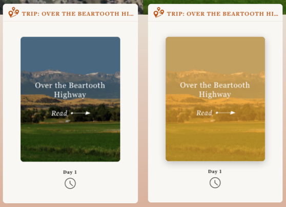
Image hover events help the user understand that they can interact with an element.
On mobile devices, however, hover states fall short. To activate the element, most of the time a user would have to tap once to trigger the hover event, then again a second time to carry out the action – a case when less feedback is more helpful.
Error Messages
It is important to provide context-appropriate error messages for user input forms with text catered to the level of sensitivity the situation warrants. These input forms include feedback about fields that were required but not filled out or information that wasn’t formatted correctly.
We offer that feedback as soon as they leave the field, so if you type an invalid email, it instantly alerts you there is an error. To further guide users, when a form is submitted we scroll users to the place on the page where the first error was encountered and, in some cases, a popup message fixed to the element at fault so users can easily find and remedy their mistakes, eliminating any unnecessary frustration.
Form Labels
In many of our forms, we provide a simple placeholder label before a user has provided information, so they are aware what that field is for.
Then, once they begin to type, we move the label to an adjacent position so that the purpose of their information is preserved in case they are filling out a longer form or are interrupted mid-task, making it easier to resume.
Conclusion
Frustration is the killer to satisfactory user interaction, and many times, so avoidable! Implementing proper feedback in your design projects can not only secure a successful conversion rate but also solidify the confidence customers feel about the company’s brand as a whole.
As designer and author Josh Clark aptly writes, “Our job is to help our users translate their intent into action.” The more we can guide users through our interfaces and provide clear feedback about their progress, the more success, and fewer frustrations, we can create.
Related Topics
Top