The search engine is our best tool for sifting through all of today’s websites. There are billions of domains online and many of them haven’t even been crawled by search engines! Google is certainly the pioneer of this industry. But over the years we have seen notable brands begin to surface as up-and-coming search engines.
These other prominent companies are slowly gaining traction on the Internet. Many have taken some lessons from Google in regards to web interface design. This is even the case in modern social websites such as Twitter and Facebook. The elegance of these webpages can be captured with clean and orderly design trends.
Absolute Simplicity
I feel that Steve Jobs followed a similar appeal in the design of Apple products and software. Simplicity can be described as the lowest common denominator between functionality and extra non-essential design.
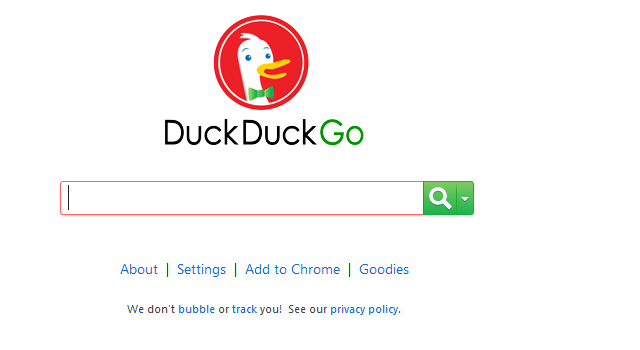
Search engines provide a very specific purpose to their users. Everyone is looking for the fastest way to receive their query results without distractions. Difficulties may arise if you offer a bit too much functionality where your visitor’s feel overwhelmed. Check out my example screencap above from the newer engine DuckDuckGo.
Their homepage design is a perfect example of how to keep out of your user’s way! Give them the tools and links they need to perform searches with the least amount of intrusion. The best part about DuckDuckGo is their online reference guide. It walks you through example queries for their additional features such as calculations, unit conversion, and site-specific searches.
Quick Reference Guides
Most Internet users are familiar with the outer-workings of Google. With the ever-growing market of search engines it can be difficult to keep up with all these features. But one of the best interface features you can utilize is a reference guide, explaining some of the basic features in your engine and what you can offer to visitors.
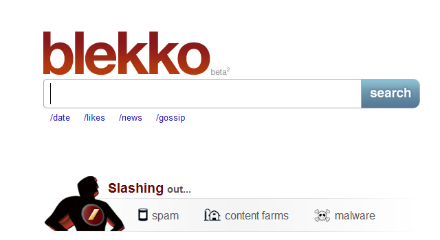
Blekko does this very well in a number of ways. First you can find a bit of introductory notes and FAQ in the bar underneath the search form. This explains how Blekko drops spam results and does not even index content farms, blog carnivals, and similar duplicate web publications. Additionally the developers have provided a small video which you can access in the top left corner.
It is possible to slip bylines explaining these features into your web branding. But it’s difficult to give helpful details with just a short sentence under your logo. Write up a quick “About Us” page and stick the link in your footer! You certainly don’t need the full capabilities of creating a video to explain your search engine’s purpose – oftentimes written context and graphics work better anyways.
Custom Profiles
There is a large divide between support & reject account signups in search engines. The new Google+ design features profile and settings links at the top of each page. AskJeeves and Bing are two networks which have also adopted this trend, and of course many others to follow.
The most important aspect of this design paradigm is unobtrusive access. Users are primarily looking to use your search engine strictly for online searches. Any other social features should always come secondary within the interface. If possible, stick to jQuery dropdown boxes for login and registration forms. It saves time for your visitors and makes the interface appear more snappy and responsive.
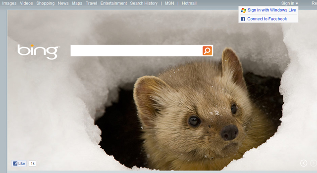
Bing does a nice job of separating the integrated user experience from search tools. Along the top bar you’ll find links related to all different categories of news. It’s also very easy to access your Hotmail and past search history, so there are a lot of options to choose from. Yet none of these deter from the core focal point which is the search field front-and-center. The alternating background photos unique to Bing attribute to a wonderful aesthetic in the overall layout design.
Keyword Suggestions
Google Autosuggest was all the hype just a few years ago. And even today their latest technology dubbed Google Instant is still exciting buzz discussed between web developers. Other search engines would be wise to notice this trend and possibly implement a similar effect in their own interfaces.
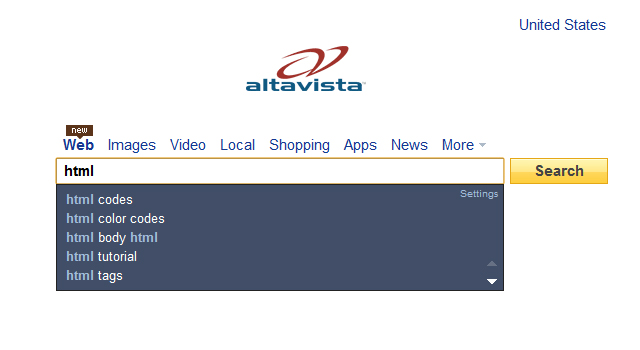
AltaVista was purchased by Yahoo! and is currently in the process of migration. Both these search engines use a similar autosuggest feature as Google, though scaled back quite a bit. It’s a great tool to provide for your users and it can always be refined through analytics data. If you can successfully gather any user registrations it’s possible to display related queries based on their past interests and search history.
Of course, his feature may not be so popular with everyone. It may cause lagging in web browsers on older computers, not to mention how annoying it can be to an unexpected audience. Plus issues with privacy may pop up over time… Keep this Ajax functionality on by default if your server can handle it – but always offer your visitors the option to turn it off!
Setup Memorable Branding
You certainly don’t need to keep your page bland just to make a great search engine. Google has recently updated their design with some additional sidebar links – but the most notable trait about their layout is the logo. The company has been consistent with branding for over a decade now and this has contributed to their ultimate success.
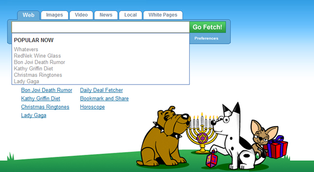
Keep this in mind as you check out other search engines, or sit down to design your own. Branding is similar to identification which your users will recognize all throughout the site. Dogpile offers an interesting example which extends outside of just the logo design. Their background illustration is adorable, and much more pleasant than just a plain white page. You will not need a fancy illustration to captivate your audience. But certainly spend a few hours or days toying with different brand ideas to build a layout which stands out above all others.
Conclusion
Search engines are easily the best source of new information on the web. Spiders and web bots are out crawling hundreds of millions of websites every day. Content is truly king on the Internet, but only if we have reasonable tools to sort through it all. Google has left a powerful search framework which can now be tweaked by other intelligent minds.
Hopefully these ideas can get you thinking about the popular trends in search engine design. These layouts cater to plenty of whitespace and the utmost potential in user experience. The market is far from flooded, and there is plenty of opportunity for new ideas to rise into mainstream success. Certainly let us know your thoughts or questions in the post discussion area below.
Top
