I’ve been working with Content Management Systems, both bespoke and open source for over 7 years. In that time a lot has changed as to how flexible and adaptive CMSs can be, but there are still times when a CMS can be restrictive.
Each CMS brings with it its own advantages and also its own disadvantages. Having primarily worked in large organisations such as universities, I’ve found that, at times a CMS can do exactly the opposite of its intentions and become restrictive rather than freeing.
There are several reasons why I’ve found this to be the case, and while generally my experience has been within larger companies, I think some of the following reasons still apply to any size company.
Everyone wants a piece of the pie
Ownership. Staking your claim. Everyone wants to claim ownership of their website and the content that is on the site. This can lead to endless scrolls of unnecessary blurb and level upon level of navigation that takes the user down a route, they can’t return from.
It can be a minefield trying to get around this and the temptation to start hacking into other people’s copy can be immense but doing this you can risk alienating and offending people that you need to keep on side to move the website forward.
What I’ve found best in these situations is to get the department on side and begin involving them in the process, explaining along the way what makes for effective web copy and why a simple and clear navigation will take the user to all the content you want them to see.
The website becomes the graveyard for PDFs
We’ve all come across those websites that have pages of information and an excessive amount of downloadable files: PDF, XLS, doc, you name it, I’ve seen it available for download.

Image via Jirsak on Shutterstock
I’d much prefer to look at the copy within a PDF and to see if it can be adapted to web copy. If not it’s looking at whether it is necessary, what does it add for the user, if anything? At the minute, in my day job, I’m working on a developing a website and I’m trying to steer away from including too many PDFs.
While I do agree that some downloadable, text-based files are essential, such as terms and conditions, lengthy guidance and research docs, the majority of PDF downloads can either be removed or turned into effective web copy.
Undertake a content audit and review the age of the downloads also how the value they add to a user and their experience. Add tracking to the file so that you can see in the web statistics how many users are downloading and on how regular a basis.
Be ruthless. If you’re still facing resistance then create a dedicated repository for those downloads that can be easily managed. Also make sure that your CMS includes a way to easily embed files so that they don’t need to be downloaded. Make it easy to stream audio and video and think about including a size limit on files that can be uploaded so that even if all your editors within the CMS don’t know what a reasonable file size is you can still be sure that larger files are kept in a separate place on your system and reducing potential server strain.
Stuck in the mud
There are few things worse than a design and layout that doesn’t stand the test of time. While all websites need to continually change to move with the times and it is difficult to predict the future, being slow to move forward and progress can be damaging to an organisation that’s first impression to people is an online presence.
If you’re in the web team or marketing and communication team in charge of the CMS you need to be able to make and approve decisions quickly, having to show a design or a new feature through several committees can lead to competitors moving ahead of you quickly with their website and brand identity.
WYSIWG
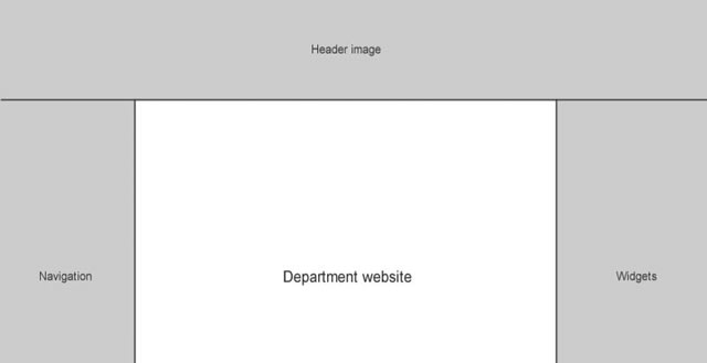
What I’ve also found is that each department wants to personalise their website and as a department’s web manager, editor, developer or designer this can lead to a battle of wills. It’s difficult for people within the department to understand what their website is and what the user sees their webpage as:

The department’s viewpoint. They tend to see the centre column as the only bit of ‘their’ website.

The user’s viewpoint. They will see the entire page as the organisation’s, and department’s, website.
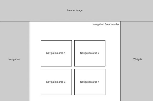
The departments viewpoint can lead to a cluttered main content area that is hard to read and adds an extra level of navigation rather than simplifying things for the user. It can lead to:

Which depending on how its constructed e.g. with <div> it might not necessarily be that bad for accessibility, but this is an area where the dreaded tables can rear their ugly head. A variety of admin roles, editor roles, contributor roles with different levels of access and editing rights within a CMS can be key to unrestricting a CMS. Make sure that the right people have the right level of access to implement best practice with code, copy and everything else.
It also pays to make sure that each possible selection within the WYSIWG editor has a CSS style attached to it and preferably a variety of styles. For example, with <blockquote> is a simple indentation enough:
Lorem ipsum dolor sit amet, consectetur adipiscing elit. Sed ultrices orci iaculis odio auctor cursus. Praesent ullamcorper accumsan eros ac sodales. Fusce adipiscing magna non lorem molestie vehicula scelerisque nisl tincidunt. Sed a quam non justo interdum interdum et et urna. In eu nisi nulla, eget imperdiet risus. Nam justo ante, aliquam id dignissim id, commodo suscipit mauris.
Or would it benefit the look of the site, not to mention providing more tools for your editors to enhance their content to have an enhanced style:
Lorem ipsum dolor sit amet, consectetur adipiscing elit. Sed ultrices orci iaculis odio auctor cursus. Praesent ullamcorper accumsan eros ac sodales. Fusce adipiscing magna non lorem molestie vehicula scelerisque nisl tincidunt. Sed a quam non justo interdum interdum et et urna. In eu nisi nulla, eget imperdiet risus. Nam justo ante, aliquam id dignissim id, commodo suscipit mauris.
I do agree that a CMS should limit styles but choosing a selection of styles for an element can still allow content to be managed effectively, but, still giving freedom to those within a department to allow more personality and their own identity to come across.
Things to think about
If you’re the web designer/team:
- • Think about design and CSS for as many elements as possible
- • Think about training and best practice
If you’re the marketing and communications team:
- • Don’t be too autocratic, be receptive and realise the potential unique selling point of each department
- • Training in writing effective web copy
If you’re the department web manager:
- • Make friends and influence people
- • Talk to the heads of department and get them on board with any changes you are planning
- • Do training sessions/content development sessions with your colleagues to keep them interested and on side with what you are doing on a daily basis
- • Keep talking to the web and marketing teams to influence change and feedback from your department
No matter what your involvement is with a CMS, I think that getting to know your CMS fully and exploring its limitations while providing training on best practice and how to successfully use a CMS will mean everyone within an organisation can get the most out of their website.
Related Topics
Top