Of course you will remember them, they were that horrible, badly designed navigation icons you seen everywhere on the internet. That was the days when graphic design and web design were so far apart that every site you turned to looked ugly, and they were made worse by those little blinking, color blind images that were trying to point you in the right direction.
Of course, I used them as well (it felt a little nostalgic collecting the gifs).
Elements of UGLY Web Design: 1. Navigation Animated Gifs.
I wouldn’t exactly call this a showcase, maybe a line up. Anyway, have a look at these gifs from a now bygone era. Thankfully.
Internet Explorer and Netscape Animated GIFs my favourites


Homepage Animated GIFs


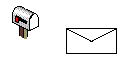
Email or Contact Animated GIFs


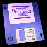
Download Animated GIFs


Statistics Animated GIFs


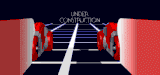
Under Construction Animated GIFs


Seperator / Lines / Breaks Animated GIFs


Arrows Animated GIFs


Animated Text GIFs


Next Week: Elements of UGLY Web Design: 2. Inline Frames.


5 Oct, 2008
I can remember all too well using some of those, or very much like them. It has to be said, they look so much worse all bunched up together like that. Thankfully web design has moved on a lot since they were prolific around the internet.
5 Oct, 2008
The flag separator is probably the worst, tied with the “colorful” Updated!.
6 Oct, 2008
lol. such nostalgia
6 Oct, 2008
This is worse than a horror movie. It stills surprises me how many clients ask for this kind of shit on their website…
6 Oct, 2008
What a ghastly collection, but perfect for the Halloween season.
6 Oct, 2008
“Ouille, Ouille”…
I’am loosing my eyes
Sorry i close the windows ;-)
6 Oct, 2008
I want to personally thank you for the seizure.
6 Oct, 2008
Still very popular in MySpace comment sections!
6 Oct, 2008
They are pretty psychedelic when listening to the prodigy!
6 Oct, 2008
Hmm, I think I may use some of these for my website…. ;)
9 Oct, 2008
But,about before 5 years,these gif were very fashinable.Now,Web 2.0 buttons are fashinable.Thanks for content.
9 Oct, 2008
thank you
10 Oct, 2008
Um…what about the blinking, jiggling classmates.com ad at the top of this page?
12 Oct, 2008
Ah.. Brings back the memories. So 1996.
27 Oct, 2008
The birth of epilepsy..!
What was we thinking
16 Nov, 2008
oh what a headache. Thankfully those days for most of us are over.
27 Nov, 2008
It’s like that client who INSISTS the graphic they created in word is AWESOME and wants it on their site. I hide in shame and deny I even touched the site >:( Actually, I still think I receive these in an email here and there. :S
28 Jan, 2009
I can remember myself also using some of them during my early days of web design. ;)
lol
16 Feb, 2009
i absolutely hate these icons
16 Feb, 2009
can never even imagine to use such icons on my website
9 Apr, 2009
feels like internet way back 1994
10 Sep, 2009
Still a lot of such (or little bit less ugly) animated (of flash) stuff on websites. Especially if it’s some ppc ads. Irritating! Blinking and blinking “press here” or “you won 100000$”
4 Dec, 2009
It will be good to have a gif animation software like what is being suggested by Photo Animation Software