A great color scheme can really make your visual design stand out. Often times the difference between an eye-grabbing design and a bland one is the color combination. The same layout of shapes and text, when paired with the right color scheme, can go from drab to fab (wow that was corny).
There are certain trusted color combinations that many designers go to: red and blue, yellow and green, black and white. They work, but they’re overused. If you want your visual design to stand out, you need to start exploring more adventurous color combinations. But rather than relying on trial and error, you can simply look to already-effective designs. And album covers are a great source of color scheme inspiration.
The following 10 album covers all use fairly non-standard color schemes. The layout of these covers might even be pretty standard, but what makes them stand out is the color combinations. Further proof of just how much of a difference the right color scheme can make.
So here are 10 album covers for eye-grabbing color scheme inspiration:
1. Autechre – Garbage
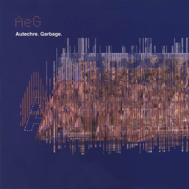
Colors: blue + brown
This is perhaps the epitome of an unconventional color scheme. Blue and red, blue and orange – those are the typical choices. But blue and brown? Usually, brown only works with green, to give a natural tree-like vibe. Yet, it works great here, and it turns what would normally be a typical futuristic/glitchy design into something more unique.
2. The Clash – London Calling
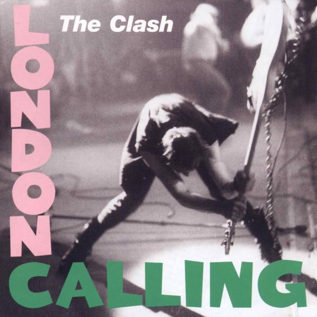
Colors: pink + green + grey
The pink and green evoke a watermelon. So if you want your visual design to be sweet and tasty, pink and green is a lighter, more unconventional twist on the more typical red and green color scheme. And the grey makes the color scheme lighter than if you were to use a black background.
3. Clipse – Till the Casket Drops

Colors: Red + pink
You’d think that using slightly different shades of the same color would make for an ugly color scheme. Yet this design shows that it surprisingly works, especially with a bright, fire-y color like red. The shades of red and pink are just different enough to stand out from each other, and by using them exclusively you end up with an intense color scheme.
4. Elvis Presley – Elvis Presley
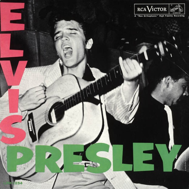
Colors: pink + green + grey
The album cover that inspired The Clash’s London Calling. Not much extra to say, other than it’s further proof that pink and green go well together with a grey background, providing a sweet and tasty color scheme.
5. Gatecrasher – Disco-Tech
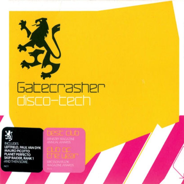
Colors: yellow + pink + white
The yellow and pink combination gives a bold, sugar-y vibe that’s not too feminine and not too masculine. The white gives a lighter, almost candy-like feel that wouldn’t be there if you used a black background instead.
6. The Orb – Live 93

Colors: Yellow + blue-yellow
On paper, yellow and blue-yellow seems like it’d be disorienting. Yet, similar to the red and pink combination earlier, it works in an intense way. Specifically, it gives a biotech, future-industrial energy. Something you couldn’t get if you used safer color combinations like blue and grey or even blue and yellow.
7. Prefuse 73 – Vocal Studies + Uprock Narratives

Colors: blue + brown + black & white
Similar to Autechre’s Garbage, this design uses blue and brown in a really effective way. Futuristic yet more unique. And with the inclusion of black and white, the color scheme becomes more classic as well. Like a fusion of futurism and a ye old novel.
8. Roots Manuva – Slime and Reason
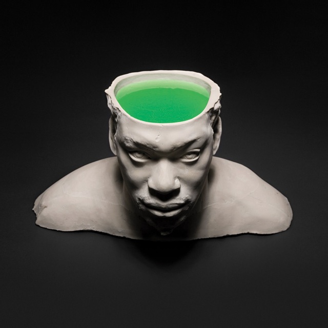
Colors: grey + black + green
The grey and black is a standard yet effective grayscale color combination. It can give the feel of something classic and mysterious. Just look at all the black and white photos and noir films. And that’s what this album cover evokes – the head sculpture is elegant yet brooding. But the green is what makes this color scheme eye-grabbing, providing a certain toxic touch to an otherwise standard color combination.
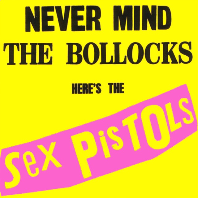
9. The Sex Pistols – Never Mind the Bollocks

Colors: pink + green + black
A similar color scheme to both the Clash and Elvis covers. But by making pink the background and using black instead of gray, the sweet and tasty vibe is perverted into something more intense. Like, it’s going to be fun, but it’s also going to be in-your-face and maybe even a little bit nasty. Which is what The Sex Pistols were. A great example of not only using a more unconventional color scheme, but twisting it into something that the original color combination did not intend.
10. The Sex Pistols – Never Mind the Bollocks (Version 2)
Colors: pink + yellow + black
An alternate take on the Pistols cover. By placing the pink as the secondary player to the yellow background, the color scheme goes from sweet-yet-twisted to much more loud and even more in-your-face. Unlike the Gatecrasher design, black is used here instead of white. That tilts the scale to be much more masculine than feminine. Yet another great example of perverting an unconventional color combination to be even more unique: a pink and yellow-based color scheme that’s menacing and testosterone-fueled.
Eye-grabbing Color Scheme Inspiration
Hopefully these 10 album covers have given you some eye-grabbing color scheme inspiration. There are plenty more unconventional-colored album covers and visual designs, but these ones can help you start exploring and using more adventurous color schemes for your designs.
Your turn: where else have you been inspired by or looked to for eye-grabbing color schemes?
Related Topics
Top