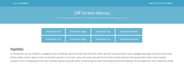
In this tutorial, we’re going to create some slide and push menus using CSS3 transitions. The menus will be hidden off screen at first, and will transition into view when the “toggle menu” button is pressed.
Let’s first define the difference in the two types of menus:
- A slide menu will slide in above the content when toggled, and the content will stay in place.
- A push menu will slide in and “push” the main content aside when toggled.
Before we proceed, there are some important things to note:
- This tutorial relies on CSS transitions to work smoothly. On older browsers though, the content will just jump to the appropriate position.
- I’m using classie.js for easily adding and removing classes.
- I’m using the JavaScript functions querySelector and querySelectorAll which are supported from IE8 and up.
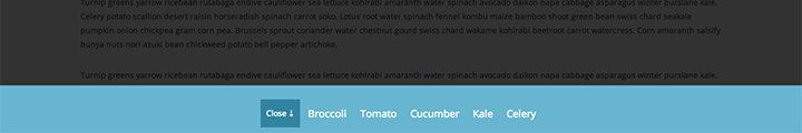
Finally, let’s take a look at the 8 varieties of menu we will create:
- Slide left menu, which slides in from the left above the content
- Slide right menu, which slides in from the right above the content
- Slide top menu, which slides in from the top above the content
- Slide in bottom menu, which slides in from the bottom above the content
- Push left menu, which slides in from the left and pushes the content to the right
- Push right menu, which slides in from the right and pushes the content to the left
- Push top menu, which slides in from the top and pushes the content down
- Push bottom menu, which slides in from the bottom and pushes the content up
When a menu is open, we’ll show a “mask” over the main wrapper. This is basically a semi-transparent overlay that hides the main content. When the user clicks the overlay, the menu will toggle back out of view. In each menu, there will also be a “close menu” button, which will help out when the menu takes up the full width of the screen on smaller screen sizes. Let’s first take a look at the general markup and CSS for all.
The HTML
<body>

    <nav class="menu slide-menu-left">
        <ul>
            <li><button class="close-menu">← Close</button></li>
            <li><a href="#">Broccoli</a></li>
            ...
        </ul>
    </nav><!-- /slide menu left -->

    <nav class="menu slide-menu-right">
        <ul>
            <li><button class="close-menu">Close →</button></li>
            <li><a href="#">Broccoli</a></li>
            ...
        </ul>
    </nav><!-- /slide menu right -->

    <nav class="menu slide-menu-top">
        <ul>
            <li><button class="close-menu">↑ Close</button></li>
            <li><a href="#">Broccoli</a></li>
            ...
        </ul>
    </nav><!-- /slide menu top -->

    <nav class="menu slide-menu-bottom">
        <ul>
            <li><button class="close-menu">Close ↓</button></li>
            <li><a href="#">Broccoli</a></li>
            ...
        </ul>
    </nav><!-- /slide menu bottom -->

    <nav class="menu push-menu-left">
        <ul>
            <li><button class="close-menu">← Close</button></li>
            <li><a href="#">Broccoli</a></li>
            ...
        </ul>
    </nav><!-- /push menu left -->

    <nav class="menu push-menu-right">
        <ul>
            <li><button class="close-menu">Close →</button></li>
            <li><a href="#">Broccoli</a></li>
            ...
        </ul>
    </nav><!-- /push menu right -->

    <nav class="menu push-menu-top">
        <ul>
            <li><button class="close-menu">↑ Close</button></li>
            <li><a href="#">Broccoli</a></li>
            ...
        </ul>
    </nav><!-- /push menu top -->

    <nav class="menu push-menu-bottom">
        <ul>
            <li><button class="close-menu">Close ↓</button></li>
            <li><a href="#">Broccoli</a></li>
            ...
        </ul>
    </nav><!-- /push menu bottom -->

    <div id="wrapper">
        <div id="main">
            <div class="container">
                <div class="buttons">
                    <button class="nav-toggler toggle-slide-left">Slide Menu Left</button>
                    ...
                </div><!-- /buttons -->
                <section class="content">
                    <h1>Vegetables</h1>
                    <p>Turnip greens yarrow...</p>
                </section><!-- /.content -->
            </div>
        </div><!-- #main -->

    </div><!-- /#wrapper -->

</body>
The Common CSS
/* ------------------------------------------------------------ *\
|* ------------------------------------------------------------ *|
|* Template
|* ------------------------------------------------------------ *|
\* ------------------------------------------------------------ */
body {
    overflow-x: hidden
}
#wrapper {
    position: relative;
    z-index: 10;
    top: 0;
    left: 0;
    -webkit-transition: all 0.3s;
    -moz-transition: all 0.3s;
    -ms-transition: all 0.3s;
    -o-transition: all 0.3s;
    transition: all 0.3s;
}
section {
    margin-bottom: 30px
}
section h1 {
    font-family: "Oswald", sans-serif;
    margin-bottom: 10px;
}
section p {
    margin-bottom: 30px
}
section p:last-child {
    margin-bottom: 0
}
section:last-child {
    margin-bottom: 0
}
section.toggle {
    text-align: center
}
.mask {
    position: fixed;
    top: 0;
    left: 0;
    z-index: 15;
    width: 100%;
    height: 100%;
    background: rgba(0, 0, 0, 0.8);
}
/* ------------------------------------------------------------ *\
|* ------------------------------------------------------------ *|
|* Menus
|* ------------------------------------------------------------ *|
\* ------------------------------------------------------------ */
/* general style for all menus */
nav.menu {
    position: fixed;
    z-index: 20;
    background-color: #67b5d1;
    overflow: hidden;
    -webkit-transition: all 0.3s;
    -moz-transition: all 0.3s;
    -ms-transition: all 0.3s;
    -o-transition: all 0.3s;
    transition: all 0.3s;
}
nav.menu ul {
    list-style-type: none;
    margin: 0;
    padding: 0;
}
nav.menu a {
    font-weight: 300;
    color: #fff;
}
button.close-menu {
    background-color: #3184a1;
    color: #fff;
}
button.close-menu:focus {
    outline: none
}
Understanding The Structure
Our body overflow-x is set to hidden, because we don’t want to have scrollbars on display when the wrapper is pushed to the left or right. When it’s pushed vertically, it doesn’t matter. More importantly though is positioning our off-screen navigation menus OUTSIDE the wrapper, because oddly enough, when a transform is applied to an element, it takes on a relative positioning temporarily. Since our navigation menus need to be fixed to the outer parts of the browser window, we don’t want it inside an element with relative positioning. Inside each menu, there’s a list of menu items, and a close menu button.
There’s ongoing discussion about the performance differences of absolute positioning/left/top versus transforms/translating. Paul Irish digs deep into this and you can read about it here. I’m using positioning in this case because we will have a non-transitioning fallback solution for older browsers, without having to use conditional stylesheets. Also, after testing both, the difference was totally unseeable to the human eye. Let’s take a look at version of our menu now.
1) Slide Menu Left

This menu slides in from the left over the content. Here’s the CSS for it:
nav.slide-menu-left {
    top: 0;
    width: 300px;
    height: 100%;
}
nav.slide-menu-left li {
    display: block;
    text-align: center;
    border-bottom: solid 1px #3184a1;
    border-top: solid 1px #b5dbe9;
}
nav.slide-menu-left li:first-child {
    border-top: none
}
nav.slide-menu-left li:last-child {
    border-bottom: none
}
nav.slide-menu-left a {
    display: block;
    padding: 10px;
    font-size: 18px;
}
nav.slide-menu-left button.close-menu {
    margin: 10px 0;
    padding: 10px 30px;
    background-color: #3184a1;
    color: #fff;
}
nav.slide-menu-left {
    left: -300px
}
body.sml-open nav.slide-menu-left {
    left: 0
}
2) Slide Menu Right

This menu slides in from the right above the content. Here’s the CSS for it:
nav.slide-menu-right {
    top: 0;
    width: 300px;
    height: 100%;
}
nav.slide-menu-right li {
    display: block;
    text-align: center;
    border-bottom: solid 1px #3184a1;
    border-top: solid 1px #b5dbe9;
}
nav.slide-menu-right li:first-child {
    border-top: none
}
nav.slide-menu-right li:last-child {
    border-bottom: none
}
nav.slide-menu-right a {
    display: block;
    padding: 10px;
    font-size: 18px;
}
nav.slide-menu-right button.close-menu {
    margin: 10px 0;
    padding: 10px 30px;
    background-color: #3184a1;
    color: #fff;
}
nav.slide-menu-right {
    right: -300px
}
body.smr-open nav.slide-menu-right {
    right: 0
}
3) Slide Menu Top

This menu slides in from the top above the content. Here’s the CSS:
nav.slide-menu-top {
    left: 0;
    width: 100%;
    height: 100px;
}
nav.slide-menu-top ul {
    text-align: center;
    padding: 25px 0 0 0;
}
nav.slide-menu-top li {
    display: inline-block;
    margin: 0;
    vertical-align: middle;
}
nav.slide-menu-top a {
    display: block;
    line-height: 50px;
    padding: 0 10px;
    font-size: 18px;
}
nav.slide-menu-top button.close-menu {
    display: block;
    line-height: 50px;
    margin: 0;
    padding: 0 10px;
}
nav.slide-menu-top {
    top: -100px
}
body.smt-open nav.slide-menu-top {
    top: 0
}
4) Slide Menu Bottom
This menu slides in from the bottom above the content. Here’s the CSS:
nav.slide-menu-bottom {
    left: 0;
    width: 100%;
    height: 100px;
}
nav.slide-menu-bottom ul {
    text-align: center;
    padding: 25px 0 0 0;
}
nav.slide-menu-bottom li{
    display: inline-block;
    margin: 0;
    vertical-align: middle;
}
nav.slide-menu-bottom a{
    display: block;
    line-height: 50px;
    padding: 0 10px;
    font-size: 18px;
}
nav.slide-menu-bottom button.close-menu{
    display: block;
    line-height: 50px;
    margin: 0;
    padding: 0 10px;
}
nav.slide-menu-bottom {
    bottom: -100px
}
body.smb-open nav.slide-menu-bottom {
    bottom: 0
}
5) Push Menu Left

This menu slides in from the left, and pushes the content to the right. A lot of the CSS is similar to the slide menu left, except we have to move the wrapper as well. Here’s the CSS:
nav.push-menu-left {
    top: 0;
    width: 300px;
    height: 100%;
}
nav.push-menu-left li {
    display: block;
    text-align: center;
    border-bottom: solid 1px #3184a1;
    border-top: solid 1px #b5dbe9;
}
nav.push-menu-left li:first-child {
    border-top: none
}
nav.push-menu-left li:last-child {
    border-bottom: none
}
nav.push-menu-left a {
    display: block;
    padding: 10px;
    font-size: 18px;
}
nav.push-menu-left button.close-menu {
    margin: 10px 0;
    padding: 10px 30px;
    background-color: #3184a1;
    color: #fff;
}
nav.push-menu-left {
    left: -300px
}
body.pml-open nav.push-menu-left {
    left: 0
}
body.pml-open #wrapper {
    left: 300px
}
6) Push Menu Right

This menu slides in from the right, and pushes the content to the left. A lot of the CSS is similar to the slide menu right, except we have to move the wrapper as well. Here’s the CSS:
nav.push-menu-right {
    top: 0;
    width: 300px;
    height: 100%;
}
nav.push-menu-right li {
    display: block;
    text-align: center;
    border-bottom: solid 1px #3184a1;
    border-top: solid 1px #b5dbe9;
}
nav.push-menu-right li:first-child {
    border-top: none
}
nav.push-menu-right li:last-child {
    border-bottom: none
}
nav.push-menu-right a {
    display: block;
    padding: 10px;
    font-size: 18px;
}
nav.push-menu-right button.close-menu {
    margin: 10px 0;
    padding: 10px 30px;
    background-color: #3184a1;
    color: #fff;
}
nav.push-menu-right {
    right: -300px
}
body.pmr-open nav.push-menu-right {
    right: 0
}
body.pmr-open #wrapper {
    left: -300px
}
7) Push Menu Top

This menu slides in from the top, and pushes the content downward. A lot of the CSS is similar to the slide menu top, except we have to move the wrapper as well. Here’s the CSS:
nav.push-menu-top {
    left: 0;
    width: 100%;
    height: 100px;
}
nav.push-menu-top ul {
    text-align: center;
    padding: 25px 0 0 0;
}
nav.push-menu-top li {
    display: inline-block;
    margin: 0;
    vertical-align: middle;
}
nav.push-menu-top a {
    display: block;
    line-height: 50px;
    padding: 0 10px;
    font-size: 18px;
}
nav.push-menu-top button.close-menu {
    display: block;
    line-height: 50px;
    margin: 0;
    padding: 0 10px;
}
nav.push-menu-top {
    top: -100px
}
body.pmt-open nav.push-menu-top {
    top: 0
}
body.pmt-open #wrapper {
    top: 100px
}
8) Push Menu Bottom

This menu slides in from the botomm, and pushes the content upward. A lot of the CSS is similar to the slide menu bottom, except we have to move the wrapper as well. Here’s the CSS:
nav.push-menu-bottom {
    left: 0;
    width: 100%;
    height: 100px;
}
nav.push-menu-bottom ul {
    text-align: center;
    padding: 25px 0 0 0;
}
nav.push-menu-bottom li {
    display: inline-block;
    margin: 0;
    vertical-align: middle;
}
nav.push-menu-bottom a {
    display: block;
    line-height: 50px;
    padding: 0 10px;
    font-size: 18px;
}
nav.push-menu-bottom button.close-menu {
    display: block;
    line-height: 50px;
    margin: 0;
    padding: 0 10px;
}
nav.push-menu-bottom {
    bottom: -100px
}
body.pmb-open nav.push-menu-bottom {
    bottom: 0
}
body.pmb-open #wrapper {
    top: -100px
}
The JavaScript
Now, let’s take a look at the JavaScript to toggle our classes when we hit the different menu buttons. We’ll also display our mask over the rest of the content, and implement some “close menu” functionality when the user clicks the mask or the close-menu button. Remember, I’m using classie.js to add and remove classes. My JavaScript, of course, is covering all eight menus. You might want to tailor your JavaScript and cut out the unnecessary stuff (unless you’re actually using 8 menus on your site…). Here’s the JavaScript:
(function( window ){

  'use strict';

  var body = document.body,
    mask = document.createElement("div"),
    toggleSlideLeft = document.querySelector( ".toggle-slide-left" ),
    toggleSlideRight = document.querySelector( ".toggle-slide-right" ),
    toggleSlideTop = document.querySelector( ".toggle-slide-top" ),
    toggleSlideBottom = document.querySelector( ".toggle-slide-bottom" ),
    togglePushLeft = document.querySelector( ".toggle-push-left" ),
    togglePushRight = document.querySelector( ".toggle-push-right" ),
    togglePushTop = document.querySelector( ".toggle-push-top" ),
    togglePushBottom = document.querySelector( ".toggle-push-bottom" ),
    slideMenuLeft = document.querySelector( ".slide-menu-left" ),
    slideMenuRight = document.querySelector( ".slide-menu-right" ),
    slideMenuTop = document.querySelector( ".slide-menu-top" ),
    slideMenuBottom = document.querySelector( ".slide-menu-bottom" ),
    pushMenuLeft = document.querySelector( ".push-menu-left" ),
    pushMenuRight = document.querySelector( ".push-menu-right" ),
    pushMenuTop = document.querySelector( ".push-menu-top" ),
    pushMenuBottom = document.querySelector( ".push-menu-bottom" ),
    activeNav
  ;
  mask.className = "mask";

  /* slide menu left */
  toggleSlideLeft.addEventListener( "click", function(){
    classie.add( body, "sml-open" );
    document.body.appendChild(mask);
    activeNav = "sml-open";
  } );

  /* slide menu right */
  toggleSlideRight.addEventListener( "click", function(){
    classie.add( body, "smr-open" );
    document.body.appendChild(mask);
    activeNav = "smr-open";
  } );

  /* slide menu top */
  toggleSlideTop.addEventListener( "click", function(){
    classie.add( body, "smt-open" );
    document.body.appendChild(mask);
    activeNav = "smt-open";
  } );

  /* slide menu bottom */
  toggleSlideBottom.addEventListener( "click", function(){
    classie.add( body, "smb-open" );
    document.body.appendChild(mask);
    activeNav = "smb-open";
  } );

  /* push menu left */
  togglePushLeft.addEventListener( "click", function(){
    classie.add( body, "pml-open" );
    document.body.appendChild(mask);
    activeNav = "pml-open";
  } );

  /* push menu right */
  togglePushRight.addEventListener( "click", function(){
    classie.add( body, "pmr-open" );
    document.body.appendChild(mask);
    activeNav = "pmr-open";
  } );

  /* push menu top */
  togglePushTop.addEventListener( "click", function(){
    classie.add( body, "pmt-open" );
    document.body.appendChild(mask);
    activeNav = "pmt-open";
  } );

  /* push menu bottom */
  togglePushBottom.addEventListener( "click", function(){
    classie.add( body, "pmb-open" );
    document.body.appendChild(mask);
    activeNav = "pmb-open";
  } );

  /* hide active menu if mask is clicked */
  mask.addEventListener( "click", function(){
    classie.remove( body, activeNav );
    activeNav = "";
    document.body.removeChild(mask);
  } );

  /* hide active menu if close menu button is clicked */
  [].slice.call(document.querySelectorAll(".close-menu")).forEach(function(el,i){
    el.addEventListener( "click", function(){
      classie.remove( body, activeNav );
      activeNav = "";
      document.body.removeChild(mask);
    } );
  });

})( window );
Wrap Up
There it is! Some nice slide and push menus, ready to drop into your project. I included sample media queries in the source code, so feel free to download it or view the demos by clicking the links below.
Related Topics
Top