 Get 10 Free
In this tutorial, we show how to easily create some fantastic round, flat and flip-style CSS toggle switches. We’ll be using pure CSS to create some toggle switches, adding a neat user experience to checkbox functionality.

The Reasoning
Often times, we find ourselves needing users to check/uncheck a checkbox to signify a yes/no answer to some question or statement. We set up a label, a checkbox input type, and fetch the boolean value after form submission to see if the user has left the box checked or unchecked. We’re all aware what default checkbox styling looks like, and there’s no pure CSS way to style a checkbox. It’s an element whose style is managed separately by each browser engine. Wouldn’t it be nice to have a smoother interface, like we see in mobile apps sometimes?
But wait! A little CSS trickery can solve that for us, and by combining the :checked, :before, and :after pseudo classes to our checkbox input, we can achieve some beautiful toggle-type switches with smooth transitioning effects. No black magic…just pure CSS beauty. Let’s get started.
Laying The Foundations
The HTML is nothing we haven’t seen before. It’s a standard checkbox input with a corresponding label. Each of these label/input combinations are wrapped inside a div. I gave mine a class of switch. I’m going to demonstrate 3 different styles:
- Round style toggle (similar to iOS toggle switches)
- Round style with a flat finish
- Yes/no flip style switch
Each style will be targeted by a class that is attached to the input element. Labels will be targeted using the input + label selector targeting, and so they don’t need class names of their own. And now, let’s look at the HTML:
<div class="switch">
  <input id="cmn-toggle-1" class="cmn-toggle cmn-toggle-round" type="checkbox">
  <label for="cmn-toggle-1"></label>
</div>

<div class="switch">
  <input id="cmn-toggle-4" class="cmn-toggle cmn-toggle-round-flat" type="checkbox">
  <label for="cmn-toggle-4"></label>
</div>

<div class="switch">
  <input id="cmn-toggle-7" class="cmn-toggle cmn-toggle-yes-no" type="checkbox">
  <label for="cmn-toggle-7" data-on="Yes" data-off="No"></label>
</div>
Nothing major there. For the CSS, we want the actual checkbox to be hidden way off screen and out of sight. The label is where we’ll actually do all the styling. It’s convenient because clicking on the label will actually “check” or “uncheck” the checkbox. Here’s the CSS that we’ll be implementing for all toggle switches:
.cmn-toggle {
  position: absolute;
  margin-left: -9999px;
  visibility: hidden;
}
.cmn-toggle + label {
  display: block;
  position: relative;
  cursor: pointer;
  outline: none;
  user-select: none;
}
All of our switches will require a little math to get right, but scaling up and scaling down is a breeze once you wrap your head around it. If you’re using Sass (or any other CSS preprocessor), it become even more a breeze because you can set some variables and just change them up. As usual, I’ll be using the box-sizing: border-box property on everything. The CSS presented below (and above) is un-prefixed, so make sure you prefix yours if you’re copying from the tutorial. If you download the source, everything is prefixed for you. Without further ado, let’s dig into the examples.
Example 1 – Round Style CSS Toggle Switch
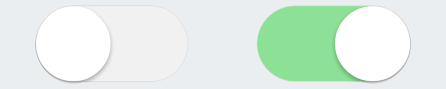
Our label, acting as our container, has a width and height. We set a background colour on it too, which will simulate a border on our toggle switch. Our :before element will simulate the inner light-grey area of the switch, and will transition into green. The :after element will be the actual round switch that sits on top of everything, and slides from left to right on click. It’ll have a box-shadow also to make it stand up above everything else. We’ll change the background colour of the :before element and the position of the :after element when the input takes on the pseudo class :checked, and everything will transition smoothly. Here’s the CSS:
input.cmn-toggle-round + label {
  padding: 2px;
  width: 120px;
  height: 60px;
  background-color: #dddddd;
  border-radius: 60px;
}
input.cmn-toggle-round + label:before,
input.cmn-toggle-round + label:after {
  display: block;
  position: absolute;
  top: 1px;
  left: 1px;
  bottom: 1px;
  content: "";
}
input.cmn-toggle-round + label:before {
  right: 1px;
  background-color: #f1f1f1;
  border-radius: 60px;
  transition: background 0.4s;
}
input.cmn-toggle-round + label:after {
  width: 58px;
  background-color: #fff;
  border-radius: 100%;
  box-shadow: 0 2px 5px rgba(0, 0, 0, 0.3);
  transition: margin 0.4s;
}
input.cmn-toggle-round:checked + label:before {
  background-color: #8ce196;
}
input.cmn-toggle-round:checked + label:after {
  margin-left: 60px;
}
Example 2 – Round Style Switch With Flat Finish

This example is fairly similar to example 1, the main difference being the aesthetic presentation of it. It fits right in line with the slick flat trends of modern websites, but functions the same as example 1. The CSS will only represent a change in aesthetic, the rest is the same. Here’s the CSS:
input.cmn-toggle-round-flat + label {
  padding: 2px;
  width: 120px;
  height: 60px;
  background-color: #dddddd;
  border-radius: 60px;
  transition: background 0.4s;
}
input.cmn-toggle-round-flat + label:before,
input.cmn-toggle-round-flat + label:after {
  display: block;
  position: absolute;
  content: "";
}
input.cmn-toggle-round-flat + label:before {
  top: 2px;
  left: 2px;
  bottom: 2px;
  right: 2px;
  background-color: #fff;
  border-radius: 60px;
  transition: background 0.4s;
}
input.cmn-toggle-round-flat + label:after {
  top: 4px;
  left: 4px;
  bottom: 4px;
  width: 52px;
  background-color: #dddddd;
  border-radius: 52px;
  transition: margin 0.4s, background 0.4s;
}
input.cmn-toggle-round-flat:checked + label {
  background-color: #8ce196;
}
input.cmn-toggle-round-flat:checked + label:after {
  margin-left: 60px;
  background-color: #8ce196;
}
Example 3 – Yes/No Flip Style CSS Toggle Switch

Now we’re gonna do something a little different. We’re going to create flip style CSS toggle switches. The default view will be greyed out and say “No” (or anything that signifies unchecked), and the checked view will be green with “Yes” written in it. When the label is clicked, the switch will flip over, spinning 180 degrees (that’s 3.142 radians for you engineers!) on its y-axis, revealing the opposite side. We’re going to populate the content of the unchecked/checked switch by using data-attributes. These data-attributes were specified in the HTML by data-on and data-off, each of which will populate the :after and :before pseudo elements respectively. Take note of the backface-visibility on the :after element, which initially hides its back side due to its starting point at -180 degrees. Here’s the CSS:
input.cmn-toggle-yes-no + label {
  padding: 2px;
  width: 120px;
  height: 60px;
}
input.cmn-toggle-yes-no + label:before,
input.cmn-toggle-yes-no + label:after {
  display: block;
  position: absolute;
  top: 0;
  left: 0;
  bottom: 0;
  right: 0;
  color: #fff;
  font-family: "Roboto Slab", serif;
  font-size: 20px;
  text-align: center;
  line-height: 60px;
}
input.cmn-toggle-yes-no + label:before {
  background-color: #dddddd;
  content: attr(data-off);
  transition: transform 0.5s;
  backface-visibility: hidden;
}
input.cmn-toggle-yes-no + label:after {
  background-color: #8ce196;
  content: attr(data-on);
  transition: transform 0.5s;
  transform: rotateY(180deg);
  backface-visibility: hidden;
}
input.cmn-toggle-yes-no:checked + label:before {
  transform: rotateY(180deg);
}
input.cmn-toggle-yes-no:checked + label:after {
  transform: rotateY(0);
}
Browser Support
Browser support for all of this is very high. IE8 and down fails to recognize the :checked pseudo class, so you’ll want to do some feature detection to make sure that old IE’s fallback to normal checkboxes. CSS transitions aren’t supported from IE9 and down, so this would only interfere with the transition part of the toggle. It should work just fine otherwise, with the switches snapping from one position to the next (still a nice touch).
Wrap Up
And that’s a wrap folks, some nice CSS toggle switches! This technique keeps everything totally semantic, doesn’t add any crazy markup, and is done with pure CSS goodness. Of course, be mindful of browser support, but it’s no big deal to cater to older browsers with conditional styles. Using the examples presented above, there’s no shortage of approaches you can take on. I hope you enjoyed this tutorial and learned something. Feel free to download the source code and view the demo, and leave any comments, questions, or feedback below.
Related Topics
Top