Ever since Windows 7 Mobile was released in a distinctly anti-skeuomorphic format, the explosion of flat aesthetics has been obvious, evident, and pervasive. Anything with an edge is eschewed, gradients are grinding to a halt, and shadows are even more insubstantial of late than usual. Flat design is considered modern, corporate, and cucumber cool.
Its influence can be witnessed from the plethora of two-dimensional web domains so abundant across the internet. Moreover, its impact is obvious from the multitude of conversations the online media are having about it (careful now. We’re approaching the fourth wall).
So why the sudden interest? What meaning is there in the sudden resurgence of a design style owing its origins to the Swiss in the 1950s (don’t worry we’ll get to that in a minute)? Much like a comic book superhero, flat design is getting its gritty reboot in the new millennium because of its classic appeal. In other words, it just plain looks good and people appreciate that sort of thing.
Perhaps, though, a more thorough investigation into the origins and evolution of flat design can give us a better clue as to its direction and staying power. It’s always worth looking into the history of a trending topic if you want to find out whether or not it’s going to last. So without further ado, let’s head into the Way-Back machine and have a look see.
Flat Origins across the Round Globe
As previously noted, the nation of bankers, knives, and cheese is responsible for flat design’s origins, or at least its popularization. In all actuality, the true beginnings of flat design probably stretch back to the 1920s in more aggressive/less candy-oriented countries like Germany and Russia.
I told you this reboot would be gritty.
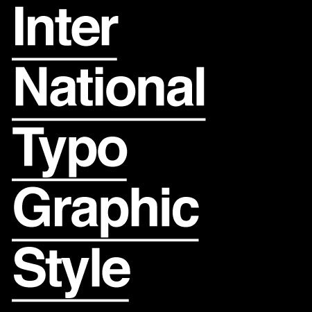
Even so, the nation most associated with the emergence of flat is indeed Switzerland. This is due to their innovation of the Swiss Style, often also referred to as International Typographical Style. This was basically the print prequel to the digital trend we all know and love today. It was defined by:
- Grid style organization
- Sans serif fonts
- Asymmetric layouts
- Emphasis on typography
And a preference toward photography over illustrations
This stripped down style focused on readability and was accompanied by other legibility-focused contemporaries such as Helvetica, which came along in 1957.
This Swiss Style blended well with another popular historical influence from which today’s flat designers draw: minimalism. Minimalism is about as ancient as artistic tastes get. Its hallmarks are basically the removal of all but the most essential elements of any piece of artwork.
Minimalism in art and design had one of its many heydays during the early 60’s in New York. Artists such as Frank Stella, Robert Ryman, and Ellsworth Kelly all experimented with minimalism using colorful, geometric abstractions to confuse spectators while they pretended to understand the underlying meaning of each piece.
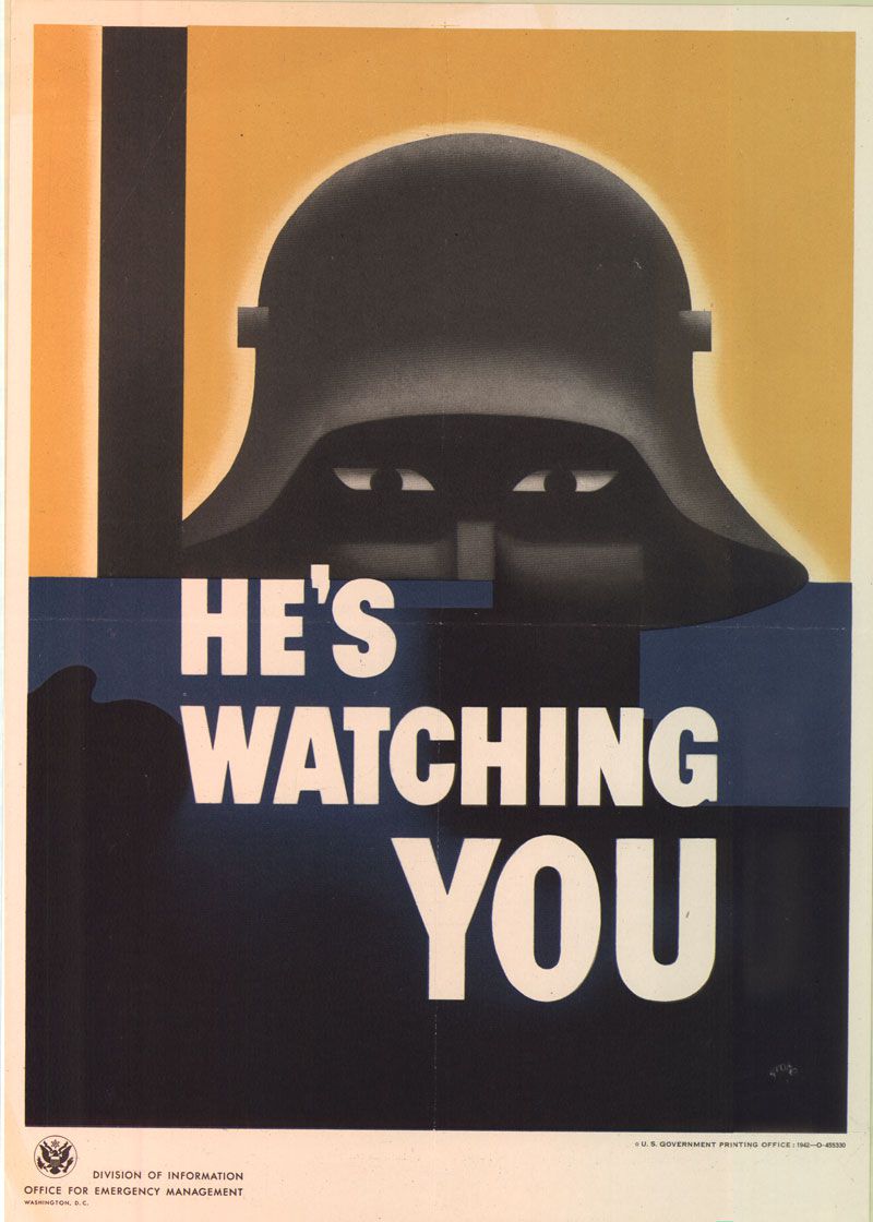
If you want to go back even further though, the Bauhaus School of Art in Germany was playing with minimalism more than 30 years prior. If you’re doing the math while you’re following along at home, then you just learned that modern minimalism is in large part the invention of German artists, right before WWII. Interestingly, the Bauhaus school was seen as a center of sedition among Nazi leadership and was closed in 1933.
That means minimalism, and by proxy flat design, isn’t just pretty. It’s downright patriotic. Food for thought.
Of course, all that is ancient history, so to speak. Today, we’re more concerned about how things look on a smartphone screen than on a foldable piece of print. Even flat design on flat paper is too three dimensional for true flat enthusiasts. Let’s get back to the safety of a computer screen and talk about the rise of flat in the digital era.
Back to the Future
There are two major players to talk about in regards to the responsibility of flat design’s resurgence. Apple and Microsoft. I mentioned above that Microsoft’s Windows Mobile 7 was a primary culprit for bringing flat into the fore. The only reason I said that is because Zune’s weren’t all that popular. The truth is that Zune was a functional design, ahead of its time, on a crappy piece of hardware created in reaction to Apple’s iPod.
It’s Skeuomorphing Time!
This was a swinging of the pendulum because up until that point, skeuomorphism held supreme sway. Skeuomorphism is a style in which imagery is designed to emulate real life. Think about your smartphone’s interface, unless you have iOS7, then just think about your friend’s Android and its interface.
Rounded edges, shadows, three dimensions, textures, and so on are common features of skeuomorphism, and they were conceived as the perfect designs for graphic interfaces because they breed familiarity between digital abstractions and physical realities. In other words, they make it easier to intuit how you’re supposed to interact with your devices.
That all began to change in 2013, when flat design returned like an Arthurian legend to reclaim its throne and slay the skeuomorphic dragon. But we’re skipping ahead just a bit, let’s get back to the preamble.
Windows Prophetic Phones
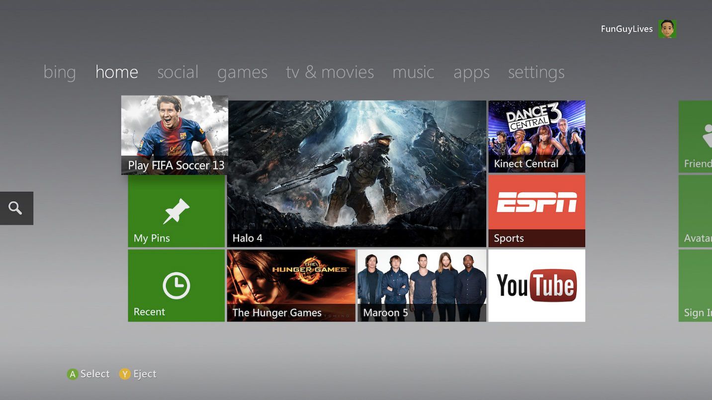
In 2010, the Windows Mobile 7 was released in all of its complanate glory. The phone featured bold colors, uniform grid structures, and a striking lack of depth or texture. It was received warmly by the masses who were apparently hungry for something novel.
The subsequent iteration of Microsoft’s OS, Windows 8, was also released in this new “Metro” style, so named after a Microsoft design language; one that likewise focused on legibility rather than realism. Nowadays, most of the Microsoft products you find will feature a fondness for flatness. Even the Xbox one, which touts super hi-definition hyper realistic gaming graphics, ironically delivers these features through a flat interface.
Which brings us back to 2013, and the aforementioned return of the king. When we last left our hero flat design and his trusty sidekick, minimalism, they were busy bloodying Nazi noses before the war even started. They took a brief trip to NYC in the 60’s to mingle with all the hip cats, and then laid low in the latter half of the 20th century. Let’s, for the sake of the parallel I’m trying to draw, say they were slumbering peacefully on Avalon, awaiting the day when they would rise once more to flood the world with simple, clean, and trustworthy designs.
Apple Heralds the Return of the King
In early 2013 Apple began leaking strategic propaganda to get their fanboys super psyched about a visual revamp. A graphic overhaul which promised approximately one less dimension than users were accustomed.
Because of Apple’s rabid fan base, and that fan base’s penchant for unquestioning loyalty to all things created in the name of Steve Jobs, flat design’s popularity skyrocketed.
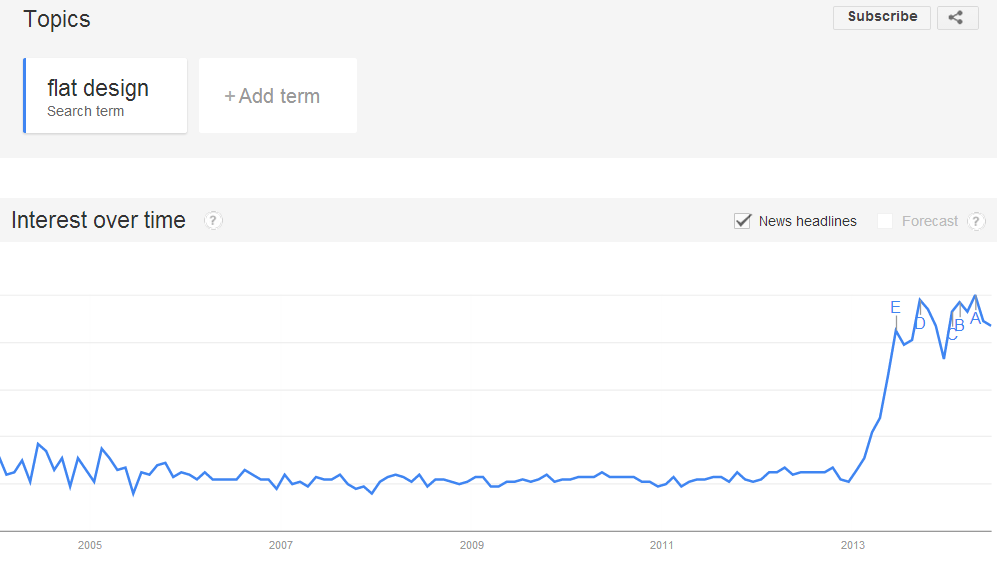
From there it was an avalanche of headlines, social sharing, and opportunistic guest bloggers trying to ride the design trend’s coattails to prominence… ahem.
Now the question remains: is flat a lasting trend?
Public Opinion is a Fickle Bitch
The majority of web professionals say yes. Some 68% of web pros agreed, according to a study performed by Usabilla.com, that this was no mere trend, but rather an exponential growth curve of design prominence that had nowhere to go but up… in the next 5 years. I’m paraphrasing and embellishing.
Actually, the study revealed some mixed feelings about the trend. A lot of those surveyed thought it was boring, and that it had some challenges in regards to usability. Though most did agree that it made websites cleaner, more attractive, and easy to navigate. The main problems for usability, revolved around finding the clickable elements.
My personal opinion is that these were web professionals, and as a consequence overly critical when asked about a design trend. Though that’s not necessarily a bad thing. It points out potential problems and challenges designers to address them in their planning phase if they’re considering a flat layout.
I’m neutral on flat, myself. I’ve seen good examples and bad examples. I think the motif has to match the website’s purpose, just like any other style of design. I like the emphasis on content as that obviously benefits me personally, but I’m a huge fan of being whisked away by overwhelmingly realistic visual experiences as well.
How about you? What do you think of flat’s past, present, and future? Let me know in the comment section.
This article has been written by Zack Rutherford, a freelance copywriter. He contributes web content and especially snappy articles to TemplateMonster. Combat sports enthusiast and poetic soul, Zack endeavors to create beauty through syntax, sentence structure, and the liberal use of hyperbole. Follow him on Twitter (@zack_rutherford) or visit his website (Zackrex.com) to read all of his innermost thoughts and unfounded opinions.
Related Topics
Top