Selecting the perfect font for promotional materials is a vital aspect of brand identity. Many small business owners and marketing professionals neglect to give proper attention to the fonts they use and how they can help the company or organization connect to its audience.
Some don’t realize that slapping a default font onto a logo is like putting your money into savings instead of investing it: you’re playing it safe and you risk losing money by doing so.
Choose the Right Tone
Different fonts and colors express semi-universal tones that can be summed up in a few adjectives. Some fonts are seen as warm and friendly, others straightforward and serious. All affect how customers view companies. Many new businesses might not see the direct impact of font choice on their marketing successes, but some veteran brands who change the type in their logo see a strong backlash and sometimes even a drop in sales. The tone of a font has great power over how your brand is perceived.
Here are a few examples of various fonts and their tones:
1. Classic and Traditional
Classic and Traditional fonts, like serifs, can indicate professionalism or luxury depending on how they’re used. They can also indicate knowledge and authority within a brand.
Examples: Modum, Fenix STD, Museo and Novello.

2. Modern and Trendy
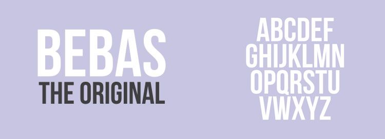
Modern sans serifs are trendy and simplistic. They are straightforward and functional because they don’t distract from the text.
Examples: Brandon Grotesque, Bebas, and Din.
3. Elegant, but Relatable
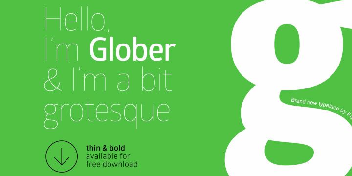
Thin or narrow fonts are more elegant, but are also very relatable and “human.” The rules change and vary with every new font that is created.
Examples: Kraftstoff, Simplifica, Neutraface and Glober.
4. Warm and Friendly
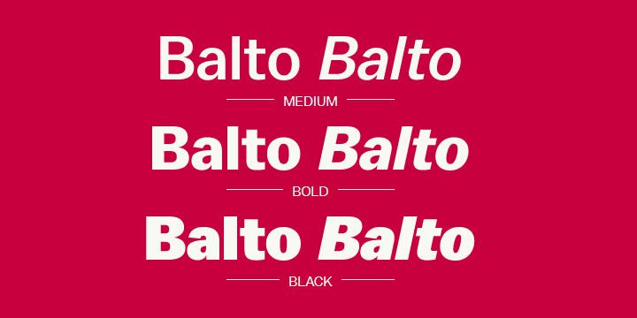
Bold fonts, such as the one used in the popular GAP logo, are more generic and friendly. They can also be seen as dramatic depending on the context they are used in.
5. Fun or Emotional
Fonts can also have a sassy or fun personality. Handwritten fonts can be fun and outgoing while scripted fonts are very emotional in nature. These would make bad choices for body text because they are at their most legible in a large size.
Examples: Barrio, Bad Script, Lobster and Blenda Script.

Select a Small Range of Fonts
Choose just a few fonts that can be incorporated well together regardless of the document. This will allow your brand image to appear honed and streamlined instead of all over the place. Here are the font categories your brand needs:
- Logo font: Your logo font should absolutely NOT be a default font like Arial or Times New Roman. The logo represents each potential customer’s first encounter with your company as well as the image that comes to consumer’s minds when they think of you in the future — if they think of you in the future. It should encapsulate what makes your brand unique, whether you’re a freelance photographer or a CEO of a large corporation.
- Heading and tagline font: If your logo font is legible in other formats, it can double as your heading and tagline font, but you can also choose something else. This font should be an eye-catching (though not obnoxious) display font since it’s meant to be used for headlines, subheadings and any other special text.
- Body font: Select another font for your body text. This should be highly legible and neutral since it will most likely be small and used for long and mid-length blocks of text. While the serif vs. sans-serif rule isn’t set in stone, it is customary to use a serif font for printed body text and a sans-serif font for online text.
These fonts should hold you over unless the ones you choose don’t translate well to a different size or weight. In that case, choose something that complements them well. This should be extra simple if you have decided to choose all of your fonts from the same family.
One of the most crucial keys to making your font selections is ensuring readability. If the text you’ve chosen for body text doesn’t comfortable shrink to a small size, you’ve chosen the wrong one. If your display font is too decadent for readers to easily distinguish one letter from another, it will take them too long to grasp the message. Choose fonts with generous spaces between the letters so they can be read more fluidly.
Be Consistent
Finally, allow your audience a chance to become familiar with your brand’s visual style. From dense, informative literature to billboards, use the fonts you have already selected to represent you. If your visual components conflict from channel to channel or message to message, your audience will have trouble connecting encounters with your brand into one lasting impression.
If you feel that your fonts are out of style or that your logo no longer accurately reflects the qualities of the company, think before you make over. Don’t tweak your logo font without updating the other fonts to make sure they pair well. People become attached to the feel of certain brands and experience everything from distaste to a sense of betrayal when a reliable visual element changes.
We use typography to communicate, so let your font choices accomplish two major goals: connecting clearly with your customers and accurately reflecting the character of your brand.
Related Topics
Top