Type can be confusing for designers. We have access to thousands upon thousands of different fonts, many of which are free to download and use. This results in an overabundance of typographical solutions to problems that aren’t really so complicated.
Today, we’re going to look at five key rules for selecting an ideal typeface for any project, and how to determine if that font you think is amazing may not be so great after all.
You Don’t Need as Many Typefaces as You Think You Do
When I was in school, my type teachers would stress that graphic designers really only need around 5 or 6 ‘default’ typefaces that they can use to handle 99% of all possible scenarios.
This has the effect of giving your design work a very distinctive look; only using five fonts for everything will clue people in faster as to who the designer is. It can become a bit monotonous, though, and, if done incorrectly, can make your work look awkwardly limited.
By Rikki Rogers
However, that doesn’t mean it isn’t good advice to stick to a particular ‘palette’ of fonts for the most part. If you learn the fundamentals of type, you can get a lot more versatility out of even a single typeface than many type novices think is possible.
Type can be altered, tweaked, spliced, and shaped to fit a variety of needs. Many of the newer fonts out there were created from classic ones anyway.
It’s all about making sure the changes are seamless and look like they were always part of the letterform.
Check For Telltale Signs of Auto-Tracing or Lumpy Vectors
Back before digital took over the print world, type was created by actual foundries, which offered sets of metal letterforms to be loaded into a printing press.
A common problem with a lot of modern digital fonts (even the ones you have to pay for) is that the ‘foundry’ that designed the typeface cut corners to produce it.
They might have taken scans of printed letterforms, auto-traced them in Illustrator, and put them into FontLab or a similar program without bothering to clean them up or correct any errors created by the software.
Display fonts are meant to be shown at large sizes, and when you have one that’s poorly drawn, it’s going to be that much more obvious when it’s blown up to the necessary size.
A good typeface should be just as elegant and readable at size ten as it is at size 84.

By Blink Design
If it isn’t, consider looking for a different one. If you need a display font, make sure the vectors are clean and elegant, with no signs of lazy auto-tracing.
It’s easy to create outlines of any typeface in Illustrator to see whether it’s a prize or a dud.
Don’t Forget About The Symbols!
Symbols, numbers, ligatures, and dingbats may not seem important… until you need one and are forced to improvise or borrow from a different font.
It’s much easier and more cohesive for your design to just pick a font that has all the symbols you need.
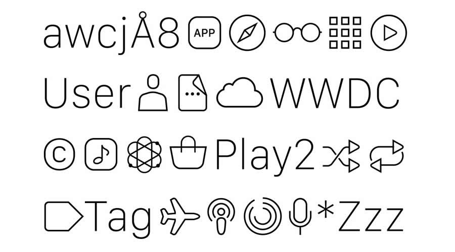
Believe me, even if you think you’ve found the ‘perfect’ typeface, if it’s not complete enough for your project, you are going to be kicking yourself as your next deadline approaches.
Before you commit to an incomplete font, check to see if there isn’t a better option that’s just as good, which won’t have you scrambling to fill in the gaps.
Pulling Your Own Weight
Remember all that rambling about type weights you slept through in design school (don’t pretend like you didn’t)? Well, as it turns out, it was a vital piece of the typography puzzle.
Like symbols, type weights (bold, italic, etc.) only seem insignificant as long as you don’t absolutely need them.
Of course, there are plenty of faces – Roman capitals and many stencil or pixel fonts – that only come in one weight. If you choose to work with one of these fonts, it’s important to take their limitations into account before you begin your project.
Application is Everything
Are you using a web font, a print font, or a combination of the two? There is a difference, and it does matter. Web fonts are designed to be read on a computer screen.
They are typically sans serif, like Arial or Tahoma, although there are serif fonts, like Georgia, which are intended for digital applications as well.
Fonts meant for print are older and more classic, like Bodoni, Baskerville, or Goudy, and the best ones can be perfectly suited to web design with just a few tweaks to their curves and spacing.

Modern typefaces like Helvetica look great both on and off-screen. The popular Helvetica Neue was specifically created for digital design, relying heavily on Helvetica’s classic letterforms.
Just like celebrity break-ups and recipes for black forest cake, typefaces can be googled. With a simple search, you can find out a font’s origins, whether it was created for print or digital, and whether there is an updated version that might be better for your design.
Related Topics
Top