The need for a website to be mobile-friendly is undeniable. Mobile has already overtaken desktop in the number of users, and Google has made no bones about the fact that it awards brownie points for sites that are mobile friendly. For business owners hoping to make the most of their online presence, it is a matter of necessity to make their websites mobile-friendly.
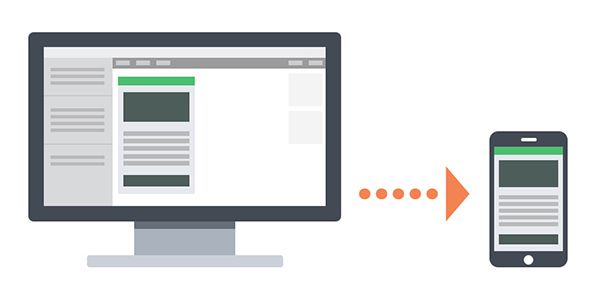
Many website owners believe this means merely making their interfaces smaller to accommodate the size constraints of the typical mobile device, be it a smartphone or a tablet. The fact is, mobile sites works differently from desktop sites.
Mobile has far more limitations, such as dependence on a battery, wireless connectivity, and of course screen space. Functionality does not always easily translate in a smaller screen. In most cases, a mobile-friendly design requires a certain differentiation. Here are some approaches to mobile design you should consider.
Mobile-First
Many website developers today design for mobile use first, and then desktop. Because of the screen size limitations, they quickly learned that less is more, and to keep minimal features in the design. It is a matter of focusing on important aspects of the site, and enabling users to easily execute key tasks that would benefit the business.

The key to this mobile first approach is to identify the main categories, prioritize them, and then design for the smallest screen first. You can add more elements (in order of priority) as you move up the screen sizes.
Menus and navigation elements are as important with mobile as it is on desktop. However, the typical menu bar in a desktop site is way too big for a mobile site, so in most cases it is better to use a hamburger icon (which is easily recognizable) or a drop down accordion menu and place it on the top right or left of the screen.
Multilevel menus also present a problem in mobile, because users normally will not want to go through several taps to access what they need. The maximum would be two taps before a user will abandon the site, in contrast to the lengths to which a user will go through on a desktop site.
The trick is to show only the most important parts of your website, those that your users are most likely to want or need. Avoid putting too many options and widgets on your page. Here are some navigation mistakes you should avoid.
Value Creation
It is true that a mobile-version of your website is a must if your business wants to tap into the mobile market. It will certainly help with optimizing your site for search engines. However, your mobile app itself may not get any traction with your users if they cannot find any value in it.

Your mobile app or site should bring something to the table for the end user to motivate them to download and install it, or to bookmark it. This includes making it easier to pay for something, getting a discount, or obtaining vital information quickly. Banking, communications, and newsfeeds are typically useful mobile sites that most people use on a daily basis.
You should strive to create that kind of value for your business for mobile users. If you are able to create value for your mobile app, then all your efforts in designing and creating the mobile site or app will not be in vain.
Keep Your Layout Liquid
You might think that you can design your mobile website for a fixed 320-pixel break point (which is the most common size for mobile) and call it good, but the fact is mobile has a wide range of dimensions, from 176 to 600 pixels.
You need a liquid layout so that it will adjust fluidly no matter the dimensions of the mobile screen. You need a mobile design defined in percentages instead of a fixed number of pixels so that it will not matter what mobile device the user has. The site will be responsive, which is what you want for ease of use.
Touchscreen Functionality
Most mobile devices nowadays use touchscreens, and users are used to interacting with them in that manner. Designing a mobile site is thus more challenging, because you need to account for differences in finger sizes, textures, and pressure in order for the screen to respond accurately.

You have to make sure that all elements that require a user’s input such as buttons and forms are large enough and do not overlap. You cannot rely on the use of styluses or keypads that some older mobile devices may have.
You can use the swipe and pinch functions standard in many mobile devices to help you with your design. You can put in more clickable elements that way.
User Centricity
The key to designing your mobile website is to keep the user in mind. You need to follow certain patterns to improve the user experience. These include:
- Keeping controls big and at the bottom of the screen, to make it easier for the user to see content and manipulate them as necessary.
- Making it easy for the user to find what they need.
- Keeping all the elements intuitive and consistent, so users won’t have a hard time trying to figure out how to use the site.
- Minimizing the need for user input, using auto-correct whenever possible, and supporting the use of a landscape orientation.
- Using default values to pre-populate forms.
Feature Utility
Mobile devices have limitations, but they also have features you will not find in a desktop. These include slide to unlock, GPS, gestures, gyrometers, and location services. You can use these mobile-specific features to enhance the user’s experience with your app.

A good example of putting a mobile-specific feature to good use is a discount site using location services to help users find specific stores. The swipe function also comes in handy for some dating websites. Use your imagination for creating opportunities to give your end-users an appreciation of your mobile app or site.
Keep on Task
Many mobile users may get interrupted while they are on a mobile site or app, forcing them to close it without completing a task. It could be a call coming in, the boss comes in, or the light turns green.
In any case, it is important to make sure that your user can pick off where they left off upon opening the site or app again. You can design it so that it is easy and quick to restart the site or app, and your users will appreciate it.
Conclusion
A mobile site or app caters to the growing need of users to be on the go without sacrificing access to their favorite websites. However, designing a responsive and engaging one is not as easy as it sounds. Certain limitations and features of mobile devices pose a challenge for web designers that want to make the user experience seamless and positive. These tips can guide you in creating a true mobile functional design for your business.
You might also like to read about the The Dos and Dont’s of Mastering Responsive Web Design.
Related Topics
Top