Typography in logo design says a lot about your business. When used correctly, typography can add balance to your logo. It can also make your logo more memorable if you use nothing but typography, as simple logos are often the ones we easily remember.
There are a few things to keep in mind when it comes to using typography or creating typography-based logos. For starters, you have to know the intended audience. Who is this brand trying to attract, and what are their personal interests, preferences, and pain points?
Once you know who the audience is, you have to understand what feelings the logo should convey and how it should make them feel. Of course, you also have to be familiar with the visual basics and know which fonts would be better suited to convey a particular message.
For example, a brand that wants to present itself as traditional and reliable would do well with serif fonts in their logo. A brand that caters to a young audience, on the other hand, could use a sans-serif font. Another example is a high-end luxury brand that might use script fonts to convey elegance and luxury.
Another aspect of logo design that you should pay attention to is the use of color. For starters, limiting the choice of colors is the best way to ensure your logo looks professional. Then, you need to choose the color based on the message and feel that should be conveyed.
We’ve collected our favorite logo examples that use clever typography with fantastic color choices and font selections. They also all make use of negative space to create an effective and memorable logo.
Codeshift Logo Design
Designed by Dalius Stuoka

Attach Logo Design
Designed by Paulius Kairevicius

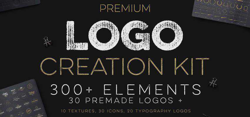
Logo Creation Kit
Designed by Zeppelin Graphics
Vip1 Identity Project
Designed by Leo

Extend Logotype
Designed by Vlado Paunović

Kingdom Wordmark Logo
Designed by Sumesh A K

Gorillove
Designed by Vaneltia

Minimal Logos Vol.4
Designed by Zeppelin Graphics

Heavy Logotype
Designed by Vlado Paunović

Seolution.it
Designed by Mattia Moretto

Rock Fries
Designed by Ahmed Creatives
Bark And Sip Logo
Designed by Peter White
Hatchet Logo
Designed by Jordan Wilson

OpenBox
Designed by Alek Triptic

Japan Logo
Designed by Ina Basholli

Sydney Logotype
Designed by Vlado Paunović

Umbrella Wordmark
Designed by Jabir j3
USB Logo
Designed by Piotr

Check Logo
Designed by Ina Basholli

Geometric Logo
Designed by Zeppelin Graphics

Drop Logo
Designed by Ina Basholli

Milk Logo
Designed by Sumesh A K

Doctor Wordmark
Designed by Aditya
Perforation Logotype
Designed by Vlado Paunović
My Indian Closet
Designed by Ancitis

Warning Logo
Designed by Ina Basholli

Minimal Geometric Logo Collection
Designed by Eightonesix Studios
Dyslexia Logotype
Designed by Vlado Paunović
Blind Wordmark
Designed by Sumesh A K
Vintage Logo Collection
Designed by Orca Creative
Smash Logo
Designed by Sumesh A K
Disappear Logotype
Designed by Vlado Paunović

Technology Logo Collection
Designed by Eightonesix Studios

Jankeš Beekeeping
Designed by fraGile
CodeMaus
Designed by Mads Burcharth

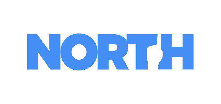
North
Designed by Sehban Ali Akbar
Handpicked Logo
Designed by Minimalexa Design

Related Topics
Top