When sitting down to plan a website you will likely consider a number of factors. These revolve around your general target audience and what they might be looking for. As desktops are getting larger there is more of a need for bigger font sizes. Oversized typography and web page graphics will generally herd visitors deeper into your layout.
I want to look at just a few design trends related to building oversized website layouts. The term “oversized” implies that maybe the design is too big, however, I think it is more accurate to say the website appears much larger than a typical design. Web sites would often utilize smaller fonts to save space and appear more professional, dating back 10+ years ago. But there is nothing unprofessional about increasing your text sizes and including more space between your page content within a more modern design.
Catching Eyes Above-the-Fold
One of the biggest advantages for larger website elements is the captivation you will receive from visitors. This means when you set up large page elements above-the-fold your visitors are more likely to scroll down and check out the rest of your content. It will not be the case with every visitor, but it is much more likely to occur with glamorous designs.
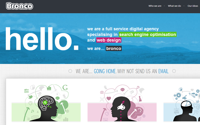
The agency layout for Bronco has a unique mix of smaller and larger page elements. At the very top you can see their logo and some related links to their services pages. Each of the various colors and text effects will naturally catch your eye right after the page finishes loading. And since it looks like there is a lot more to be found lower in the page, you may feel curious to scroll down and continue reading.
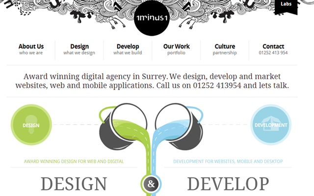
On the website for 1minus1 I feel there is a similar approach but heavily focused on graphics. Each of the top navigation links is big enough to clearly read where they go. And the heading design is definitely enticing, but it is the lower page graphics which initially make you say “wow!”. This is a wonderful response you want to elicit from visitors within the first few seconds after landing on your homepage.
Large Screen Imagery
I like to see photo slideshows and video previews right on the homepage of any new website. This is an extended connection offering a brief insight towards their company, what they do, and what they have done in the past. I especially think these page elements work nicely in portfolios and design agencies, such as the website for Capcan.
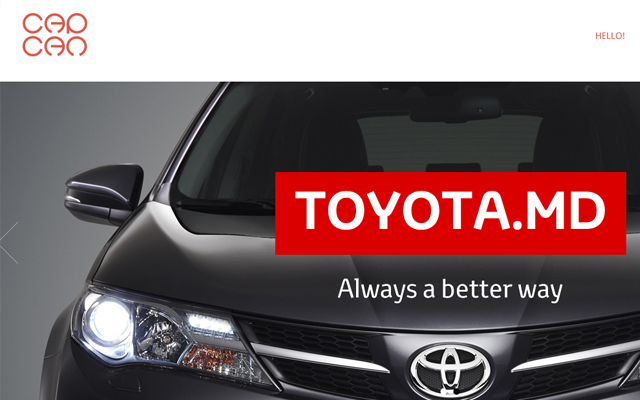
On their homepage you will find a big fullscreen image slideshow which transitions between a number of different works. I also like on their portfolio page which uses a fullscreen grid of thumbnails for the display listing. These larger graphics are much easier for users to see and therefore interact with.
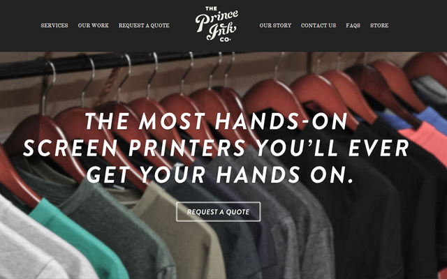
Also on the homepage for Price Ink you will notice a similar design feature. One solid homepage graphic along with a few columns underneath. Each item will showcase a different icon design as the heading portion. It is a feature which works nicely for professional businesses and studios who want to quickly share their areas of expertise.
Readable Web Copy
My personal favorite reason for utilizing bigger page elements is the readability. On mobile devices and tablets you can still quickly get through the content – especially using media queries which automatically adjust the font sizes. But for readers on desktop computers it provides a simpler method of getting through and reading each paragraph of your content.
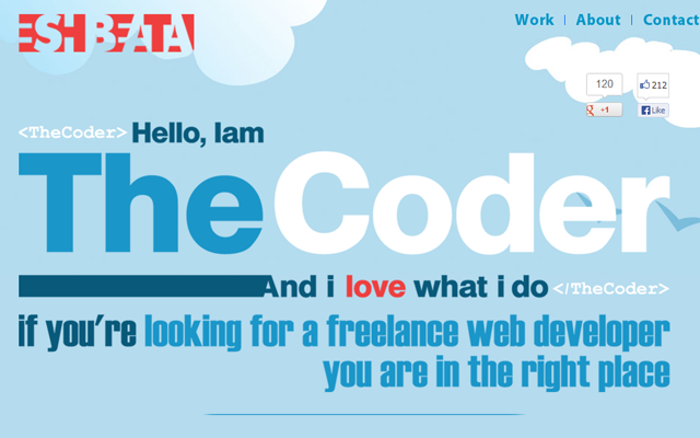
The portfolio website for Mohammad Eshbeata showcases a prime example of bigger and more readable web copy. The homepage design is built using parallax scrolling which minimizes the effort of the visitor. Also the font colors contrast brilliantly against the changing background styles.
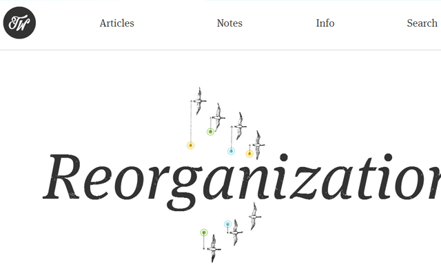
Trent Walton uses an even more minimalist approach in his web design. This is the ultimate choice for contrast because your text will be large, crisp, and easy to scan from a distance. The biggest problem is that not everybody will have a website to use this for design quality. I greatly admire Trent’s website because of the various font choices, and how it all appears very natural in the layout.
Fullscreen Backgrounds
How could we talk about oversized websites without delving into full-screen background images? There are plenty of free open source plugins such as Backstretch which allow you to create full screen backgrounds very quickly.
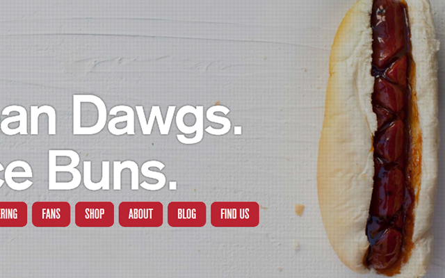
The example from J Dawgs also includes some really nice text animation. I think all of these aesthetics coupled with the background image provides a very unique experience to the user. Yet these websites are typically used for static content consumption, and a large background image may get in the way of your font choice.
Try using segments of your page to split into block-line content elements. This makes designing big fonts and graphics a lot easier because you can split up horizontal slides as the user scrolls vertically down the page. But again, this feature is mostly advantageous when you can make good use of your homepage design. Not every website will need a full-screen background image unless it is directly relevant to the web copy.
Parallax Effects
Websites using a parallax scrolling feature often have a navigation bar which allows visitors to jump between sections on the page. This toolbar will generally be fixed onto the top of the page for easy access. Many designers have come to loath this technique, but I still really enjoy the accessibility. The latest redesign of Smokey Bones features exceptionally large elements with a fixed scrolling navbar.

I have always been a fan of this restaurant and I like to check their website frequently. This was quite a surprise to find a new design and witness how great the entire interface looks. Each of the horizontal panels is using some type of texture or background image, and the content is still quite clearly legible. By keeping all of this on a single page you save the user from more HTTP requests and it saves them time browsing through information.

Parallax design is a much more complicated topic but I feel it pairs nicely with oversized content. Graphics, videos, text, and anything else you may place on your website will be easy to access and easy to understand. The homepage design for Thrive Solo uses a lot of circles and icons for containing alternate content sections. It can be a great technique for bridging the gap to explain your website’s purpose while also keeping visitors curious at a distance.
Showcase Gallery
Along with these general design trends I also want to include a small inspirational gallery of website designs. This collection focuses on websites using big graphics, big logos, oversized backgrounds, and large typography. Bigger websites are not always better, yet they can draw in a lot of attention with just a short amount of time. See if you can locate any familiar design themes in this showcase, or even pinpoint newer trends with your own research.
Manos

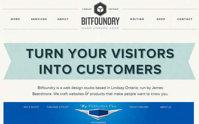
Bitfoundry
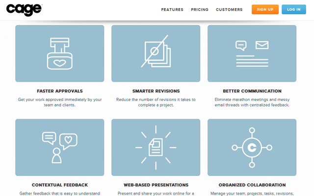
Cage
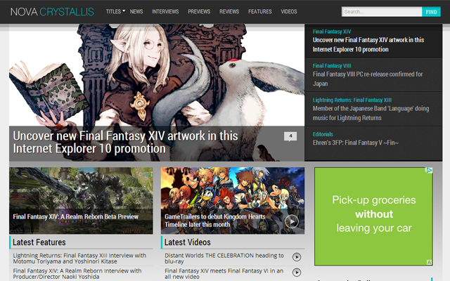
Nova Crystallis
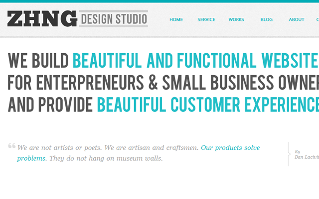
ZHNG Studio
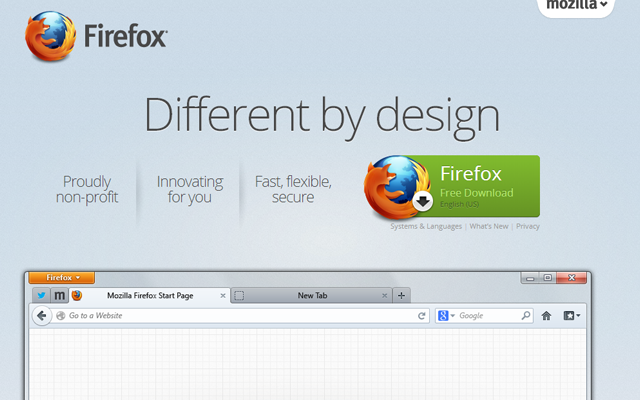
Mozilla Firefox
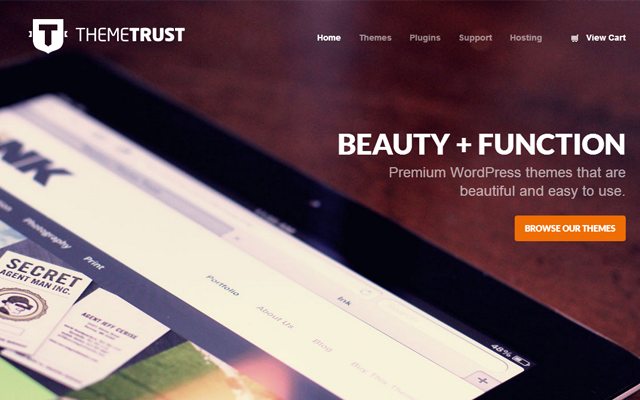
Theme Trust
Data Driven London

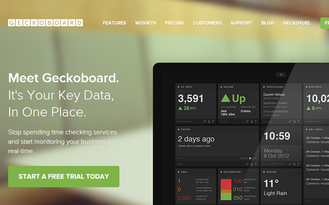
Geckoboard
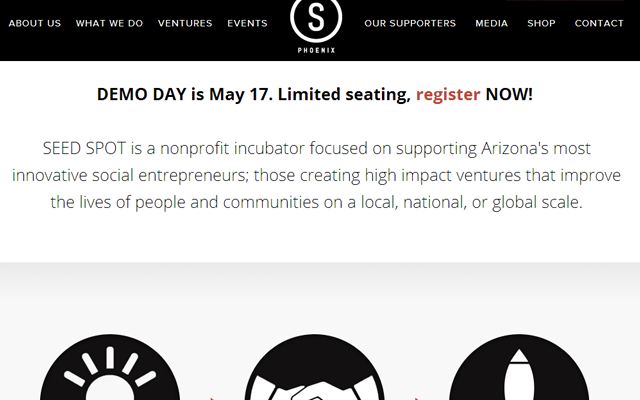
Seed Spot
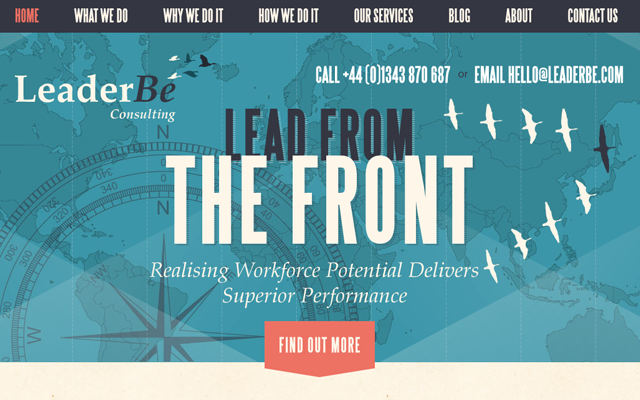
Leaderbe
Cujo
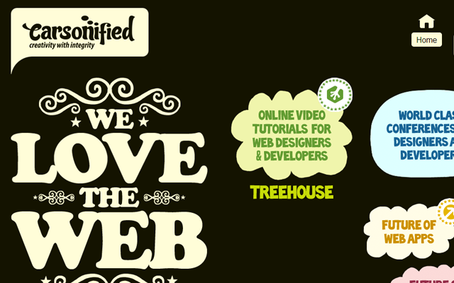
Carsonified
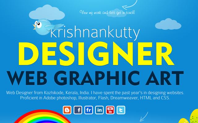
KK Designs
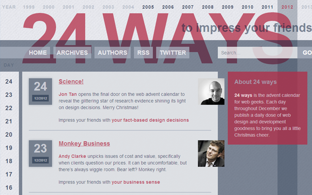
24ways
Skewed Icons
![]()
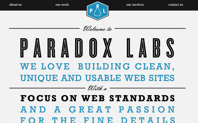
Paradox Labs
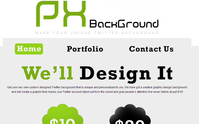
Px Background
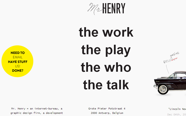
Mr. Henry
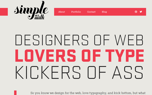
Simple as Milk
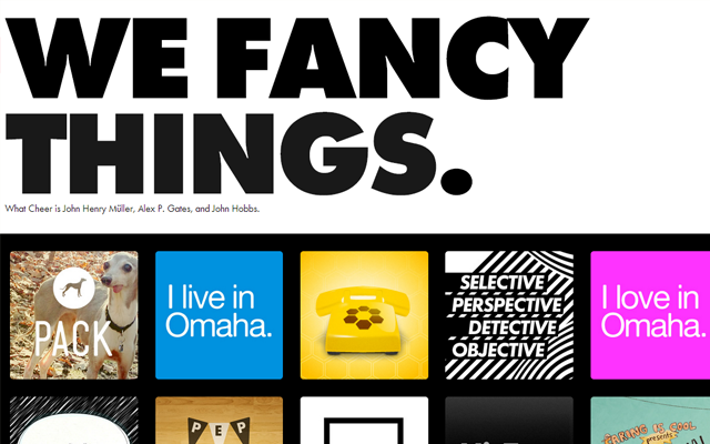
What Cheer
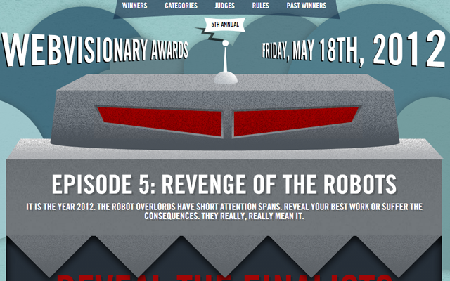
Web Visionary Awards
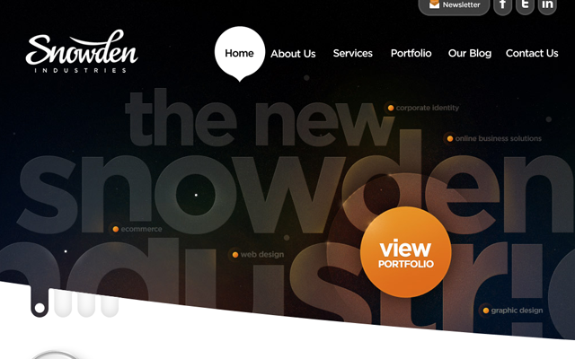
Snowden Industries
Rareview
Boxee
Fajne Chlopaki
Merge Agency
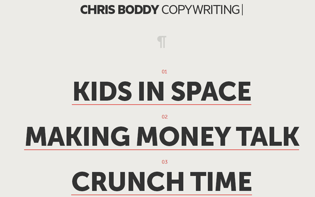
Chris Boddy
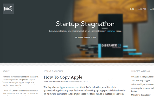
Francisco Inchauste
Related Topics
Top