Sometimes, revamping a website’s or a mobile app’s interface causes users to freak out. People may get disappointed with a new color scheme, the positioning of elements, or anything similar. Obviously, such a reaction isn’t what you’re expecting from your interface redesign.
Even large, successful corporations like Facebook, Instagram, and Spotify are frequently exposed to negative feedback. For instance, in February 2017 Spotify updated its web player, introducing a new layout, new search functionality, and artist pages.
This change caused many users to express their dissatisfaction on social media. One Twitter user even wrote: “Oh, cool, they’ve upgraded Spotify web player and made it worse in every single way! Awesome!”
So how can you prevent overwhelming your users with UI changes? Let’s take a look at a few techniques that’ll help you refine your product’s interface and keep your users satisfied.
How People Perceive Information
Today there’s a diversity of interfaces, and users must learn every time they encounter a new (or revamped) interface. Consequently, users spend their time looking for functionalities and feeling displeased.
Aalto University recently conducted research during which they modelled visual search, trying to find out how people pick up new or altered interfaces.
As a result, researchers determined that the key to fast learning for users lies in three factors: long-term memory, short-term visual memory, and eye movements. Knowledge of how people perceive visual information enables UI/UX designers to create efficient interfaces (and UI tweaks) that don’t impede users.
The question of how people scan a page for information and how their eyes move has been studied by various research companies including the Nielsen Norman Group. According to the group’s study, users generally follow three patterns while reading or observing content.
The Gutenberg Diagram
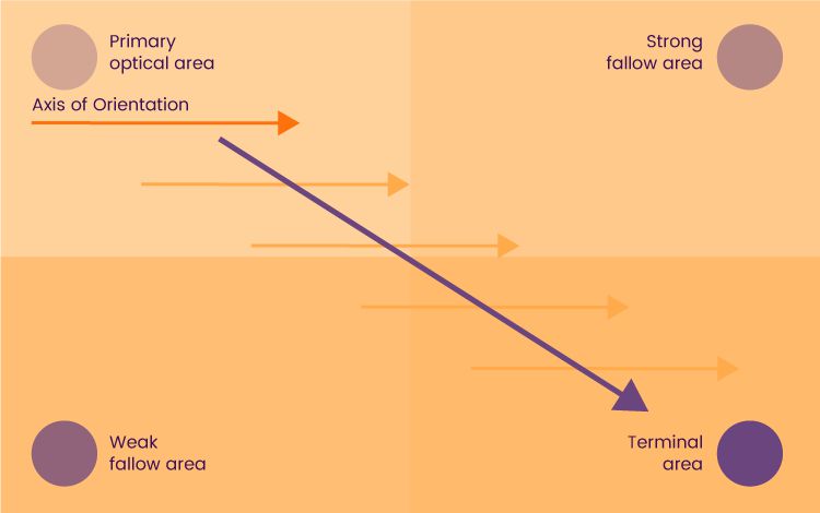
The Gutenberg diagram reflects the Western culture of reading: top to bottom and left to right. According to the Gutenberg diagram, information on a page should be divided into four quadrants, making it easier for users to perceive text-rich content:
A Gutenberg diagram introduces content arrangement principles that shed light on how to make it easy for users to find relevant content.
As you can see, users opt for scanning the top left quadrant first; this quadrant is called the primary optical area. This is where you should put your key content like a headline and a logo.
Next, the users’ eyes move to the strong fallow area. Consider putting some sort of follow-up content in this section, for example an image that illustrates the idea you’ve expressed previously.
Then, users proceed to the weak fallow area, which isn’t likely to draw much attention. This area serves as a “break” along the user’s reading path. Finally, a terminal area in the bottom right quadrant leads users to the logical conclusion. It’s recommended to put a CTA (call-to-action) in this section in the form of text, a video, or a link.
Using the Gutenberg diagram in interfaces facilitates reading rhythm along with reading comprehension. The knowledge of this pattern also gives you insights into placing important elements in the places where they’re most likely to be read or noticed.
The F-Pattern
The F-pattern represents an F-like positioning of the elements on a page. According to Nielsen Norman’s study, people start engaging with content by moving their eyes in a horizontal line. Next, they scan a vertical line trying to find the points they’re interested in, and if they find what they’re looking for, they continue scanning the content horizontally.
Nielsen Norman conducted research based on 200 participants which showed that one of the popular patterns of scanning content is F-like.
To improve the user experience, use elements like bullet points, typography, colored buttons, highlighted texts, and so on. These elements give visual weight to the interface and indicate important points.
Using the F-pattern ensures an efficient visual hierarchy on a page, so users can scan content rapidly and find quick fixes to their issues.
For example, Medium’s previous layout took advantage of the F-pattern by arranging the main content (blog posts) on the left side while putting the sidebar to the right. The sidebar on Medium contained the non-primary but still relevant content including daily digest, tags, and links to “About Us” and “Terms of Use.”
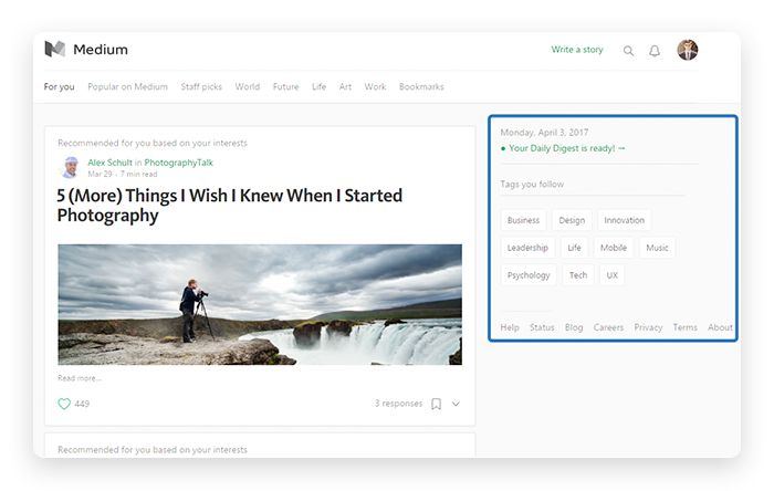
Medium’s previous layout is a vivid example of the F-pattern
Today, Medium has gotten rid of the classic thread with image previews and large headlines. Instead, new blog posts are displayed as lists, so they draw users’ attention to the authors of posts rather than just to image previews.
The Z-pattern
The Z-pattern is unofficially considered the king of landing pages since it covers important aspects including visual hierarchy, content structure, and CTAs. Unlike the F-pattern, which is more suitable for text- or content-heavy pages, the Z-pattern efficiently grasps users’ attention on landing pages with minimal copy.
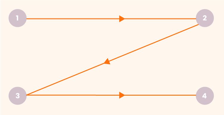
As you might have guessed, this pattern represents the Z-like movement of users’ eyes.
Minimalistic interfaces can reap benefits from a Z-pattern to delight users with a consistent layout and a visually pleasing content structure.
When designing with the Z-pattern, stick to the following structure:
- A top horizontal line should include catchy content and elements like the logo and navigation bar (so users quickly access the website’s pages).
- Following a classic storytelling approach, a diagonal line should introduce users to the main content including the main copy, attention-grabbing images, slideshows, and so on.
- Finally, a lower horizontal line should feature a CTA that stimulates users to perform a certain action such as signing up, subscribing, or making a purchase.
The Bottom Line:
Knowledge of visual patterns provides designers with an understanding of how users perceive and recognize the content on a page. Successfully applying these patterns allows designers to build and revamp interfaces that please users and create overall ease of use.
How to Prevent User Dissatisfaction with Interface Changes
The successful makeover of a website or an app is achieved with in-depth research that includes various kinds of usability testing. Usability testing is aimed at evaluating the design and functionality of a new or an existing system with real users. Here are a few efficient testing techniques employed by designers:
A/B Testing
A/B testing, or split testing, is a method of comparing two different concepts such as buttons, CTAs, color schemes, and banners. The aim of A/B testing is to find out which of various options is the most successful; for example, which button gets the most clicks.
Each case of A/B testing is unique. What elements you test depends on your business goals. However, in user interface design, the following elements are generally tested:
- Copy (product descriptions, button text, etc.)
- Calls-to-action (for example, their placement or wording)
- Application forms
- Layouts
- Images
- Color schemes
Keep in mind that A/B testing must be performed simultaneously, not consecutively, so you get relevant results not influenced by shifting trends or behaviors.
Doing A/B tests helps you prevent audience backlash and can even help you achieve better conversion rates by making necessary tweaks to an interface.
Online tools that help you perform A/B testing include Google Analytics, Optimizely, and CrazyEgg.
Hallway Testing
Hallway testing is an informal way to test your design with real users. A hallway test involves going to a crowded area and simply asking passers-by to test and evaluate an interface.
A local Starbucks can be a good place to go: as a rule, people are more likely to interact with strangers in cosy places with relaxed atmospheres. Besides, at Starbucks you can reward your interviewees with a muffin or a cup of coffee and increase your chances to steal a few precious minutes of their time.

Testing a design with your office colleagues will work too. In this case, you can quickly test your idea literally in a hallway or at a water cooler. Besides, some people prefer to interact with the people they already know rather than with strangers in the street.
To conduct testing successfully, plan everything in advance. Prepare layouts, test products, questionnaires, and anything else you may need during testing. Also, remember to explain the purpose of testing to your participants so they fully engage with the process.
When demonstrating your design, you may ask the following questions:
- Do you understand this caption/name?
- What do you think happens after you push this button?
- How do you evaluate the look and feel of the interface?
Though hallway testing is a preferred method of testing UX design to check if an interface is easy to navigate, it’s also used with UI design as well. By hallway testing UI designs, you’re able to find out what elements of an interface puzzle users and how your users conceive the system as a whole.
Five-Second Testing
The aim of 5-second testing (also called impression testing) is to elicit the user’s first impressions of an interface and find out if a website or an app communicates its purpose to its visitors.
Even though the name of the test implies spending only 5 seconds on interface assessment, sometimes the timeframe is extended to 10 or 15 seconds depending on the visual complexity of an interface.
During a 5-second test, users view an interface and try to remember as much as possible. Afterwards, they’re asked a set of questions that help you get a sense of their reactions:
- How would you describe the look and feel of the website/app?
- What is the website/app about?
- What elements drew your attention?
- What did you like most about the website/app?
- …and so on
Remember that it’s efficient to use 5-second testing as part of detailed research, since this test is generally aimed at evaluating a visual UI component rather than the whole interface.
Tools like UsabilityHub and Userzoom help you conduct 5-second testing efficiently.
Wrapping Up
The practice of global companies has taught us that changes in user interfaces may upset people. However, ignoring the fact that your UI needs vital changes won’t do any good either.
In order to handle the challenge of revamping an interface and not causing backlash, employ research tactics. Do usability testing and conduct user research that will help you make the necessary tweaks without scaring off your users.
Related Topics
Top