Google Analytics can be an incredibly powerful tool for optimizing your site’s user experience.
Here are my top tips for harnessing its full potential.
1. Always have a goal
Google Analytics has continually evolved since it was initially released and now offers a mind-boggling amount of information about your site visitors. This is a double-edged sword, though, as one of the most common mistakes I see analysts making is getting lost in a labyrinth of data without any clear goal or direction.
Sure, you might find some interesting tidbits by just poking around through the various views and filters, but you need to be setting some study goals before diving in. I find it’s best to work with stakeholders before the study and make a list of all the questions you need answered.
Some examples might include:
- What content is trending right now?
- What are people doing on the homepage?
- Are people reading a specific piece of content?
- Do mobile users exhibit different kinds of behavior to desktop users?
The questions you’ll set out to answer will depend on the unique needs of your business, but having goals ensures that you stay productive in gathering meaningful, relevant data.
2. Make all insights actionable
For an audit to be productive, it’s important to provide actions along with data. The information we’re collecting in analytics isn’t going to be very useful if it doesn’t drive us to do something in response. Usually, an action comes naturally if solid goals are set at the beginning of the study, but it’s still important that we don’t just collect data for data’s sake.
An example, then. If we’re checking to see if a specific piece of content is being read and we find that it isn’t – what do we do with that insight?
In some cases, the improvements might be clear, such as rethinking the site structure, making copy tweaks, or promoting it more prominently on the homepage. Other times, further usability or AB testing may be required. Either way, these are all valid actions and ensure that we’re doing something productive with the data we’re collecting.
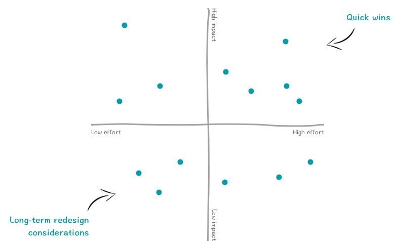
3. Prioritise your actions
When presenting the findings of a study to your stakeholders, make sure that the resulting actions are prioritized. In my experience, the prioritization of a study finding is mainly affected by two factors:
- Impact: Is it going to marginally improve content, or will it fix a huge usability issue that is costing us conversions?
- Effort: Is this a tiny content tweak that can be made in the CMS, or the introduction of a whole new site feature that needs building from scratch?
If you plot these actions on a hypothetical graph, you’d see the low-hanging fruit in one corner – this is the stuff you should be addressing right now. The opposite corner is still relevant but might be better considered as a longer term for the next larger-scale site redesign.
4. Compare historical trends (where relevant)
A lot of insights can be affected by the time that data was extracted. Google Analytics allows you to control your sample’s date range quite easily. This is pretty useful for benchmarking any data that we’re gathering, so take advantage of it whenever relevant.
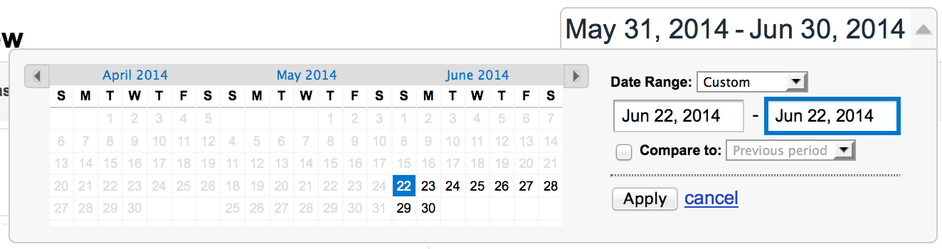
Sometimes, stats can fluctuate over time, which might be due to an outside event. For example, the traffic or behaviors of a museum website could change during school holidays, giving a very different view of the data regarding demographics and content interests.
An excellent way to keep track of this is by using annotations. Analytics allows you to add annotations on a specific date to highlight where these events might be occurring and affecting our data. You’ll also want to include other internal factors that could cause data fluctuations, such as the site going down for maintenance or a sale taking place.
5. Assign a value to goals
Google Analytics allows admins to create on-site goals and assign a monetary value to their completion. To go back to our museum example, if we know that the average order value for tickets is around $20, we can infer that this is the value of a visitor completing our ticket booking form.
Therefore, goal values give a much clearer impression of how much money things like bounce and exit rates cost us. This is a great way to sell proposed actions to your stakeholders and give them a much better idea of the return on investment that they’ll get for implementing the proposed change.
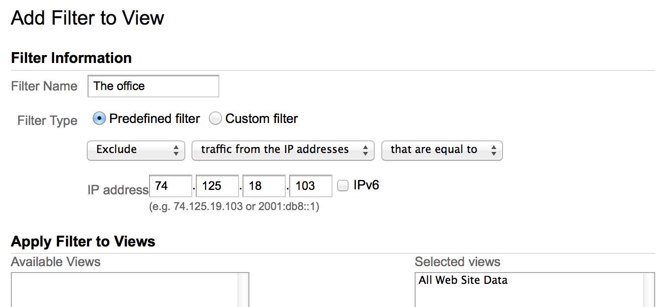
6. Filter out your internal traffic
This is a really important setting in your analytics that often gets forgotten. Internal stakeholders who aren’t representative of your target audience can often be looking at the site for content curation or reference purposes and skewing your data. After all, who can resist the temptation to go and have a look at that new content they were so proud of writing?
You can prevent this by setting up a filter in Google Analytics to exclude all traffic from a specific IP address (namely your office or place of work). It’s important to note that these filters aren’t retroactive, so I’d recommend this is the first thing you look into when setting up a new Google Analytics install.
Also, remember that sometimes internal stakeholders can actually be a valid audience for your site. For example, a large corporation might communicate with existing employees through the .com website. In these cases, treating internal audiences as an advanced data segment might be better rather than excluding them from the analytics altogether.
7. Use advanced segments
Speaking of advanced segments, they’re incredibly useful and should be used to answer all of those tricky audience-specific questions you’ll be setting. An advanced segment is essentially a permanent audience filter that can be applied to any analytics view. They’re fantastic for directly comparing the habits of two different user groups, and you can be as specific as you need to be when creating them.
In the example below, I’ve created an advanced segment for all elderly visitors who have made purchases using older versions of Internet Explorer.
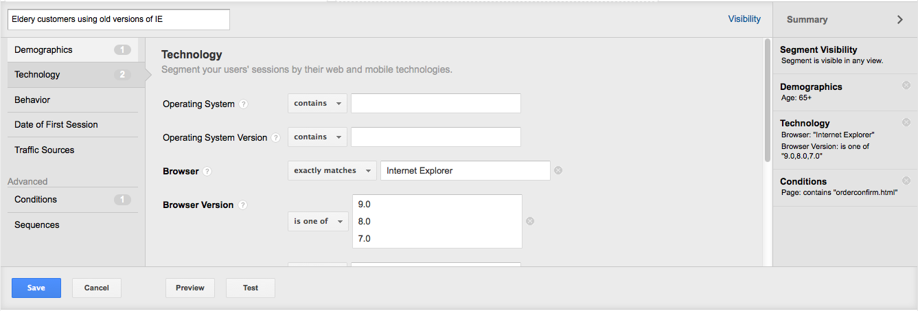
Obviously, it’s rarely necessary to be that specific in your segmentation, but it really demonstrates how complex Google Analytics has become. Just remember to always ask questions, and don’t create segments unless they’re going to provide those answers.
8. Leverage search analytics
Site search analytics are an extremely interesting and often overlooked way to see exactly what people are looking for on your site. They might seem like a no-brainer, but I’d say about 90% of the analytics installs I’ve looked at didn’t have this set up – and it only takes about 30 seconds!
Search analytics are especially useful since they can reveal what users might be after you haven’t accommodated them in your navigation or on your homepage. It might also bring to light that your visitors are using words or terms different from those you might expect, prompting changes to your navigation.
This is usually one of the first things I look at when doing a site audit, as it’s a very quick way to identify deficiencies in the site navigation or gaps in content.
9. Use dashboards for frequent reports
A lot of our audits might need to be repeated regularly. For example, it might be useful to provide stakeholders with a breakdown of top content or mobile device usage that is updated every month. The concept of an analytics dashboard isn’t anything new, but Google has made this extremely easy with the recent introduction of in-built dashboards in Google Analytics. We no longer have to spend time mucking around with the API and an excel spreadsheet, our useful dashboards can now be made in the application itself.
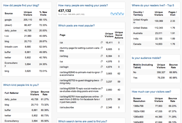
As per the previous advice in this post, try to structure your dashboards around answering questions instead of just providing reams of data. Check out this article from Econsultancy for some great examples of dashboards.
10. Avoid analysis paralysis
This is a simple one, but it’s probably the most important point of all.
Web analytics tools have provided us with a fantastic opportunity to get real user insights quickly and easily. But data without action isn’t any good to anyone. Always be actioning your insights, otherwise there isn’t much point gathering them in the first place.
Related Topics
Top