Styleguides have been around for years and have always been important to the visual identity of a company, but the rebrand of the term has given a new dimension to the whole concept.
In the olden days, a UI designer would create a loose interpretation of the basics. An overview of colours, fonts, buttons, and possibly and the style of icons and it would be saved away on a hard-drive, only ever to be opened when being sent to external agencies who need a glance at a visual direction for an upcoming project, or new starters to the design team, but it is very rarely held much importance to the actual in-house designers using it.
The main wealth of knowledge was generally lodged firmly at the forefront of the designer’s brain. This would mean a constant barrage of issues around trying to remember if a certain visual pattern was used before somewhere. This, 9 times out of 10, would end up in a chaotic mess of inconsistency.

In recent years, the styleguide has been given a refresh, and with the introduction of the concept of a Design System, or a Design Language. With this, comes a whole new approach that can epically effect how a product team approaches design as a whole.
With a solid, consistent, well explained and thought out system, the visual aspect of creating a design becomes totally modular. Products such as Craft by Invision or Brand.ai have made the visual design phase almost drag and drop to a certain extent.
Creating safety in the knowledge that the elements you’re using are consistent with every other designer on the team. They remove any animosity from the visual design phase, almost to a level where creating low-fidelity prototypes are a thing of the past.
“Styles come and go. Good design is a language, not a style.” – Massimo Vignelli
I’m not going to use this article as a way to explain how to exactly create a design system. I’ve already written an article around that: Creating a Design System Language. This is more a one-way discussion about how a design team can benefit from investing in a design system.
An introduction to our design system – QUIK
Over the last few years I’ve been heavily involved in creating design systems across various companies, from startups through to well-established organisations. My latest venture has been creating our design system for Qstream.
From very early on in my time at Qstream, I realised how essential it was that we introduced a fresh, working system to our design team as quick as possible. Inconsistencies and poor design choices plagued the product, and as the product and the design team expanded, it was vital to steady the ship and create a language that each designer could totally.
And with that, we began to create our new design system, aptly named QUIK – Qstream User Interface Kit.
Step 1: Inconsistencies
Again, I’m not going to go in too deep for the process as to how we created the system but I’ll give a quick run through as to how we got out of the weeds.
The first thing to do was to do a total audit of the visual components within the product. Brad Frost has put together a great article around how you go about doing a UI audit if you’re interested.
This can be an awful, time consuming, monotonous task, but it is so beneficial. It a) allows you to get a total understanding of where the main inconsistencies lie b) gives you a really good overview of what elements are important and used consistently throughout the product c) gives you a crash course on how exactly the product works and d) allows you to show the wider business the frailties of the existing visual system, and exactly why a new, consistent design system is needed.
A snippet of our UI Audit outlaying the inconsistency across the platforms UI.
Step 2: Creating the Elements
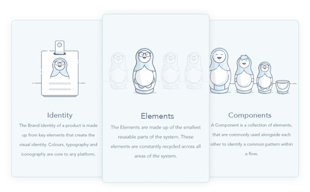
We broke down our system into 3 different entities.
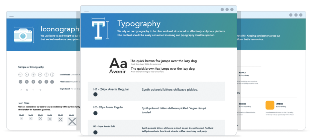
- Brand – The Brand Identity of a product is made up from key elements that create the visual identity. Colours, typography and iconography are core to any platform.
- Elements – The Elements are made up of the smallest reusable parts of the system. These elements are constantly recycled across all areas of the system. (Buttons, inputs)
- Components – A Component is a collection of elements, that are commonly used alongside each other to identify a common pattern within a flow. (Alerts, tables, cards, etc)
The next step is to prioritise, based on the UI audit, what elements are most commonly used across the product. These will be the first areas you tackle first.
Once we identified the key elements for the system, it was time to start creating the style and rules around each area. We tackled colours, typography, spacing and general iconography first before moving onto the more formed elements such as buttons, inputs etc.
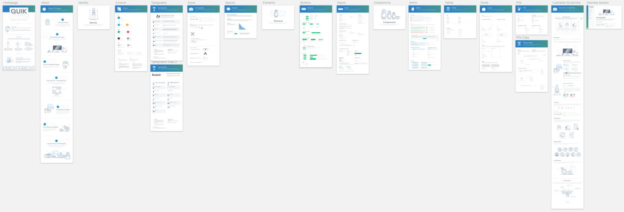
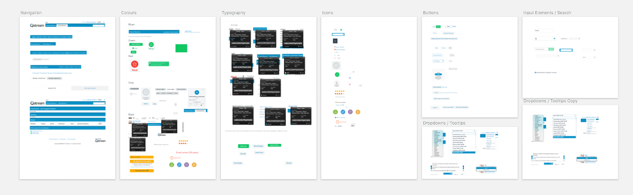
A birds eye overview of our whole System to date.
Obviously the deeper the system goes, the less frequent the elements are used, but it’s all part of growing the system and making the overall language as consistent as possible across all aspects of the product.
(We also have another project ongoing around our illustration style but I’ll save that for another article, you can see more around it here)

A sample of our illustrative style used across the platform.
Step 3: Implementation
We’re currently in this phase. To be honest, we’ll probably never move out of this phase. One thing that you’ve got to realise before you take on a challenge like this is that it will never end. You’re developing a product, it’s not a project that will eventually end. It will constantly be evolving and growing.
All you have to do is to take a look at how product teams have restructured to cater for design system teams, many opting for designers solely focused on working directly on their design system, nothing else. The system has become an integral part of a products core. When created properly, a design system creates focus, clarity and confidence and in turn will create consistency across the product and will speed up the turn around of product development. What’s not to love!
“A design system isn’t a project. It’s a product serving products.” – Nathan Curtis
Tying up the Systems
Creating a design system that works across the product is one thing. We’re also in the middle of creating brand guidelines as well as outline our design principles. (Again, more articles to follow regarding our process).
We feel it is key to create a solid foundation across all aspects of design before we move any further as without the proper scaffolding in place, it will cause issues down the line. Creating a solid set of guidelines and principles will help guide us in the correct direction when we start scaling up.
The plan, once we have QUIK to a level that we feel is consumable, is to create a Playbook that will house the key features of our products core personality and entity.
- Brand Guidelines – a set of guidelines that will introduce our brand personality as well as outline key characteristics such as tone of voice, colours, logo constraints etc.
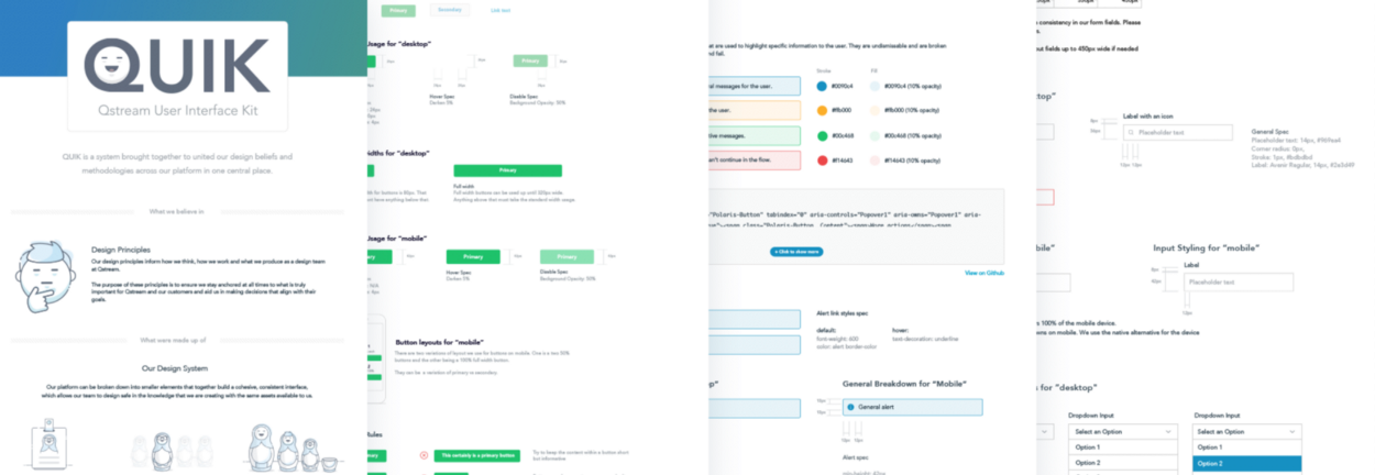
- QUIK – a system brought together to unite our design beliefs and methodologies across our platform in one central place.
- Design Principles – The purpose of the principles is to ensure we stay anchored at all times to what is truly important for Qstream and our customers. They will aid us in making decisions that align with their goals.
Going Forward
We’ll strive to create consistency across our platform. We’ve still a long way to go. Everyone, from all angles of the product team, is fully aware that this is a monstrous challenge, but we’re also equally aware of its importance for the scalability of the product.
Related Topics
Top