An Illustration is like any other form of design. It’s vital that it is consistent. The best way to do this is by creating guidelines across our illustrations
Why is it needed?
Identifying the core values and a high-level rationale as to why you need illustrations is key to outlining your style. Having a consistent style will obviously create an overarching style that will create harmony across you illustrations. It will mean that various illustrators can tackle illustrations on the same platform safe in the knowledge that their work will look part of the family.
Highlighting key areas such as a colour palette or the stroke weight are obviously vital to creating solidarity across a style. But outlining information such as the values attributed for the illustration style, or what you want to achieve from having them on your platform are also just as important.

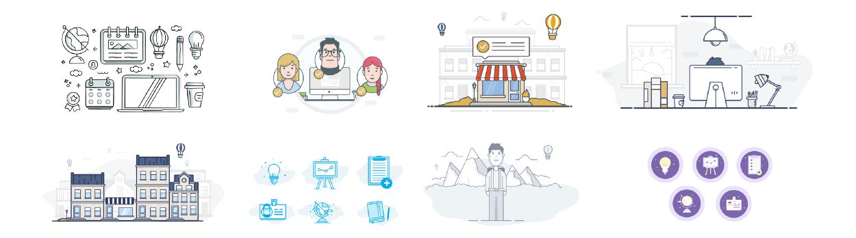
A sample of some exploratory styles
Don’t just jump in…
Before you start any project, it’s important that you understand exactly what you or the stakeholder wants to achieve from the project.
I generally break it down to the following few questions to give both myself and the stakeholder a better understanding as to what we’re trying to get out of the project.
1. Goals
Why do you want to introduce illustrations to the platform? How would you deem the project a success?
2. Existing Styleguide
If there are existing styleguides already in place, it obviously helps a great deal. It doesn’t have to be illustration based. Core design guidelines, brand guidelines, anything that feeds into the overall brand identity of the platform will help create focus.
Particularly existing colour palettes and how heavily you would expect the illustrations to lean on specific colours available. Even if the company has an existing colour palette, it doesn’t specifically mean that the illustration style should follow this. You’re illustrations may need to stand out away from the interface and using the brand colours might work against itself to a certain extent.
3. Values
How do you see the illustrations fitting into the platform. How do you feel the illustrations should shape your brand identity. Will they be fun, quirky, soft, passive, detailed, elegant, sharp etc. It’s basically a general synopsis of the style.
Even before you start you should have a general idea of how you want the illustrations to work within the interface, or how you want to use them, to educate the user, for basic empty states, or maybe you simply just to inject some personality into your project.
4. Moodboards
Create a moodboard of styles that you feel would be a direction that you feel might be a good fit for your product. This is always a really good way to get to to the point where the stakeholder can literally point at a style and say ‘I want that one’…. Obviously they can’t have ‘that one’ but it will give the illustrator a really good idea of what the stakeholder wants.
When creating a moodboard, they don’t need to be totally consistent. It’s more just to give an overview of what direction you think may work. There are various outlets to do the research, specifically Behance, Dribbble, Pinterest, iStock or even good old Google Images can work. It’s all about gathering as much information as possible before you ever go near an artboard.

Don’t just jump in. You have to figure out why you’re doing it first
Time to Pull up your Sleeves
Luckily enough, here’s one I prepared earlier. Having recently joined Globoforce, I was tasked with creating an illustrative style that would be used across our white-label platform.
Our main aim for our illustrations is to inject some personality into areas on the platform that felt unfinished. Or at a very high level: To create an overarching illustrative style that will introduce consistency across our platform.
Explore, Explore, Explore
No one said it was going to be an easy, quick process. We explored various styles that ended up in the bin. It’s all about exploring ideas. Nothing is really wasted, it all plays some part in finding the final solution. It’s just another hurdle you jump before getting to the finish line.
Some styles work, some don’t so you’re going to have to be willing to dump the ideas, that may be good, but just don’t work for what you’re trying to achieve for this particular project.
Our Language for Illustrations
It is import that everyone is on the same sheet when it comes to terminology. You have to create a language of terms that everyone is comfortable with. Terms that people understand. It doesn’t have to be too detailed, just a specific set of words that allows stakeholders and designers to be able to speak about illustrations without getting confused.
Our Icons
We use icons across the site to give prominence and to enhance the usability of specific elements across the interface. They can be used from 12px up to 64px. We have more rules around how to use iconography in our UI styleguide.

Iconography
Our Spot Illustrations
A spot illustration is used to help showcase a small feature or explain an experience. They’re lightweight, not too busy but are there to help enhance the flow by bringing the interface to life and delighting the user.
Spot Illustrations
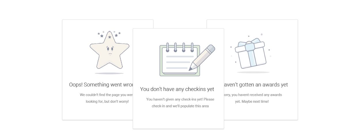
Our Empty State Illustrations
An empty state illustration is used to explain a feature but should never be the primary focus of the component. It is used to main as a way to address the need to fill an empty area but it also gives us a way to energise a possible lifeless area.

Empty State Illustrations
Our Scene Illustrations
A scene illustration works on a larger space and allows the user to explain a feature or a scenario with a more detailed driven approach.

Scene Illustrations
Our Approach
Illustrations can be use illustrations to bring our interface to life. They’re used to educate the user and help draw attention to specific features across a platform.
“Used to delight the user in an otherwise lifeless area”
Keep it Simple
As our product is a white label product, the illustrations will be used across a huge range of varying clients. For this reason we try to keep the style and concept as simple and as passive as possible.
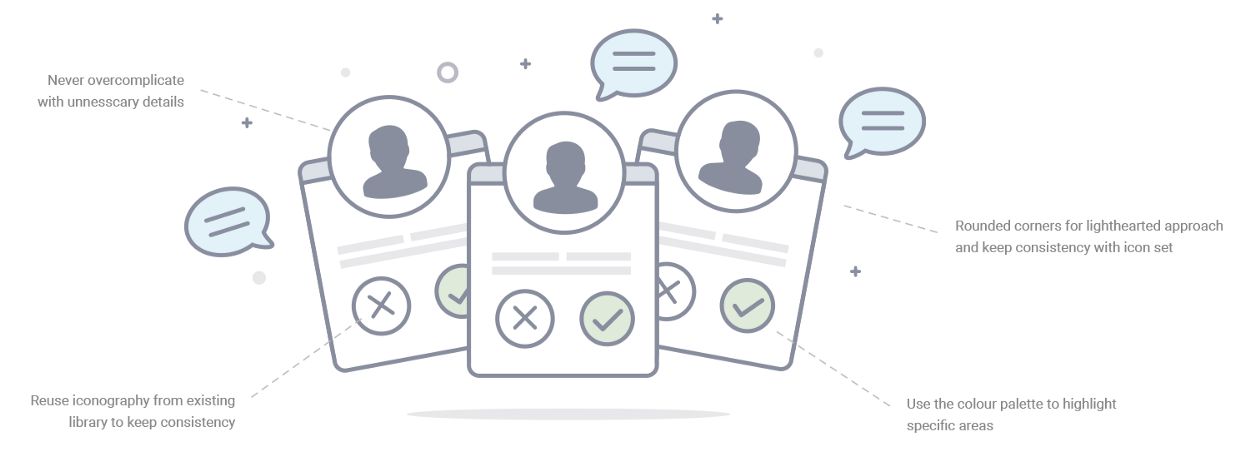
Use of Characters
We refrain from using characters where possible. The use of a character opens up questions regarding race and gender, and due to our wide range of clients it’s best to simplify as much as possible.

Colour Palette
Our colour palette was chosen carefully with the business in mind. It’s passive nature was chosen to complement our wide range of clients. Our aim is for our illustrations to delight the user without stepping on any brand team toes.
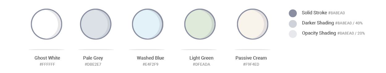
Colour Balance
We generally refrain from using too much colour in our illustrations. We try lean on our ‘Ghost White’ as much as possible, only introducing the rest of the colour palette to give the illustration balance.

Ghost white is our most frequent colour choice. Try use it for the key elements in the illustration
Reasons: The colour should not be used as a subjective choice. The illustration should be passive and not too noticeable. Colours can be used but we need to be selective when they’re being used. Our style is passive, not colourful.
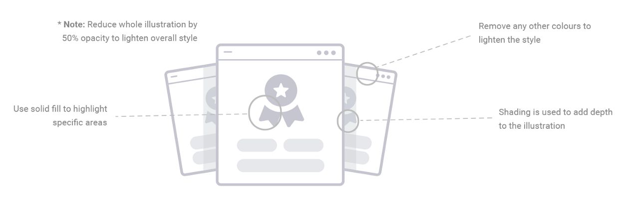
Colour Palette for Empty State Illustrations
We remove the options for the Empty State illustrations. We only use ‘Ghost White’ along with the Solid Stroke option. We allow for shading but never use any other colours. We have a 50% opacity on all illustrations to reduce the weighting.
Stroke Breakdown
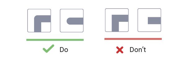
We use a consistent default smooth brush with a 6px stroke. We also allow for 3px stroke if there is smaller details needed in a tight space. We use a rounded cap at all times to work alongside our rounded corner approach.
*Note: We never deviate away from using #8A8EA0 as our stroke colour.

Stroke Caps
We use a rounded cap at all times to work alongside our rounded corner approach.
At the end of the day…
It’s pretty simple when you break it down. The main aim for an illustration style is you create a style that is consistent, recognisable and brings value to the platform. There are generally 3 steps you have to do to deliver:
- Identify why you need illustrations
- Create a style that works for you and your business
- Document your style so that going forward you have a solid style that will be easily cloned across other concepts.
You can see the full case study here.
You might also like: When Illustrations Matter to the Design Process.
Related Topics
Top