The Internet is chock-full of tips for developing your forms, but when you need to figure out where to start from, it will always be the user side that gives you the right perspective. After all, the main goal of a form is to get filled in – by humans, most of the time.
So what makes a web form visually appealing and easy to fill in? There is no direct answer, but a set of best practices that leads to it. The following form making steps are inspired from the advices of Luke Wroblewski, and other authoritative sources of knowledge upon web form usability.
1. Research, target and organize
There are three main phases of form implementation that should be carefully crafted – form design, on page placement and post-submission behavior. Before actually shaping the form, you should do a little documentation over the tools you are going to use, the public you address and the platform you build the form on. If you use a predefined template for your CMS that provides forms too, it’s a fair chance that they would be too generic; for extended flexibility and customizing options, consider a method to build forms yourself or use a dedicated app.
It’s important to choose the exact type of web form you need: contact form, registration form, order form, survey or others. Its purpose will then tell you how to structure the form and which fields to include. Also, make sure your form title matches its scope. Technology limitations on the user’s end are another thing to consider. If the form is to be accessed frequently from mobile devices, use a design that supports mobile displaying and avoid fields that could be difficult to manipulate, such as dropdown lists.
2. Make it pass the blink test
It’s 8 to 10 seconds that a visitor scans the webpage before making their decision to stay or leave – in other words, the time it takes before the first blink of an eye. The design and text of your form should make a friendly welcome to any viewer and focus his or her attention to the fields that call to be filled in.
Make good use of space, but don’t clutter the form – don’t be afraid of leaving blanks, as they let the form “breathe” and it will look as if requires less effort when filled in.
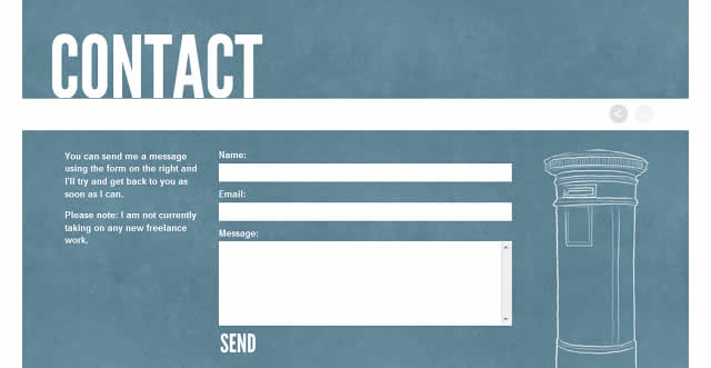
Avoid using the traditional grey-cream color code for your form, but make it match the look and feel of the overall webpage. Most times, it’s best to keep all elements “above the fold”, so that the entire form can be visualized from one glance, without scrolling. This greatly influences users’ decision whether to fill in the fields or not.
The quickest people realize what’s in there for them, the greatest chance for the form to be submitted; therefore you should make it clear what they will achieve by taking time to fill in the fields – an incentive, a problem being solved, the opportunity to make their voice heard. Include some details over this outcome in the form heading or at its side on the page.
Always remember to A/B test your form!
3. Match the natural attention flow
Two main principles of web design say: “don’t squander users’ patience” and “use conventions that follow users’ expectations”. The layout of your form should do the same. All form elements have to convey the KISS rule: fields, labels, actions, input fields, help and instructions, system messages, form validation, security.
It’s a good idea to establish your set of conventions from the start and not give them up as you go. For example, if you choose to align labels above the field (which slows down reading but makes users focus upon their content), keep this procedure in the entire form. It’s most common for error messages to be highlighted in warning colors (red, orange), so don’t use green for them.
To require less effort, get users to choose, not type – so radio buttons, likert scales and checkboxes should replace text boxes wherever possible. Always provide guidance in filling in the fields. Write labels in a friendly and brief manner; if additional details are needed include instructions below the field. Field validation should be easy to understand for users – e.g. for phone numbers make it obvious what is the exact format expected, so people won’t have to go through an error message then return and correct the possibly mistaken input.
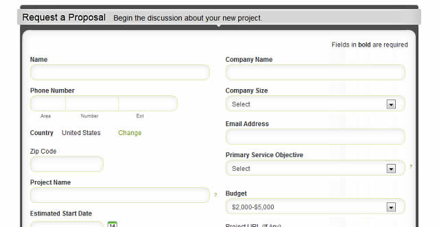
Every once in a while, eyes move away from the particular spot in order to get the general picture, so make it easy to see the progress – if your form is longer, split it into pages and display a progress bar in the header or footer. Content should be divided into meaningful sections, for the same reason. Generally, a one-column layout is preferable for shorter forms; if you need to include two, make sure users won’t be tempted to ignore it visually.
4. Place the form somewhere easy to get to
Once your form is ready, it should be placed on the page in a manner that attracts attention. The best fill-in rates are obtained with forms that are embedded on the page, not linked to. This option also has the advantage of keeping the user on the spot. For contact forms and get-quote forms, it’s common to create a special website tab that can be placed in the header, footer or sidebar (the most visible of all spots).
5. Prevent spam but don’t inhibit users
The most common security option used in forms is CAPTCHA – an image composed of distorted alphanumeric characters that can only be deciphered by humans, excluding bots. This is a good method to keep spam away, but make sure the characters are not too hard to read, otherwise you will hinder legitimate users that could abandon the form.

The best alternative is smart CAPTCHA that only shows up if there is a sign of abuse over the form. There are, of course, other security options too that you could include in your forms: limitation of submissions per IP, country filter, or password protected forms for internal company use.
6. Form behavior after being submitted – get the most out of it
Your communication with users doesn’t end once they hit the Submit button. It’s always a good idea to show your courtesy by sending them a confirmation message such as “Your message has been sent, thank you for filling in our form!” You can also redirect him to a certain webpage that may load automatically upon submission.
After submission, the form can either interact with a database or/and send a notification email to the administrator to signal that the form has been filled in. Generating database entries that will be populated with submitted information is especially useful if you need to view it as a table or export it for further manipulation.
Businesses can integrate form submissions into their sales and marketing workflow with the help of dedicated applications. This can be achieved by setting the form to communicate with a third party application through an API key that allows importing data automatically into the structure of the respective application. The form data can then be used within CRMs, mass email systems and so on – such as Sales Force, MailChimp or AWeber.
Usually it’s the contact data being imported from forms to third party apps, for further use within the system, but this is not restrictive – for your form’s post submission behavior, the sky’s the limit!
Related Topics
Top