Companies typically have objectives in mind when they create websites. Maybe they want to promote a brand name or gain members. Perhaps they are trying to boost online sales.
For some companies, goals might revolve around clicks to boost ad revenue. Whatever the purpose of a website, knowing how to track and optimize conversion rates is crucial for creating effective marketing strategies.
Why Conversion Rates Matter
The website conversion rate is a useful metric to track the success (or failure) of a website’s intended purpose to better predict expected outcomes of planned marketing strategies. Using conversion rate data collected over a specified time can help business managers measure the return on investment from marketing strategies. In this same way, conversion rates can help with the management of user-interface design.
Much like a science experiment, you can change marketing elements separately and watch how they affect the conversion rate to home in on the most effective marketing approach.
For example, you could run an advertising campaign and leave the website design completely alone to see what effect the campaign has on the conversion rate. Then, make a few changes to the site design halfway through the campaign to see if conversion rates change. All of these conversion rate analyses can help you make better marketing decisions moving forward.
The Psychology of Website Users
To understand how to best design a site for high conversion rates, you must first understand how the mind of a visitor works. Humans, though unique and complex, tend to operate in similar ways when it comes to web behavior. Some fundamental psychological principles can help you better predict website user response.
1. The Law of Pithiness
Essentially, the Law of Pithiness states that people favor concisely communicated, well-organized items over excessively complex plans. When it comes to web design, users want to find the information they need as easily and quickly as possible. It may be tempting to create a wacky, out-of-the-box design, but if users cannot figure it out, the design will likely push them away.
2. Hick’s Law
Hick’s Law is the idea that increased choices lead to increased decision time. This is also referred to as the paradox of choice.
Though giving site users more options might seem like an ideal marketing tactic, it can hinder their ability to make a decision, and they may end up leaving before taking a desired action.
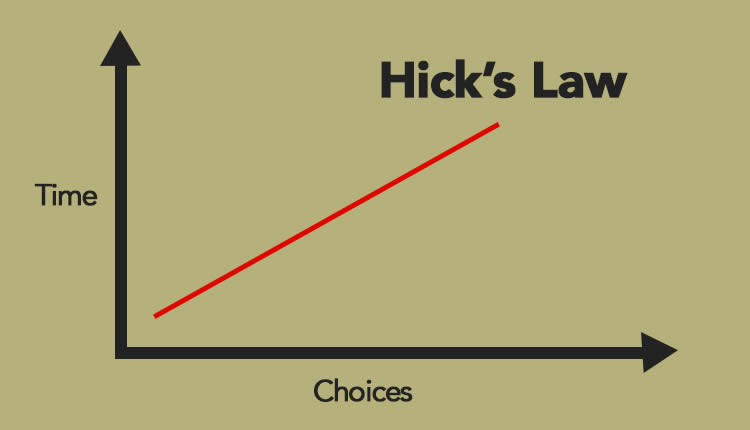
Minimalistic designs eliminate the tendency to overthink, thus guiding visitors to desired actions.
3. Fitt’s Law
A target’s size and distance from the user’s current position determines the time required to reach it.
This is the basic idea of Fitt’s Law. In terms of web design and conversion rates, this law can be used to establish the ideal size of a clickable area.
4. Rule of Thirds and the Golden Ratio
People tend to prefer aesthetically pleasing site layouts. The rule of thirds is a photography composition principle that involves the way eyes tend to scan a page. Designs should be broken up into horizontal and vertical thirds, creating a nine-square grid. When the subject of a picture is placed on an intersection of horizontal and vertical lines, it is said to be more visually pleasing.
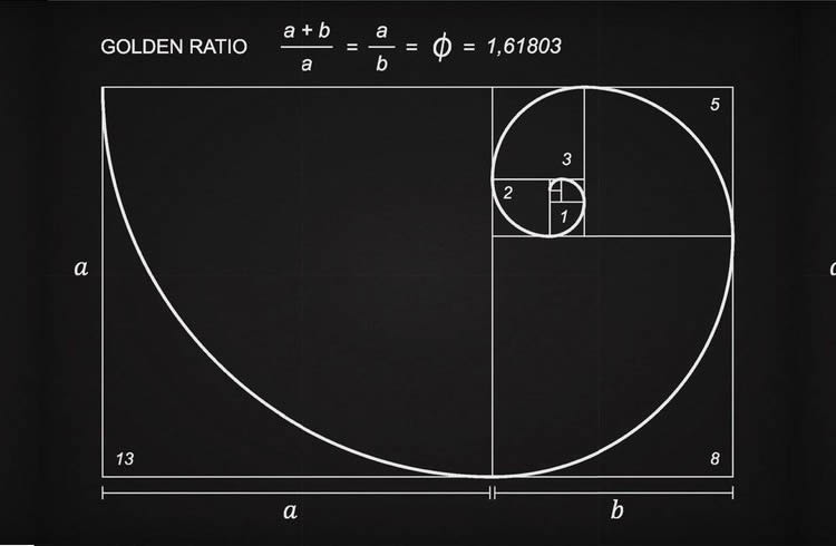
Similarly, the golden ratio utilizes naturally occurring patterns to create a visually pleasing design. The optimal 0.618 ratio of height to width creates a spiral that draws the eye in to focus on the subject. Designers can use both the rule of thirds and the golden ratio to determine the appropriate placement of important page elements such as call-to-action buttons.
Web Design Elements to Boost Conversion Rates
Site design is a major factor of conversion potential. There are many common mistakes companies make that kill their conversions. Using the psychological principles above, web designers can make simple changes that can increase user-friendliness to encourage more conversions.
Clean and Attractive Landing Page
The landing page is usually the first impression a website makes on a visitor. If the design is too chaotic or confusing, the user will likely leave before spending more time on the site.
Simplicity is key when it comes to designing an effective landing page. Give only the essential information and do not create too many distractions.
Logical Site Map
When navigating a website, users want to know where to look, even if they’ve never visited the site before. It can be tempting to show off your creative thinking skills by throwing users a curveball, but most sitemaps are similar for a reason.
Intuitive page categorization leads to user-friendliness, which helps increase engagement. Stick with the principles outlined in the law of pithiness – don’t stray too far from standard site organization.
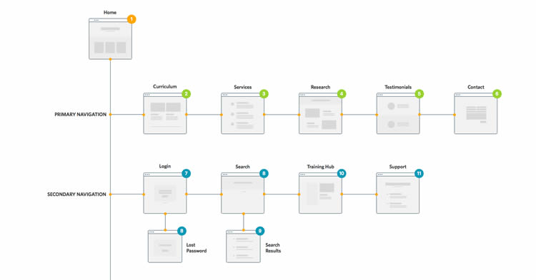
Site Map by Zarin Ficklin
Useful and Relatable Content
People are drawn in by what speaks to them personally. If they are searching for specific information, they probably won’t stay on a site that has content filled with fluff and self-promotion.
If they are looking into purchasing a product, they will look for reasons to trust the company selling it. The written content on your site must be compelling and well researched to draw in readers and build trustworthiness.
Effective Call to Action
Call-to-action buttons hold great conversion rate potential, but if they are designed poorly, they may simply be ignored. Gain the user’s interest with specific, intriguing copy that shows the value of clicking on a link.
The button should be large enough to be seen and have bright colors and bold, readable text. Place it in a prime spot on the page to ensure it will not be missed. In some cases, you may want to put it in more than one place.
Simple Forms
Following the law of pithiness, keeping forms simple can decrease user frustration and increase the likelihood of form completion.
Ask only for essential information and use a clean, organized form interface. Studies show that conversion rates increase significantly when the number of form fields is reduced.
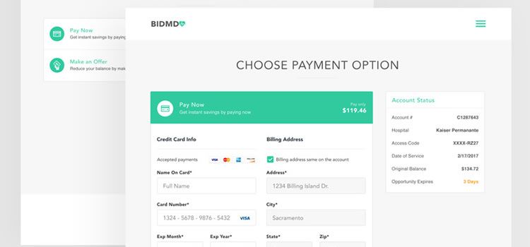
Booking Form by Wen Tong.
Responsive Web Design
With more and more website users browsing the web on smartphones and tablets, incorporating responsive web design is becoming imperative. Responsive web design allows a site’s formatting to adjust to browser windows of different sizes.
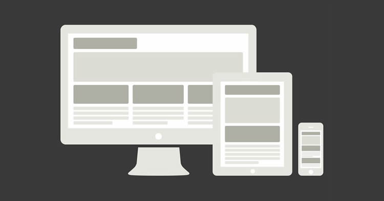
Menus that stretch across the top of a screen in desktop view may be condensed to accommodate for smaller mobile devices. Columns can adapt according to screen size by stacking, so only vertical scrolling is needed to search a page. Google favors responsive sites as well. If your website is not designed to accommodate different user interfaces, you could be missing out on thousands of potential visitors.
Load Time
People are becoming increasingly impatient. With the whole world at their fingertips, they usually do not want to wait around for a site to load to get the information they need. A poor site loading time could also decrease the chances of a user completing an eCommerce purchase.
Users may also associate poor loading times with a non-secure server and worry that their payment information will not be safe. Make sure to optimize file sizes for your site and ensure that your server is up to date to avoid losing conversions.
Familiarizing yourself with conversion rates and utilizing conversion metrics is a great way to improve your marketing strategies and track progress. Keep fundamental psychological principles in mind when working on a site design to make engaging, easy-to-navigate pages.
Stay on top of advancements in website technology to ensure your site’s responsiveness and load times are optimal. If needed, reach out to a digital marketing agency to help you optimize your site conversions.
Related Topics
Top