Perception is everything. Part of that is influenced by behavior, plus our emotion. Significant studies have shown that color effects not just what we see. It is how we feel about it and that influences our behavior. Sure, what we write and how that is presented is important. We do not, however, want to forget the design elements. Non-verbal cues are just as important to any message we are trying to convey.
That being the case let’s take a look at the design and the importance of color in its creation. When you begin building a site it is tempting to use colors that are pleasing to ourselves. We want it to look good based on our own perceptions. Unfortunately, that does not always translate into customer attraction. That, in the end, is what we want, right?
Marketing is all about psychology and how colors affect our emotional state. It is described in many psychological studies. Any design we decide on for our websites should focus on your target customer and the goods you offer. Color decisions can help with that.
It can be a challenging thing, to come up with the perfect color scheme for your website. You want people to like it because they won’t mind staying for a while to see what you have to offer. To do it you need to use strategy with your color uses and look at all sides of it.
For instance, red is considered by some as a passionate color and by others an angry color. To make your color decisions you must understand what you are offering.
Coloring What You Offer

It is an innovative idea to match what you offer with an appropriate color. Landscapers will often use green, or brown coloring in their sites. This is because many see those colors as earthy and very nature like.
Have you ever noticed a pizza box? They use a lot of red in the coloring because it is believed red also can promote appetite. It is a promising idea if you are selling food, right? This is a good example of color and marketing.
Coloring Your Marketing
It is considered essential in marketing to understand coloring. It is a powerful piece of equipment in your tool belt. With the proper use of coloring, you can grab customer attention. You can also improve the site user experience.
If the colors are off-putting, visitors to your site won’t want to hang out and see what you have to offer. Many purchasing decisions are completely emotionally based. That is why your preferences for what you want to buy can be tweaked by coloring.
Influencing with Color
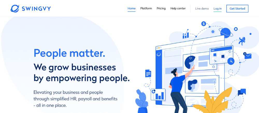
Distinct types of consumers are influenced by different things. Impulsive buyers are more apt to respond to black or orange-red coloring. Royal blue is also a lure to those types of buyers. Take a look at clearance sales, or fast food advertising. You will find those types of venues will use the aforementioned colors.
Consumers who keep a strict budget are conscious of navy blue or teal. If you look around you will see many banks and large department stores use those.
The average shopper will find themselves drawn to pink, sky blue and rose colors. Clothing stores use these to their advantage.
Different Genders, Different Colors
As with many things, color preference differs between the sexes. Women like softer colors with tints. Green, purple and green will attract women more quickly. Orange brown and grays tend to turn them away. Men, however, prefer bolder colors. Black, blue and green work for them better. Brown, purple, and orange don’t work as well with them.
It would be a good idea at this point to look at individual colors and what they are attached to.
White
Scientifically white reflects light and can strain a person’s eyes. For business, white indicates equality and also fairness. Organization and equality are another connection with the color white.
Red
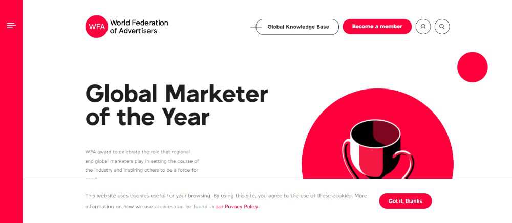
This color can cause an uptick in breathing and heartbeats. Red is intense and, in some degree, powerful. It is attached to aggression and demands. Oddly, as mentioned above, it is a help to appetite.
Pink
Pink is nurturing and non-threatening. It is compassionate and calming. Some associate it with romance.
Blue
Lighter shades of blue can also have a calming, tranquil effect. The darker shades have a stimulating effect on the mind. It can promote thinking more clearly. For some people though, it creates depression.
Green

Green is the easiest on the eyes. It is one of the few that both men and woman are attracted to. It can be relaxing and that is the reason the waiting room at talk show studios are painted green.
Yellow
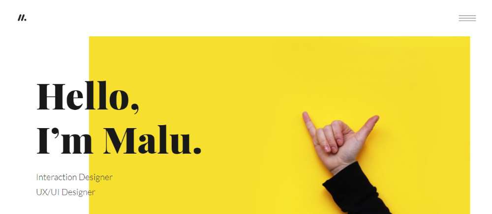
This one cries out for attention. That makes it risky to use if you are not careful with the shade. The right tint of yellow can lift the spirits, the wrong one can be irritating to the emotions.
Orange
Orange is tied to happiness. It can be uplifting and an effective way to promote conversation. It also can stimulate appetite and business uses it to encourage confidence.
Purple
Wealth, as well as royalty, is tied to this color. It can stimulate contemplation and the mind. The wrong shade can come off as cheap and tacky though. It is something to be aware of.
Brown
As a reflective color, brown can be used as a supportive color as well. It is associated with organic, earthly things. Natural things.
Gray
There are no obvious reactions to gray. The one thing to watch out for is the wrong shade can dampen the colors around it.
Black
Power and authority come with the color black. Depending on the presentation it can appear sophisticated or intimidating.
To Conclude
If you want to capture the attention of visitors, leading them to, perhaps, purchase what you have. It would be a promising idea to investigate colors. The associated effects they have on consumers might be significant.
When designing your website, colors should not be an arbitrary decision. Choosing your colors should be a careful consideration that could lead to success.
Ben Pines is CMO at Elementor, a WordPress website builder with over 700.000 users and counting. Ben has been in the online marketing industry for over 10 years, specializing in content marketing. WordPress has been Ben’s platform of choice since the time it was used solely for blogging.
Related Topics
Top

