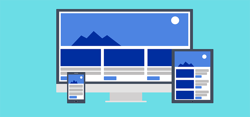
With the sheer number of devices and screen sizes out there, responsive design has become standard protocol. It’s vital that we design for and test our websites to ensure that users can navigate and easily access content – regardless of how they’re accessing it.
As with just about everything in the web design space, there are different philosophies for how we should approach the design for smaller screens in particular. But, those differences aside, there are some tenets of responsive design that we should all keep in mind.
When designing your next website, think about the following as you customize for mobile devices:
Readability and Usability Come First
Everyone wants their design to look beautiful on every screen. But there is a danger in trying to get a bit too fancy when it comes to mobile. A high-end layout or feature that looks stunning on a desktop may just not make sense for a phone.
Things need to be simplified, where appropriate. If it turns out that a specific element is just too clunky on a small screen – there’s no shame in removing it or replacing it with something that does the job more effectively.
When it comes to typography, size and contrast are just as (if not more) important on a phone. Staring at even high-quality mobile screens can still be a bit tedious when reading long articles. Make sure that text is a decent size and that line spacing and margins are set to help increase readability.
The takeaway is that the same effort that goes into usability for desktop users should also go towards making the mobile experience a great one.

Take Advantage of Available Screen Real Estate
Multi-column layouts are ubiquitous, but text-heavy columns often aren’t appropriate for the smallest of screens. In that case, it makes sense to simply turn multiple columns into a single column. But when we’re talking about both tablets and even phones held in landscape orientation, columns can still be quite effective.
The point is that it’s worth the extra effort to see how we might best use whatever screen real estate we have available to us. So many times, we roll right past these in-between resolutions and instead focus on solutions for only the smallest and largest viewports. A tablet in portrait orientation, for example, should be thought of differently than a phone in that same view.
One of the easier ways to implement this type of strategy is by using CSS Flexbox. Properly configured, it is often quite good at automatically serving up the best layout for the current viewport. You may need to make some slight adjustments via media queries, but the results are worth that little bit of additional tweaking.

Everything Doesn’t Have to Be in the Same Exact Spot
It’s easy to fall into the trap of placing every single design element in the same relative spot for both mobile and desktop viewports. And, while the desire for consistency is laudable, this approach can sometimes really backfire on smaller screens.
For example, many websites place items such as search forms or social media icons in their header. That works wonderfully on a larger screen, but can often get in the way of the main content on a phone. This is especially the case on secondary pages, where users may really just want to read the text of the page and not have to worry about all the extraneous junk.
There are several options beyond just sticking those types of items uncomfortably the site’s header. You might consider tucking those items within a button that displays them at the user’s request. Or, they could become part of whatever mobile navigation solution you’ve implemented.
The same thing may also apply to features such as sidebars. Other elements may be hidden altogether. Again, media queries (and maybe some conditional code) can place these items into more appropriate spots on mobile devices. Use your best judgement as to what should go where.
Add Mobile-Specific Features
When thinking about your responsive design strategy, you might consider adding some small touches that bring a higher level of convenience to mobile users. These items usually don’t take much extra effort to implement. Yet, they can go a long way towards improving usability.
Browsing on a touch-enabled device can bring about some challenges that desktop users don’t have to deal with. For one, having to scroll up from a long page in order to get back to the main navigation is a major pain point on mobile. You can mitigate this to some extent by using navigation that automatically displays when it detects that the user is scrolling upwards. Another option is to have a good old “Back to Top” link at the bottom of each page.
For businesses that encourage phone calls, a click-to-call button can be a welcome feature. That could take the form of a traditional button that literally says “Call Us Now”, or by hyperlinking any mentions of the phone number throughout the site.
Essentially, anything you can do to help mobile users interact with your organization is worth considering.

Mobile Matters
Responsive design is an incredibly powerful tool. We can use it to provide users with the best possible experience on virtually any device (well, maybe not on your dad’s old flip phone, but we digress). But it’s up to us as designers to take full advantage of the possibilities.
First and foremost, it’s about ensuring that mobile users can easily browse and navigate your site. From there, make the smartest design decisions that you can with regards to how things look and work. If you make users happy, they’ll be more likely to come back again (and tell their friends).
Related Topics
Top