The number of mobile internet users has far surpassed the number of desktop users, eliminating the question of whether or not websites need to be adapted to devices of varying sizes – they have to.
You don’t get to decide which device people use to access your website. But how do you decide how each page should change at each break point? Is it acceptable to squeeze your content through a funnel and hope it comes out looking responsively optimized, or should you step back and take a more calculated approach?
Using a tool like Safari’s responsive mode or similar tools in other browsers can help you to easily switch between breakpoints to test and optimize each breakpoint appropriately. In order to help you make these decisions about your own breakpoint modifications, here are a few elements we commonly adapt in order to better fit our mobile sites.
Adapting Your Content to a Smaller Space
In general, mobile sites should have all the content and power of the desktop site, but we sometimes make the decision to hide photos or illustrations when the main content is textual, particularly in cases where the imagery’s original purpose was to provide visual balance. These are a few of the content elements we choose to alter when adapting to a smaller screen size.
In Western Society, we read top to bottom, left to right. When shrinking down the content to fit a smaller screen size, we keep this in mind, making sure to preserve the important stuff at the top, while pushing the rest down according to hierarchy.
![]()
Icon Transition Menu by Silvia Sánchez
Primary navigation, for example, is aptly named; it is a user’s primary source to navigate through your site and it would be detrimental to your conversion rate to make it hard to find. On mobile, it has become common practice to shrink the menu down into a small hamburger icon and make it collapsible, always within finger touch reach.
It is a popular technique now for mobile websites to use a menu icon that expands when needed, like on the WashingtonPost.com:

Image Source: washingtonpost.com
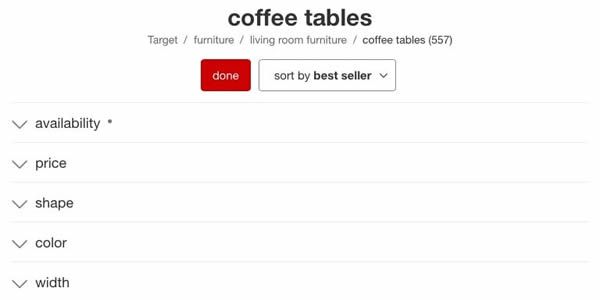
Other navigation aids, such as filters, while fully visible on desktop, are collapsed in mobile so that they use space only when needed.
Target, among other popular shopping sites, choose to auto-collapse their product filters on mobile, leaving extra space unless required:

Image Source: target.com
When adapting navigation, it is important to keep in mind that your fingertips are larger than a mouse pointer. When your cursor is the tip of your finger, we need larger targets to tap and can’t guide you with hover feedback, meaning forms and fields require additional design work.
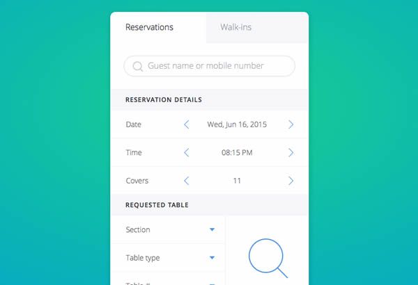
The ability to fill out a form pain-free is crucial to keeping a customer engaged; if they can’t complete their purchase with ease, why would they come back? First off, there should be no need to scroll horizontally – ever. Since everything has to fit in a single, narrow list view then, buttons can be made larger and spaced further apart to accommodate touch input, and collapsing lists can make it easier to browse content that can easily be organized into categories.

Mobile Form by Ante Matijaca
In addition to navigation through a website, enlarging elements on a smaller screen can be helpful for navigating through your physical location as well.
Most of us use Apple or Google maps, so placing an interactive map somewhere on a website is a great way to easily show visitors where your storefront is located.
When we embed maps on a webpage, there are a few pitfalls encountered on a smaller device. Because these maps allow a user to zoom and pan, they can hijack a user’s ability to read through the webpage when they react to input. In some cases, the map even fills the entire screen, inhibiting their ability to scroll beyond it at all. To solve this, we disable map interactions initially, while still providing an option for the user to enable it if they so desire – the map works when you need it, but remains out of the way when it’s not.
In addition, making a map large enough to be useful can compromise the ability to view other content on the page, so we add a “full screen” button on mobile for a better user experience. By clicking it, the map will fill the screen and interact just as we expect the Maps application to.
At the click of a button, Price Rite’s map goes full screen on a phone or tablet, without the user having to exit their browser and enter a separate application:

Another execution that benefits mobile is to nix hover events and further cater to touch interaction. Hover events are helpful on desktop; they can alert the user that they have the ability to interact with whatever it is they are hovering their cursor over, such as an image, text link or button.
However, touch screens do not detect whether a finger is “hovering,” rendering hover events useless and even cumbersome. Some mobile sites will require a user to click a link twice: once to activate the hover event, and a second time to trigger the actual action. Instead of taking this route, we remove hover events from our sites while being viewed on mobile devices to make mobile navigation a more flawless experience.
On mobile, we augment or completely replace hover behaviors with an onClick state. The moment a user taps an action, immediate feedback is shown before the response has time to load – a crucial piece of feedback on occasionally dodgy mobile networks.
This lessens user confusion: did you click or not? Was the action successful? Should I keep clicking until I get a response? This pairs nicely on mobile (and desktop) with the load status indicator (LSI), which displays a small, unobtrusive animation to alert the user that a page is loading. While most desktop computers are fast enough to eliminate the need for an LSI, we find that on older, slower mobile devices, possibly struggling to keep a connection, it is a necessary indication.
These alterations can not only help to retain customer attention and their ability to navigate, but improve the overall functionality of the mobile site overall.
Animations
Although alterations to a site can do the trick under most circumstances, there are times when features on a webpage need to be abandoned all together. While crafty, delightful animations can greatly improve a desktop experience, they can be obnoxious and intrusive on a smaller device, adding frustration to a user’s impression of your brand.

Parallax and similar fancy scrolling events – make for a unique and memorable experience on a desktop with a fast network connection and high-powered processor, but introduce confusion on a phone or tablet because the screen does not move predictably when swiping as it does with a mouse.
For mobile, we make the choice to remove fancy scroll takeover events, much like Fitbit did on their product page for Charge. They disable the parallax sliding and what remains is a single mobile-friendly page with a simplified, stutter-free experience.
Not only parallax scrolling, but anything resource-intensive should be reconsidered on mobile as it can bog down mobile browsing. WWF’s Tiger Challenge site makes the choice of skipping the animated introduction when accessed from a mobile device. When it comes to finding that balance between a fun, expressive website and the experience it compromises on mobile, sometimes less is more.
Conclusion
It is clear that adapting for mobile web design is a must when it comes to developing a website and we hope this article helps you to begin to see the pattern of what goes into making each breakpoint an ideal experience for your users.
At the end of the day, responsiveness should improve an experience, not add frustration, even if it means forfeiting a fancy effect that works perfect on desktop.
Related Topics
Top