There are 7 billion people on our planet, yet no two people are perfectly identical, so in actual fact there are several billion opinions about any given issue or topic. With these stats the designer who creates logos faces an uphill marathon.
How can a logo designer overcome this? Be prepared. They should have a good knowledge of graphic software, techniques and currents trends, while at the same time he is an artist who should have knowledge of design and should posses a certain creative calling for this domain.
To round-up, a logo designer is an artist who specializes in graphic software and is well aware of current trends and preferences. Very few people will fully meet this criteria, and that is why there are so few truly great logo designers.
The art of creating logos takes an enormous amounts of work, even if it at a first glance it may not look that way; creating logos implies talent and creativity but there are some rules to follow in the logo designs fascinating process. In this article, we will take a look at some of them:

Compositional Rules
1. Less Colors & Fonts
To establish reliable logo design rules, statisticians and designers analyzed an astonishing number of logos. Their statistics revealed: The majority of logos use no more than three colors and fonts. The use of too many fonts in addition with a great number of nuances makes if difficult to accomplish the logos initial purpose… to be retain-able.
2. Use Regular Fonts
The statistics revealed another interesting fact: numerous logos from large and popular companies use common fonts such as Arial, Times New Romans, and Helvetica.
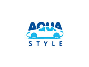
3. Simple Shapes Put You in a Good Shape!
It is highly recommended to draw simple shapes in the process of creating logos. Have a look at the logos below, two of them respect this rule and one that doesn’t.
4. Avoid Highlights, Gradients and Shadows
This conceptual rule is strictly linked with the next one, but this is about the composition of the logo. Anyway, consider the positive aspects of a logo that lacks highlights, gradients or shadows.
Structural Rules
5. A Good Logo Should be Easily Rendered on all Types of Media
We are living a radical revolution in media: before the internet, the methods for promotion were simple and few, with the most obvious being print. Nowadays the possibilities are far greater, but this has also become troublesome from the designers point of view, logo designers in particular.
A logo should look great on a website that can be accessed from a high performing computer with a display of 22-24 inches, from a smartphone that has a few inches display or from a simple mobile with wi-fi access capabilities.
The client will probably want the logo displayed on a business card or on a poster or even on a T-shirt. All of these types of media (with the exception of T-shirt design, it is not a media but requires some particularities in its design) need some specific treatment. Thus a logo that looks good on all of these is much more appreciated.
6. A Logo Should Always Look Good in Black & White
Its good practice to initially sketch on paper with a pencil your logo ideas, allowing for multiple revisions, and then proceeding to draw it with the help of graphic software – Photoshop or Illustrator – but only in black and white format.
This rule helps to emphasize the idea or notion of a logo and not its composition …we have no color shadow, only the concept.
Conceptual Rules
7. A Logo Should Respect the “KISS” (Keep It Simple Stupid)
The purpose of a logo is not to reveal as many chunks of information as possible, nor is to present the skills or the services offered by the client – it should only make the connections between a high quality product and you.
To put it simpler, a logo is the small thing that makes people remember the big thing. So, to easily stand out and be remembered, having a simple composition is a must.
8. A Logo Should be Memorable
Here, unfortunately, nobody can give you any help or advice, it is impossible. To say that using TNR will make a logo memorable opposed to using Arial or that this color works better than color would be wrong.
As was mentioned previously, the process of creating logos is an art and a science at the same time… In this article we have only covered the artistic part.
Maybe we can offer one small piece of advice: making a logo timeless will surely make it memorable for a long time. Here are some examples of timeless logos:
Conclusion
There are some rules, but nobody can guarantee that if you follow these rules you will be able to create exceptional logos. A good opportunity to find the positive and negative from your logo works is to post them on websites that offer you feedback, and attempt to act on it.
Top