Most modern website designers strive to deliver an honest user experience. Some, however, will do anything to boost conversion rates – even going as far as to trick users into taking certain actions.
All digital interactions come with a level of risk from cybercriminals, but some unethical web design practices cross the line into criminality. Learning what “dark patterns” are and how to avoid them can help your brand steer clear of this extremely harmful mistake.
A Fine Line Between Influencing User Behavior and Tricking People
We’ve all experienced it – clickbait that sends us to sketchy landing pages, false pop-up advertisements telling us to click here to prevent computer viruses, emails that use spammy lingo to grab attention.
The World Wide Web has been around for 30 years, and cyber scam artists just as long. Savvy web users know how to identify most scams and avoid them. Unfortunately, unethical web design practices are blurring the lines between true and false, and making it more difficult to spot tricks.
When users browse the internet, they do so with some degree of caution. Most people have developed a healthy wariness, triggered by things like poorly designed websites and annoying pop-up advertisements.
Users have fallen prey to cybercriminals that steal sensitive information or dump viruses onto their devices too often to blindly trust web content. Yet some website designers have found a way to avoid user suspicion and trick them into falling into their traps – using dark patterns in UI development.
What are Dark Patterns?
UI is the heart of website design and functionality. Dark patterns in UI are the tricks websites and apps use to trap users into signing up for or buying something accidentally. The purpose of dark patterns in UI design is to hide the real intentions of the website and/or company from the user until it’s too late.
Companies use dark patterns by taking advantage of the dual readership path – the fact that many readers skim web content.
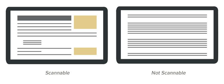
An unethical company might make certain phrases bold or in a large font, and make the truth of what they’re saying more difficult to find (i.e., in fine print along the very bottom of the page). That way, someone skimming the site would believe the company is saying one thing, when really it’s saying another. Dark patterns are dangerous because they can trick people into taking actions they otherwise wouldn’t have, such as buying a product or subscription.
Some sites may not be aware that the sales tactics they’re using qualify as dark patterns. For example, pushy sales advertisements users have to minimize before accessing the webpage’s content are common tactics many sites use. These dark patterns are becoming less and less acceptable, however.
Google has begun to penalize websites with “intrusive interstitials” – pop-up ads or email capture lightboxes. That’s because users have gotten fed up with these questionable practices, and search engines are taking note.
Learn a few common examples of dark patterns to avoid losing favor with users and falling in the rankings.
Confirm Shaming
One of the most prominent dark patterns found on today’s sites is known as “confirm shaming.” This is when a site generates an email capture lightbox (a window asking for an email address before you can go to the site) with a sentence that makes people who opt out feel ashamed.
For example, a visit to Elle.com will result in a lightbox advertisement, “Get flawless skin.” To make the box go away, you either have to enter your email address or click, “No thanks, I’m not interested in flawless skin.” This passive-aggressive opt-out phrase is an example of confirm shaming. Confirm shaming makes users feel inherently bad about themselves for failing to enter their email addresses and go along with the company’s marketing tactic.
Some websites use phrases such as, “No thanks, I’d rather pay full price,” to make users feel like chumps for not signing up to receive emailed discounts. Confirm shaming may seem like a relatively harmless way to get a message across, but in reality, it makes users feel annoyed, inadequate, and resentful toward the company. These lightboxes have become red flags for site visitors, and can even be enough to result in a lost sale.

Roach Motels
Roach motels are another pervasive dark pattern tactic on the web. Named for the cockroach baits that lure critters in just to trap them there, roach motels are web design tricks that encourage users to sign up or subscribe – only to find it extremely difficult to unsubscribe. Roach motels make it very easy and enticing to enroll, but almost impossible to remove a user’s name from the list when they realize the deal is undesirable.
Web designers often implement roach motel tactics via “trick questions,” or the process where a user has to deliberately untick boxes to opt-out of receiving marketing material.
Marketers purposely make these boxes inconsistent to confuse users and increase the odds of a person accidentally agreeing to receive emails or marketing materials in the future. Once the user discovers what they did, the unsubscribe button may be difficult to find – or the company may force the user to call customer service to resolve the issue. Roach motels are just another UI trick designed to deceive unwitting users.
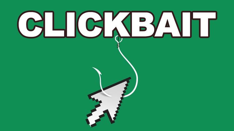
Clickbait and Sensational Content
Clickbait is one of the book’s oldest tricks, yet users are still falling into the trap. Clickbait is one of the worst trends in web design, but it is still pervasive. Clickbait refers to internet content (often links) with the main purpose of grabbing attention and encouraging users to click – only to show a web page with much less dramatic or even completely irrelevant material.
Clickbait lures readers in like bait on a fishing line, using sensational content and buzzwords to capture attention. When the reader takes the bait, the company hooks and reels them in, often trapping users with pop-up ads and email address lightboxes as they do so. Clickbait articles don’t deliver on their promises. They are, in a sense, false advertising. They use hyperbole to intrigue a user enough to make him or her want to click.
For example, a clickbait article may have the headline, “We Surveyed 100 Walmart Employees: What We Found Was Shocking.” The wording makes people curious as to what was so shocking, making them click on the link.
After reading the entire article, the reader is sorely disappointed to find that there was nothing shocking at all – only news that isn’t news at all, such as workers unhappy with their wages or encountering rude customers. This is clickbait.
Via GitHub
Deceptive Content
Many have become experts in deceptive content writing. Deceptive content serves to trick, fool, or confuse users into taking certain actions. The most common place we see deceptive content is during the unsubscribe process for newsletters and marketing materials. Many websites bring users to an unsubscribe page only to confuse them with a multi-step process and/or buttons with misleading titles.
A great example is the UI for unsubscribing from Daily Yahoo. Yahoo! states the message, “Are you sure you want to unsubscribe from Daily Yahoo?” with a large, bright blue button directly underneath that says, “No, cancel.”
The average user would skim the content above or not read it and simply press the blue button. This is a dark pattern that tricks the user into choosing “No, I don’t want to unsubscribe – cancel my request,” when they think they’re requesting to cancel the subscription.
In this case, a user must be savvy enough to read the small, plain print below that states, “Yes, unsubscribe from all marketing messages.” Yahoo! takes dark patterns a step further, however, with a similar message right above that states, “Yes, unsubscribe from this newsletter.”
If a user gets past the large blue button, they will likely select the first thing that says unsubscribe. In this case, the user would not be unsubscribing from all marketing materials – just the newsletter. Deceptive content like this is common when users try to opt-out of subscriptions.
Avoid Dark Patterns at All Costs
Dark patterns work to fool people, making it difficult to escape or avoid being caught, to begin with. Dark patterns take users down dangerous paths, often leaving them feeling confused, betrayed, and mad at themselves for falling for the trick. As a consumer or a web designer, it’s best to stay away from dark patterns entirely.
If you believe a marketing tactic is at all ethically questionable, take a different route. Consumers, search engines, and major social media platforms are wising up to dark patterns in UI and beginning to penalize sites for dubious practices. Don’t fall prey to the allure of using dark patterns – recognize and stay away from these common tricks to keep your brand’s reputation intact.
Top