Like most cultural products, web design has its own zeitgeist. Every year sees a new crop of popular design components, features, and trends. Attitudes change rapidly, especially with the fast pace of new technological developments.
Some web design trends don’t stand the test of time. You should put trends that impede usability or deter site visitors in the past. Designers should be wary of employing the following trends that can alienate the very people they’re trying to engage.
Not Enough Negative Space
Negative space plays an important, but often unsung, part in usability. Sometimes called whitespace, it’s the space around and between an image or design element. Like in art, negative space in web design has its own power as an artistic element. Unfortunately, some consider negative space as wasted space, but just like museum walls need space between the art, so do blocks of web design. Negative space makes content on your site easy to read and easy to find.
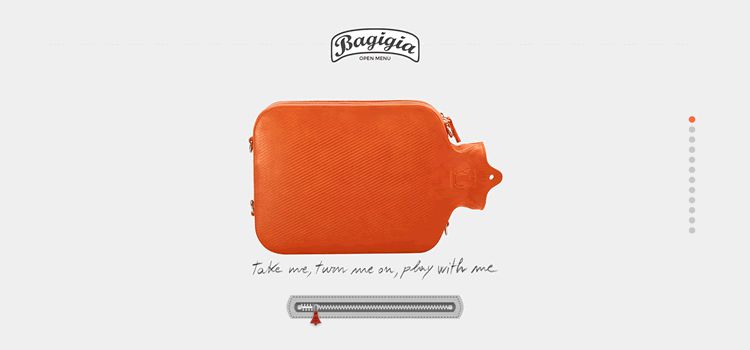
Web designers would do well to heed Coco Chanel’s advice about how less is more – “before you leave the house, look in the mirror and remove one accessory.” Web designers have to consider how CSS and HTML elements default to no empty space before they start adding extra assets.
Combine this issue with the high quality content any good website needs, and the problem is obvious – an over accessorized website with too many places to look. When there is plenty of space around each element, users will see your content and your CTAs will stand out.
There are a couple of easy fixes for a crowded site. First, use the infinite capacity of the vertical scroll. When your top navigation is clear, having other secondary elements beneath the fold is perfectly acceptable. When your site is initially easy to navigate, users won’t mind looking for further information. Second, (and we’ll talk more about typography later) be careful with font sizes. Too big takes up space and can read aggressively, like an email from your boss in all caps. It’s a balance – find a font that doesn’t overwhelm but is still attention grabbing.
Hamburger Menus
One of the most prominent web design trends of the past few years has been the hamburger menu. This trend arose, in part, due to a sudden increase in users accessing websites on mobile devices. The point of the hamburger menu is to hide menu navigation so that it doesn’t clutter the main space of a page. Users recognize the icons and usually have no trouble finding the full menu. It’s a good idea – if people know what they want before they get there.
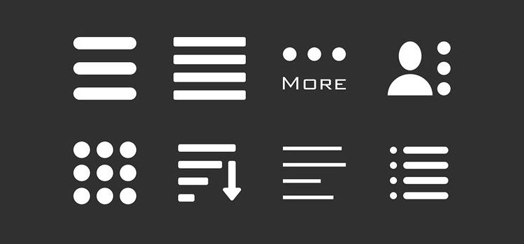
The problem arises when a site depends on a user organically discovering content. As Luke Wrobleski says, “obvious always wins.” And it is obvious – higher visability means higher usage. Consider the example of Facebook. When the social media outlet moved from a top hamburger menu to a bottom tab bar on its iOS app, user engagement went through the roof, as did increased user satisfaction, higher revenues, and speed (and its perception).
Limiting the amount of other content users will naturally discover is a dangerous game. By hiding categories, visitors aren’t exposed to options immediately.
Hamburger menus are especially damaging to eCommerce sites, where businesses depend on user exposure to goods. When users are required to open the menu, they may miss the most obvious and important aspects of your business. And if your business is dependent on readers seeing an RSS feed, then hamburger menus should be avoided completely; they adversely affect news sites that depend on readers being able to see related topics and other current headlines.
Front Page Carousels
Front-page carousels are ubiquitous right now, and you can see them on sites from small business pages to major corporations. Designers may be drawn to carousels because they create visual economy, delivering a lot of information though one feature.
If your company is still trying to get its name out, use carousels with caution. Carousels make it more difficult for people to find your page and can negatively impact search engine optimization (SEO) because they typically mean less content in the body of the page. Less text on the page means less meta information for Google to find.
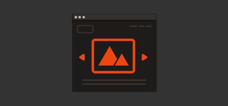
There are workarounds, though, such as making a point to add text to the page itself, but this undermines the point of using a carousel for visual economy. Carousels can also cause major accessibility issues on a site. They are notorious for slowing load-time and often use JavaScript, which can cause performance problems.
Not only do carousels make a site less accessible, they don’t successfully engage the visitors who are able access the site. A 2013 study found that about 1% of site visitors clicked on a carousel, depending on whether the carousel was automatically or manually forwarding.
And if we consider the advice that Wroblewski offers about hamburger menus, the trouble is the same with carousels – they aren’t obvious. In the study above, 83% of the 1% who clicked, clicked on the first image. What does that mean for the four other images you are hoping to catch users with? They are getting no mileage and doing little to promote engagement.
Wroblewski uses PJ McCormick’s carousel design on Amazon as an example that actually works. The images are divided into segments and when the user hovers over a particular section, it becomes the image in the carousel, making it obvious that users could click there to find what they are looking for.
Popups
Drop down menus can be complicated to operate even by the most skilled users, add that complexity to the small screen and it’s a nightmare for navigation. Popup menu controls, on the other hand, offers a contained list of menu options that can be easily scrolled regardless of user acuity or pace. Apple’s iPhone is a good example of this – drag, flick, or nudge – the large target and forgiving options make it easy to control.
When done well, popups are great for compound inputs – inputs for dates, heights, weights – and make the process much more streamlined.
For instance, instead of three options for inputting a date – the day, month, and year – a single date field can open a set of popup menus that let users scroll through three lists at one time to input the correct date. That simple fix can lessen input time along with user impatience.
Infinite scrolling can be a useful design tool. Endlessly and effortlessly loading content can produce a satisfying user experience. Sites such as Pinterest use infinite scrolling to excellent effect and are partially responsible for keeping it trendy. Though verticle scrolling has been a great success for certain apps, horizontal scrolling still confounds many users. They often don’t even realize it’s an option. If the content seems to end, they will likewise be stumped.
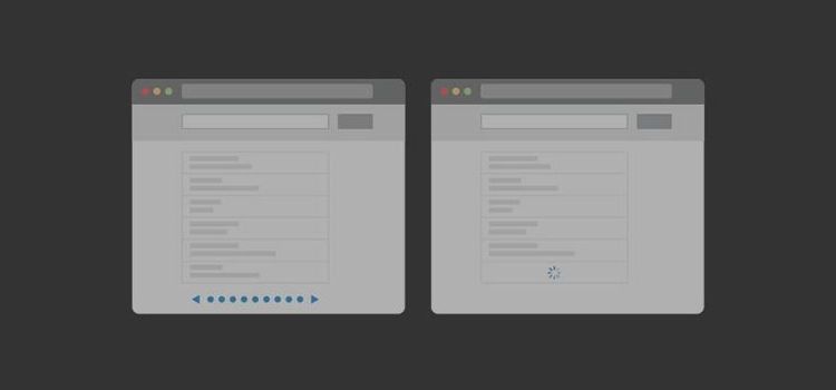
Infinite scrolling becomes a problem when a site also has a footer with content that users might want to access. Users will scroll down and down and not be able to catch up to the footer. Savvy mobile users are going to figure this out, but if it frustrates them, they may not try. Along with being obvious, navigation should be easy.
Slow-Loading Screens
The number one reason – by a landslide – users abandon a site is slow load time. In surveys, about half of users say that they won’t wait more than 10 seconds for a page to load. As we’ve become accustomed to faster internet connections and devices, people expect pages to load almost instantly. The longer a screen takes to load the more likely a user will leave.
Users shouldn’t bear the blame for this, tech has made enough of our experiences streamlined that it has become an expectation. When you are balancing complicated content that may bog down your load time, consider whether it will matter if no one sees it. Mobile users aren’t sitting around drinking lattes while they checking your website – they are on the move, and they expect their mobile experience to be just as fast-paced.
Unnecessarily Complicated Typography
With the variety of typefaces available today, web designers may be tempted to use a number of fonts on a single page. There’s an often-cited typography guideline that one should never use more than two or three fonts in a single document.
While there may be circumstances that justify multiple fonts, it’s usually better to focus on clean, clear delivery of information. Wroblewski offers his notes on Tim Brown’s best practices for typography. One of the most important elements for typography is balance – balance in size, in leading, and in measure improves readability and aesthetic appeal. What’s the point of a font if not to be read? Obscuring clarity for design is counterintuitive and won’t increase your readership.
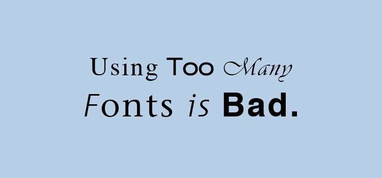
Picking one or two fonts creates a unified look and helps users better identify a brand. Remember, the goal is to engage users. Multiple fonts in too many sizes make a site difficult to read comfortably. If the text is illegible, no one will stay on the page for any length of time.
Floating Elements
Floating elements can be a great way to grab a user’s attention, but if timed inappropriately, they may alienate your users by blocking part of the page and distracting them from what they want to see. It all but ensures they won’t engage with a site. Floating elements are especially frustrating for mobile users who are trying to access a site on a smaller screen.
Additionally, floating elements often don’t function as intended, opening up even when closed and floating over important page features. The more complicated the user’s experience becomes, the less likely they’ll continue to use the site.
Parallax Scrolling
Parallax scrolling is not necessarily a bad design choice and has been used to great effect in many marketing campaigns. It offers a fresh option for sites to differentiate themselves and has recently grown in popularity.
It does come with some drawbacks. As with carousels, it can negatively affect SEO because there is less content for search engines to crawl. Parallax scrolling is also not a good design choice for sites that should be accessible by mobile devices. Because it relies on JavaScript and a lot of graphics, it can cause a page to load very slowly, increasing the likelihood that a user will become impatient and leave before the page loads.
Make the Best Use of Trends
While there are definitely appropriate applications for all these trends, web designers should think carefully before deciding to use them. The best rule for any designer is to give more weight to functionality and user experience than flash-in-the-pan trendiness. Keep Luke Wroblewski’s advice in mind with any design and be obvious. No matter how good content is, if it’s hidden, it’s useless.
Related Topics
Top