We’ve covered responsive navigation a number of times over the last couple of years, from off-canvas reveals and nested accordions, to the simpler <select> drop-down menu system. There really are a multitude of responsive navigation solutions out there. Recently though, there has been a new trend emerging, namely the fullscreen responsive menu.
Typically activated by a hamburger button, the fullscreen menu is, in it’s simplest form, an overlay that covers the entirety of the screen giving you lots of space for your menu items. It is typically used by, but not restricted to, sites with limited space as an effective replacement for the mega-menu.
If you’re looking for some interactive examples, Codrops has created a bunch of fullscreen overlay effects that you can explore, Damon Bauer has created a fullscreen menu plugin for jQuery, and we have also published a tutorial on how to create a full-width tiled menu with CSS.
Anyway, below, we have found 20 sites that use the fullscreen menu effectively, here they are:
Huge →

Threadslike

Square →

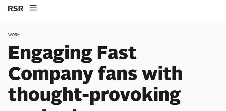
Ready Set Rocket
Tictail

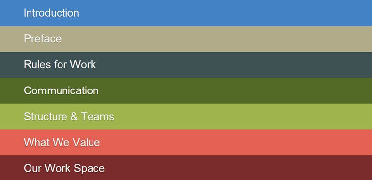
Zaarly Employee Handbook
Reach Partners →

Brooklyn Bridge Park →

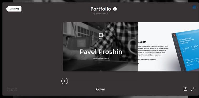
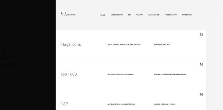
Pavel Proshin
KLM's – Flat or Not

Plasticbionic →
Southpaw →

EKWIP

Rokkan

Brad Haynes

Jim Ramsden →

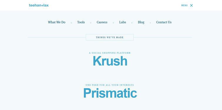
Teehan+Lax
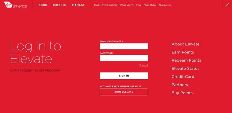
Virgin America Elevate Login
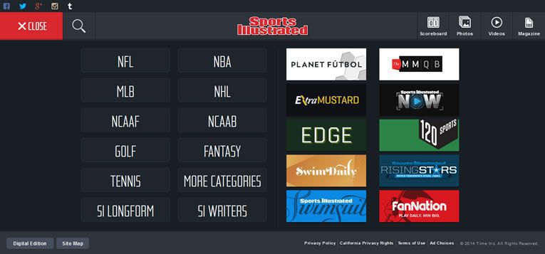
Sports Illustrated →
Not Complex

Related Topics
Top