Animation in apps has taken on a new and improved meaning. Unlike the flashy, confusing website animations of the old days, new animation is clean, smooth, and easy to navigate. Forget what you know about GIFs, obnoxious ads, and Flash websites. Those are things of the past.
When animation is used sparingly and used correctly, it greatly improves user experience (UX). There’s a host of new trends emerging in the animation world. HTML5 and CSS3 have given web designers a way to incorporate movement on a webpage without making it an eyesore. Bring a little motion to your website incrementally to make sure you’re not overloading the page and cluttering the UX. Here are a few methods to incorporate animation on your website.
Animation Between Pages
Animating page headers and page loads is an effective way to add some movement to your website without going overboard. When visitors come to your site, they see a smooth transition between pages. They’re typically quick to load, and they close the gap between pages with one fluid animation.
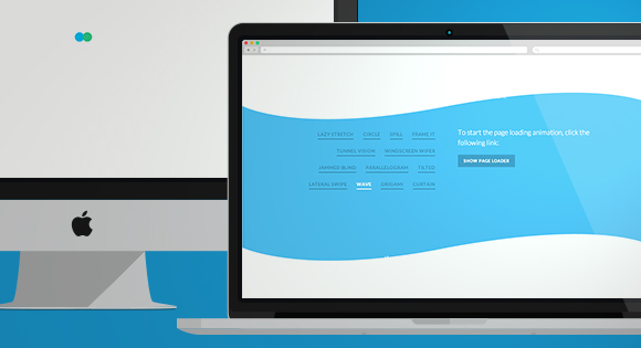
For example, the above Origami animation opens and closes a page with a diamond shaped transition. It adds visual interest between pages but on a subtle scale. There are several other transition styles to choose from as well, ranging from tunnels and circles to an undulating wave.
Infinite Scrolling Paired with Animation
We’ve talked before about the infinite scroll trend. Many website are using infinite scroll to keep all their information in one place. Instead of navigating a page through a series of menus and submenus, users simply continue scrolling down until they find what they’re looking for.
Infinite scroll is a beautiful way to incorporate motion, as long as the components on the page are clean and cohesive. Too many colorful blocks or too much movement will confuse visitors and load unpredictably. Consider using big background pictures or a grid in a pleasing color palette to create cohesiveness and simplicity.
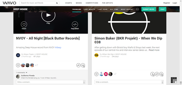
Wavo, the music/social media site, provides a wonderful example of clean infinite scrolling. The color palette is monochrome, the images are crisp and straightforward, and they break up the negative space nicely in each section. As users scroll down the page, they can easily absorb the information that’s there while still being immersed in the aesthetics of the brand.
Bringing Charts & Graphs to Life
Animated charts are easy to integrate and fun to look at. They add a bite-sized portion of movement to your website and make for an entertaining infographic. Custora.com, a website that analyzes e-commerce trends, shows off its data with an array of gorgeously animated charts.
Metrics such as mobile orders are generated in a bar chart, which loads as you scroll down onto it. It brings a little excitement to what would otherwise be some dull data points. Visitors are naturally attracted to watching the bars load because they want to see where they stop.
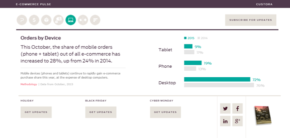
In this case, animation is used to hack into the visitor’s psyche. Again, the animation is pleasing to the eye because the page isn’t overloaded with colors and other forms of animation. The website has a subdued color palette with a muted bright font on a crisp, white background. That gives the content on the page a chance to step forward without having to compete with other elements on the site.
Slow-Motion Animation for Ambiance
Slow-motion animation is one of the most graceful ways to incorporate movement into your web design. When page elements move just slightly over a period of time, it draws the visitor’s eye automatically. It’s akin to whispering to people to get them to listen.
When you whisper something, the listener’s ears naturally perk up, and the listener subconsciously pays more attention to what’s being said. The same can be said about slow-motion animation. Because the movement is so subtle, the visitor’s eye wants to examine the object to see if it really is moving. It’s an awesome way to encourage your visitors to stop and smell (or see) the roses.
Whether you use slow-motion animation as a background image on your page or to transition to a faster-paced animation (known as “easing”), slow motion naturally resonates with the human brain. Organic objects in the real world tend to move at different paces, starting slowly, picking up speed, and decelerating before coming to a stop. Because the mind expects this kind of movement, it subconsciously makes users feel more comfortable using your site.
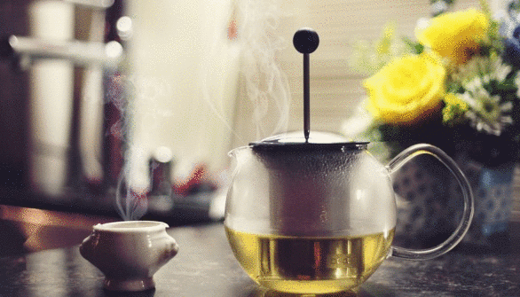
Pencilscoop shows an example of slow-motion animation in a big background image. Elements in the picture move slowly, creating a relaxing ambiance. In one animation, which features steam slowly rising from a fresh pot of tea, you would almost swear you can smell the aroma and feel the warmth of the steam. It creates a beautiful background and sets the mood for the rest of the website.
Controlled Modular Scrolling
Modular scrolling gives users control over your site’s animation. Modular scrolling features individual panels users can scroll through. This type of animation is effective because it can be used across multiple industries. For example, a construction company could allow users to scroll through one panel of images, which serves as a portfolio of work, while the other panel has individual menu buttons and company information.
It allows you to display your brand personality, right there on the page next to important information about your company. Modular scrolling delivers information and images in a stream-of-consciousness manner. Our brains work on multiple levels and process information at different rates, and modular scrolling echoes that.
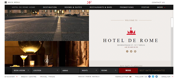
Of course, the most effective websites keep other elements of design simple to allow for all that movement. Otherwise, you risk giving users a sensory overload. The website for Hotel de Rome (above) is a perfect example of expertly executed scrolling. Hotel information is contained in the right-hand column, which has other clickable elements, while the left side scrolls through glossy photos. The control is in the user’s hands, and both sides of the page can be navigated.
Motion Design Makes Filling out Forms Fun
Let’s face it – nobody likes filling out forms. It’s boring and tedious, and long forms are downright annoying. But what happens when you animate a form? It makes it more like a casual conversation. It can almost make it fun. Users want to answer the questions on the forms because they seem more like questions coming from a friend and less like a robot nagging them for information.
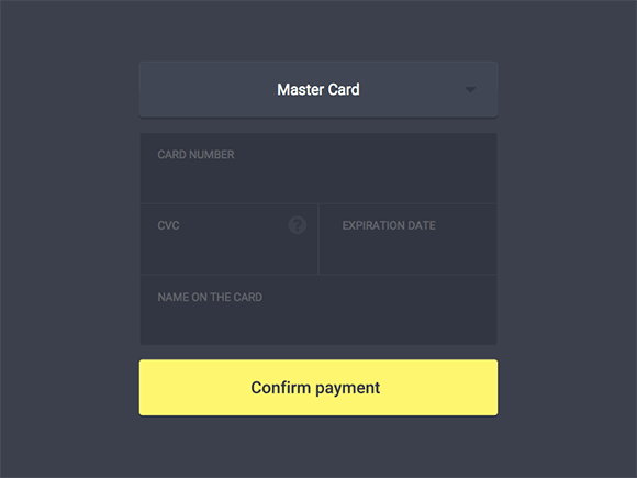
Using natural language is one trend that blends really well with animated forms. It adds to the overall casual tone of the form, and when paired with motion, it makes filling out a form a pleasant experience.

The above example of motion design in site forms uses both trends to make answering questions interesting. The aesthetics of the form are minimal, with one question per animation, and the casual language makes you want to answer. That’s a call to action (CTA) any business will want to use.
Stylizing Anchor Text Animations
Hovering has been around for some time now, but motion design trends have made it nice to look at. When you hover over a link, it lights up like Christmas tree. But instead of using old animations to show a word is clickable, why not do something interesting?
This website shows a few examples (below) of how you can make hovering a little more visually stimulating. It shows how you can use color negatives, fading, outlines, and other little details to highlight anchor text. It’s animation on a very small scale, but it still has an effect on the user. If you’re looking for a subtle way to add some visual interest to your site, changing your hover text is a nice way to do so.
Conclusion
As with all things web design, balance is essential. If you choose to get on board with the motion design trend, implement it in baby steps to get a better idea of what’s just enough and what’s too much. Whether you choose to go small-scale with animated forms or anchor text or go bigger with something like modular scrolling, your users will have a more pleasant and interactive experience – and that’s always good for business.
If you’re looking for the tools and resources for creating your own web animations, you might like to try this post: CSS Animation Tools, Frameworks & Tutorials.
Related Topics
Top