The impact Google Fonts has had on the web is undeniable. Since its somewhat humble beginnings in 2010, the 1,500+ fonts now hosted by the library have been viewed well over 75 trillion times. Of course, the likes of Adobe and others have followed suit with font repositories of their own. The difference is that everything Google Fonts has to offer is free.
And it’s a good thing that free web fonts have come along. Typography on the web used to be incredibly boring. It started out with the limitation that a specific font had to be on a user’s system in order to be viewed correctly in a browser. Eventually, @font-face brought more options to the table. But licensing issues were often difficult to deal with (if dealt with at all).
The brilliance of Google Fonts is the flexibility you have with where and how you use it. You can load fonts via Google’s service or download them to place on your own server or device. Plus, they receive contributions from font artists worldwide. That has led to an incredible variety of available styles.
Of course, some fonts tend to be more popular than others. Thanks to the openness of the library, Google provides a nifty analytics page that breaks down how much usage each font receives. Let’s take a look at ten of the most used fonts in the library. Note that, in some cases, multiple members of the same font family are separate entries on Google’s list. We’ll avoid repeating ourselves in those instances.
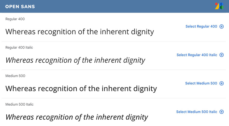
Open Sans
Designed by Steve Matteson
It’s probably not much of a surprise that Open Sans leads the way as you tend to see it all over the place. WordPress even used it as the default dashboard font at one point. It’s clean, easy-to-read and comes in an abundance of styles. The condensed version also ranks as one of Google’s more popular choices.
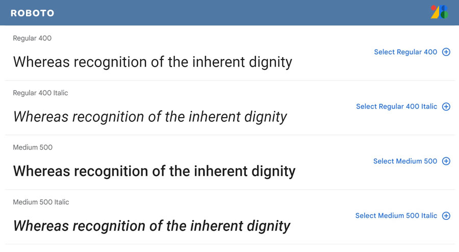
Roboto
Designed by Christian Robertson
Again, we Google Fonts fanatics love our sans-serif type. This one is great for body text as it lends itself well to reading at smaller sizes. The look is also very modern and matches up nicely with more minimalist designs. It also saw a massive 65% jump in usage from February 2017-18. Also note that the condensed version is the sixth most-used font as well.
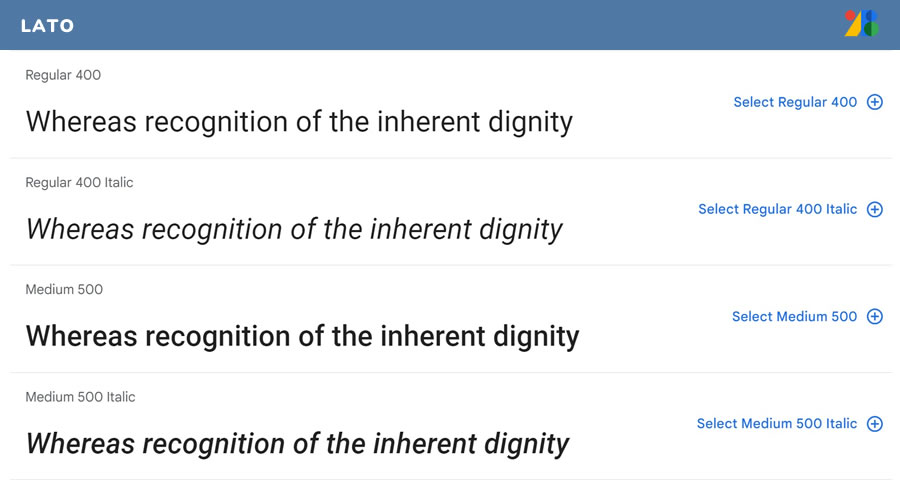
Lato
Designed by Łukasz Dziedzic
Did I mention the obsession with sans-serifs? Lato is one that I do find myself using a lot. As with its mates in the top three, it comes in a variety of styles and is a jack-of-all-trades. I think that helps to explain its popularity, along with the fact that it fits in with modern design trends.
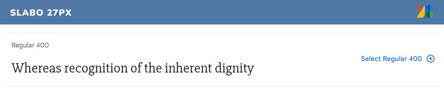
Slabo 27px
Designed by John Hudson
Finally, a serif in sight! What makes Slabo 27px a bit unique is that both it and its sister font (Slabo 13px) are optimized for viewing at the pixel size reflected in its name. This flavor is a great choice for producing clear, readable headlines.
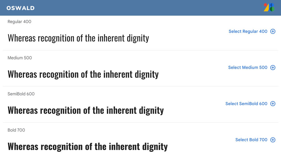
Oswald
Designed by Vernon Adams, Kalapi Gajjar and Cyreal
Many designers look for web fonts that resemble classics – but without the licensing hassles. Oswald is one that is pretty well on point with the popular Alternate Gothic family. It has that same timeless look that brings a touch of class to any website.
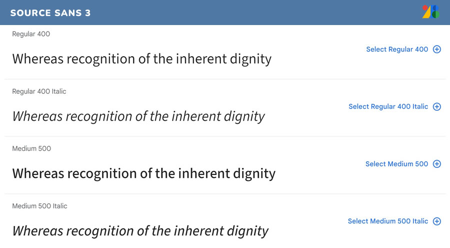
Source Sans 3
Designed by Paul D. Hunt
This font is actually historic in that it’s Adobe’s first-ever open source typeface. Their intention was to create a font that would be a good fit for UI. It certainly does hold up as being very readable. There is a nice spacing between characters and plenty of styles to choose from.
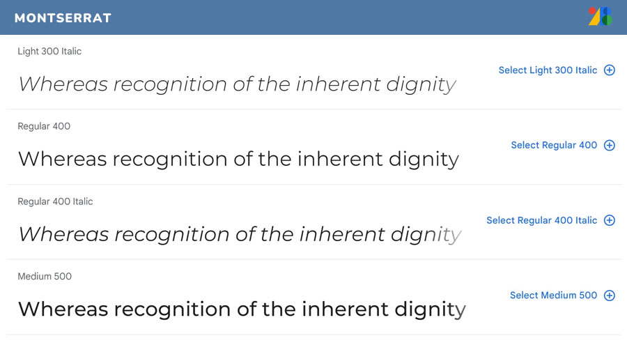
Montserrat
Inspired by the Montserrat neighborhood of Buenos Aires, Argentina, this font sports a classic urban style. It’s a great all-purpose font that adds a bit of pizzazz to both headlines and body text. Its popularity has also led to the Alternates and Subrayada versions.
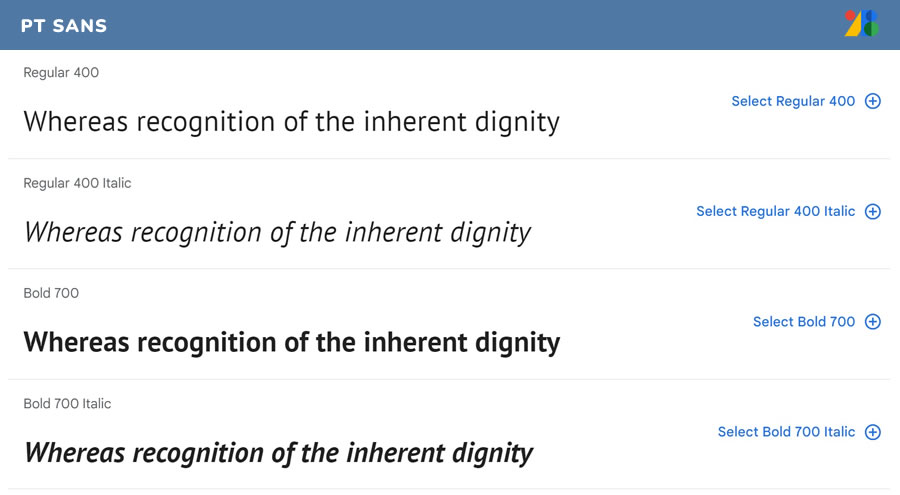
PT Sans
Designed by ParaType
Created for the “Public Types of Russian Federation” project, Google reports that the majority of PT Sans’ usage is in Russia. In fact, it features character sets for every title language in the country. That being said, designers around the world are taking advantage of this font’s clean and modern look.
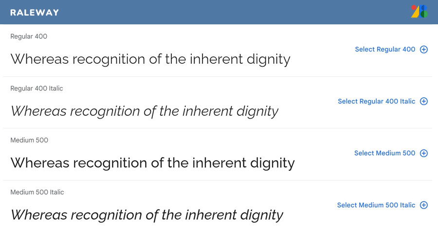
Raleway
Designed by Matt McInerney, Pablo Impallari and Rodrigo Fuenzalida
Raleway was developed as a headline font meant to be used at larger sizes. However, it does work quite well for body text as well. Personally, I don’t know if any other font on this list fits the modern, minimalist style better. It’s also available in a dots version.
Lora
Designed by Cyreal
Rounding out the list is Lora, a subtly-detailed serif font. While it only comes in four basic styles, that seems to be more than enough for just about any use.

Bringing Great Typography to the Web
What stands out about the fonts above is that they are overwhelmingly a reflection of their core audience: designers. While the library is undoubtedly used by non-designers as well, the choices at the top of the list seem to show a professional attitude towards type. Notice the lack of any comic or whimsical styles.
Overall, these fonts have brought about a typographic revolution to the web. That’s something we designers should all be thankful for.
Related Topics
Top