When working with a web design client, you have a plan, right? I’m sure you’d like to help them make a sale or get information to allow them to follow up on leads in the future.
But even the best looking website can miss the mark if your navigation strategy is off. The days of brochure-ware sites is over – if your design strategy doesn’t provide a clear path to conversions, what is the point?
People are busy. You do them a favor by building web pages that let them get the information they’re after quickly. And guess what? Great UX and a clear path to your target go hand in hand.
In other words, you help yourself and your visitors by simplifying and prioritizing navigational elements.
Understanding Choice Overload
How can a marketing theory based upon a study of jams in a grocery store apply to website development? The concept of choice overload was explored in a psychological study using jam. While it may seem unrelated, the findings have a broad application.

The aim of the study published in 2000 by psychologists S.S. Iyengar and M. R. Lepper, was to examine consumer behavior in the face of numerous options. Over two weekends displays of jams were rotated, offering either six choices or 24. The study found that while people were more attracted by the larger variety, ultimately they tasted the same number.
But of more importance to those who want to sell jam or anything else – shoppers given six choices instead of 24 were found to be ten times more likely to buy!
The psychologists conducted other studies that also showed that while consumers may be attracted to a broad array of offerings, they’re more likely to buy when there are fewer choices.
The same concept applies to website navigation. Whether you call it choice overload or decision fatigue, studies show that too many options may mean that the consumer will just walk away.
Of course, you don’t want that on your website. So here’s a three-step plan to boost conversions with prioritized navigation:
Step 1: You Need a Strategy
A strategy is a plan to achieve a goal. And to make conversions today, your plan needs to include the use of landing pages whether you are starting from scratch or working on a redesign.

As an example, consider your portfolio page. My guess is that it has samples of your work. A visitor can dive into your samples to get ideas for their site and hopefully will be so impressed with your work that they’ll consider hiring you.
But on its own, your portfolio page probably won’t win any conversions for you.
Instead of routing traffic to your portfolio page, you need to guide prospects from your social media or email campaigns to a landing page. If you provide more than one service – say web design and logo design – you’ll want a different landing page for each offering.
Your landing pages can include highlights from your portfolio, persuasive sales copy, some social proof, a list of customer benefits and – most important – a prominent call to action.
For each service you offer, think of your landing page as a one-stop shop with everything you need to convince someone you can help them.
Step 2: Supporting Evidence
With that said, you may need some supporting evidence. Some prospects may want to dig deeper to learn more about your design expertise or review your case studies. You’ve included some samples and testimonials – and you have lots more of both on other pages of your site.
But you don’t want to leave your prospect roaming around your website without direction. Your goal is conversion. There are three ways you can accomplish this from your landing page:
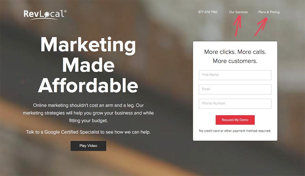
1. Limited Header Navigation – If you’re going to provide header navigation from your landing page, keep it simple. Provide just two or three choices, perhaps to more testimonials, or to more samples or case studies. With the portfolio site example used previously, consider including links to both of your landing pages so visitors can toggle back and forth.
Be sure to make your header bar “sticky” so it will stay in place as your website visitors scroll down the page.
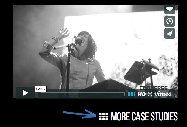
2. Contextual Links – You can also put links within the body copy of your landing pages to lead site visitors to support material, such as case studies or testimonials.
3. Secondary Navigation – UX-perts will argue about the use of secondary navigation, but ensuring a clear path to conversion is smarter than making lots of choices visible to your website visitor all the time. If you want to keep links to all of your pages or sections of your site available from your landing page, put them in a lower position on the page or even in a hidden drawer menu.
The bottom line here is that you want to keep things simple. Don’t offer too many choices that aren’t necessary for conversions.
Step 3: Prominent CTA
The most important part of your landing page is your call to action.
Using your web designer site as an example, your CTA likely takes prospects to a form to schedule a free consultation. For sites you build for customers, the CTA may be a button to purchase an item or to sign up for a free newsletter or some other incentive designed to create a mailing list for future contact.
On your page, design the CTA as a button and give it some pizzazz. Research shows that a bright pop of color that contrasts with the rest of the page attracts the most attention.
Words like “No Obligation Consultation,” “Order Today,” or “Sign Up for Free Newsletter” on your CTA button and in your main header navigation provide clear signals that let prospects know what to do next.

Wrapping Up
By following these steps, you will successfully prioritize navigation from your landing page to the point of conversion, your CTA.
By providing persuasive sales copy, samples of your work, and simple navigation, you’ve provided prospects with the information they need to respond and an easy way to get more information from you.
After all, it’s far better that they reach out to you at the point they’re interested in what you have to offer than to continue through the pages of your website and then wander away.
That’s the beauty of prioritized navigation – it helps you keep the prospect focused on conversion – the choice you want them to make.
Related Topics
Top