Typography is the backbone of web and graphic design but it can also be a form of art on its own. Pairing the right fonts together, mixing and matching different font weights, and using fonts to ensure your entire design remains legible in all situations requires a deep understanding of typography principles and how they work together with other design principles to create a cohesive design.
As such, typography can be a powerful tool that brings your entire design together and conveys the right tone and message to the intended audience. Typography can spice up website designs as well as improve any type of graphic design. And, if we’re being honest, most designers have a mild obsession with typography.
It’s no wonder, then, that typography wallpapers are among the most popular wallpaper categories. Not only can they be a wonderful work of art, but they can also inspire us, motivate us or cheer us up. You can use typography to create shapes, letters, and words or to symbolize movement. When you use your imagination, there are dozens of ways to create cool-looking designs using nothing but type.
In this post, we’ve rounded up the best desktop wallpapers that make use of beautiful typography to showcase ideas, emotions, typefaces and typography itself. Some of them use typography to create a work of art, some feature the most popular fonts, and others carry a powerful motivational or inspirational message. Browse through our collection below, get inspired, and download your favorite typography wallpaper to make your desktop look gorgeous.
Designers are Meant to be Loved…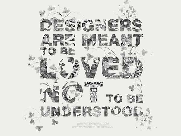
Wallpaper Download
Too Lazy For Sh*t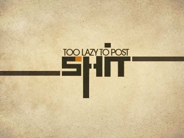
Wallpaper Download
Twitter
Wallpaper Download
Life’s a Journey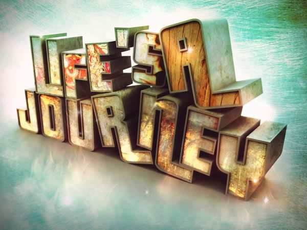
Wallpaper Download
Watercolor Wallpaper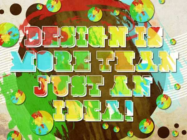
Wallpaper Download
Typographic World Map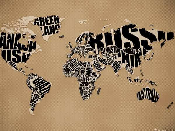
Wallpaper Download
Design Is
Wallpaper Download
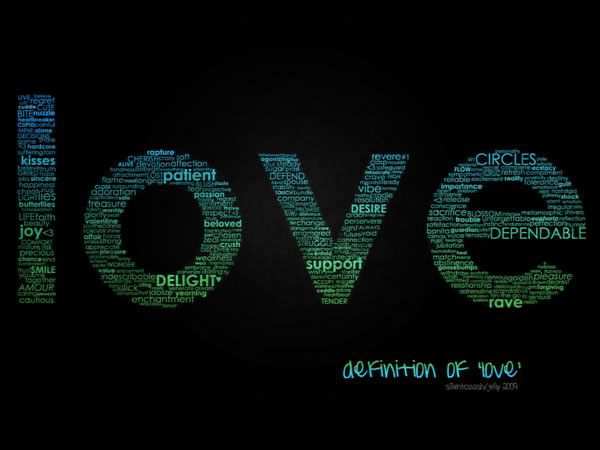
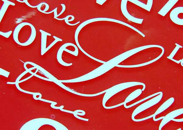
Words of Love
Wallpaper Download
R for Rosie
Wallpaper Download
Type Wallpaper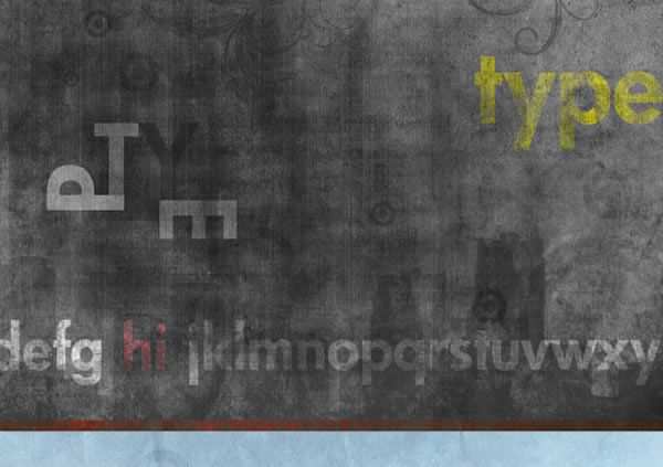
Wallpaper Download
Typography
Wallpaper Download
Sh*t!
Wallpaper Download
Blood Has Been Shed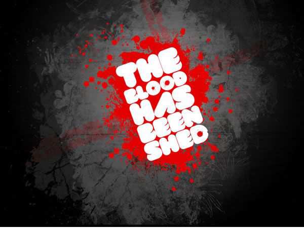
Wallpaper Download
Random Words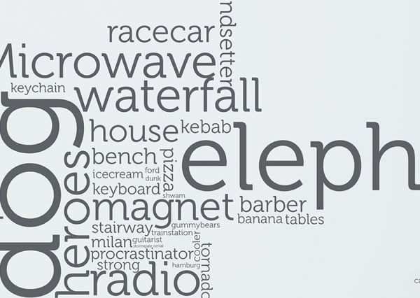
Wallpaper Download
.::Typography Wallpaper::.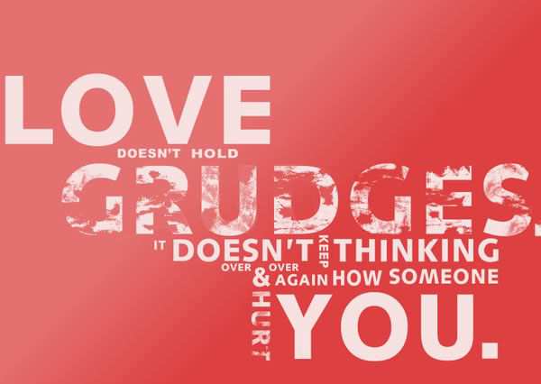
Wallpaper Download
Rome was not built in a suit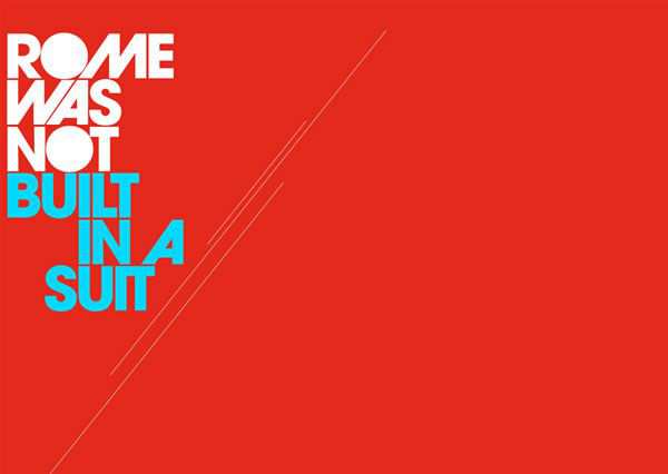
Wallpaper Download
Helvetica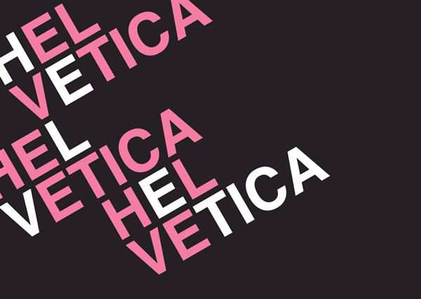
Wallpaper Download
Think More, Design Less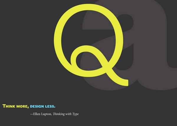
Wallpaper Download
Love 1024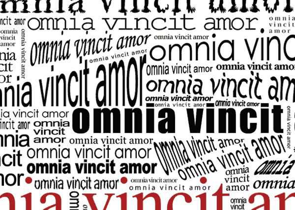
Wallpaper Download
Designers love Typography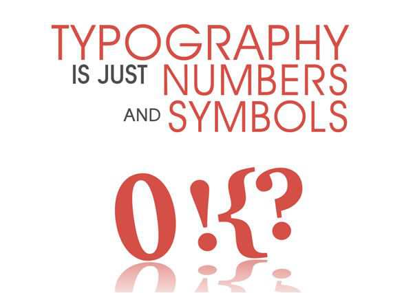
Wallpaper Download
alferg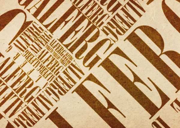
Wallpaper Download
Type and Grid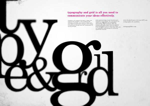
Wallpaper Download
L”Eden Numerique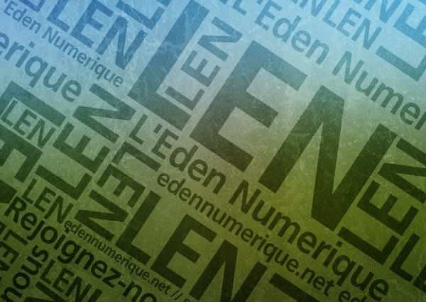
Wallpaper Download
Helvetica, how I love thee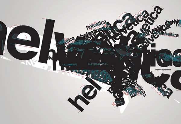
Wallpaper Download
Think Again
Wallpaper Download
Theory Typography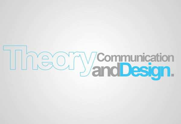
Wallpaper Download
People Talk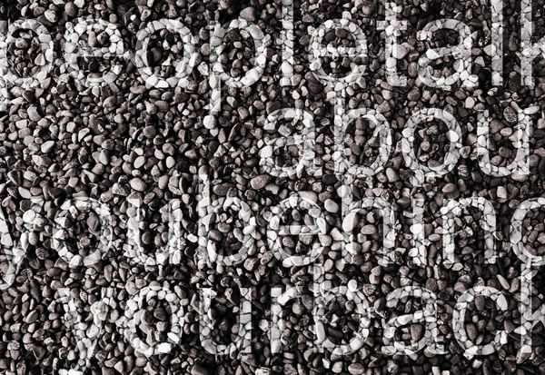
Wallpaper Download
Related Topics
Top