As mobile devices evolve, designing websites responsively has become necessary. However, unlike static or fixed websites, the fluidity and flexibility of responsive sites can make it challenging to convey design ideas visually.
Fortunately, there are some helpful tools available for responsive design, including the most basic and essential ones: pencil and paper. Specifically, sketchsheets for responsive web design can be incredibly useful.
We have compiled a collection of printable wireframing templates that you might find helpful when sketching your designs. These templates will provide a starting point and help you create a visually appealing and responsive website.
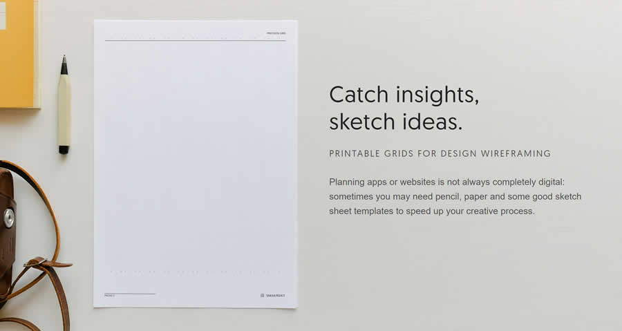
Sneakpeekit Responsive Sketchsheets
If you’re a logo designer, font creator, or web designer, you’ll find that Sneakpeekit offers an excellent free solution for all your sketchsheet needs. Their platform provides a variety of mockup templates to assist you in designing responsive websites.
Additionally, they offer grids that align with some of the most widely used grid systems and frameworks, including Bootstrap.
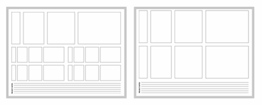
Responsive Web Design Sketchsheets by Jeremy Palford
Jeremy Palford offers sketchsheets for various device sizes, allowing you to create responsive designs that look great on any screen.
Whether you are an experienced UI designer or starting out, these responsive web design sketchsheets will help you create polished and effective websites.
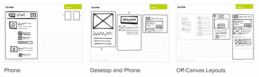
Responsive Sketchsheets by ZURB
This versatile set of free sketchsheets provides both responsive and regular sheets, giving you the flexibility to choose the format that works for your design needs. If you’re designing for mobile devices, you can download the responsive sketchsheets and get started right away. Alternatively, the regular sheets are a perfect fit if you’re designing for desktop devices.
Moreover, these sketchsheets are not limited to standard design layouts. You can also use them to design off-canvas content, making them a versatile tool for any web designer.
Responsive Sketch Pad
The Responsive Sketch Pad is invaluable for generating cross-platform application ideas and visualizing design prototypes across multiple devices. Whether designing for desktop, tablet, or mobile, this sketch pad can help you create designs that look great on any screen size.
With its support for multiple device sizes, you can create designs that are optimized for each platform, ensuring that your application looks and performs its best no matter where it’s used.

Paper & Pencil
Sometimes the simplest tools are the most effective. If you’re looking for a straightforward way to sketch responsive designs, all you need is an A4 sheet of paper and some pencils. This humble tool is probably sitting right next to your computer screen, waiting to be used.
With just a pen or pencil, you can create sketches that show how your design will adapt to different screen device orientations and sizes. And since A4 paper is a standard size, you can easily print and share your sketches with your team or clients.

While there are many more complex tools available for responsive sketching, sometimes going back to basics is the best way to approach a problem. So next time you need to sketch a responsive design, grab an A4 sheet of paper and get to work!
Related Topics
Top