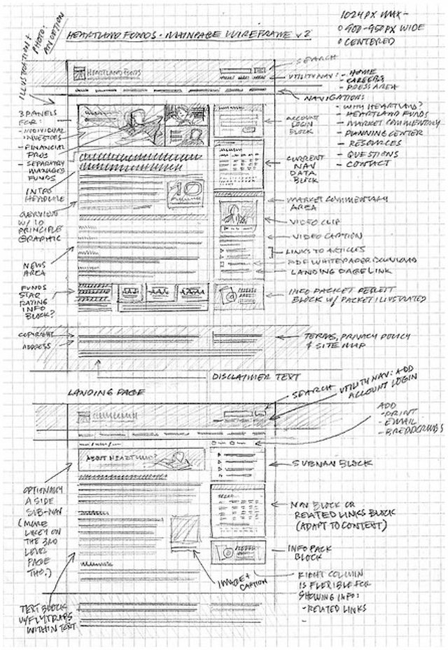
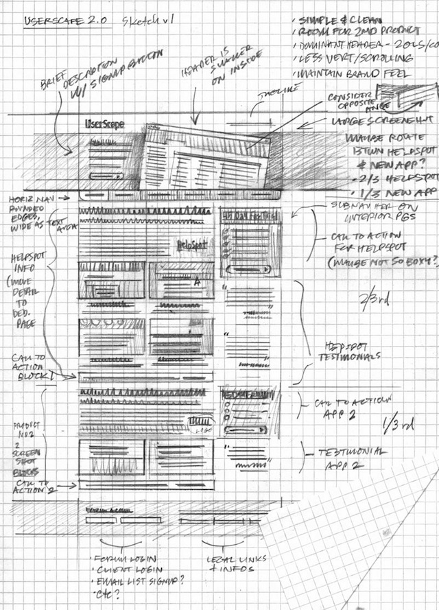
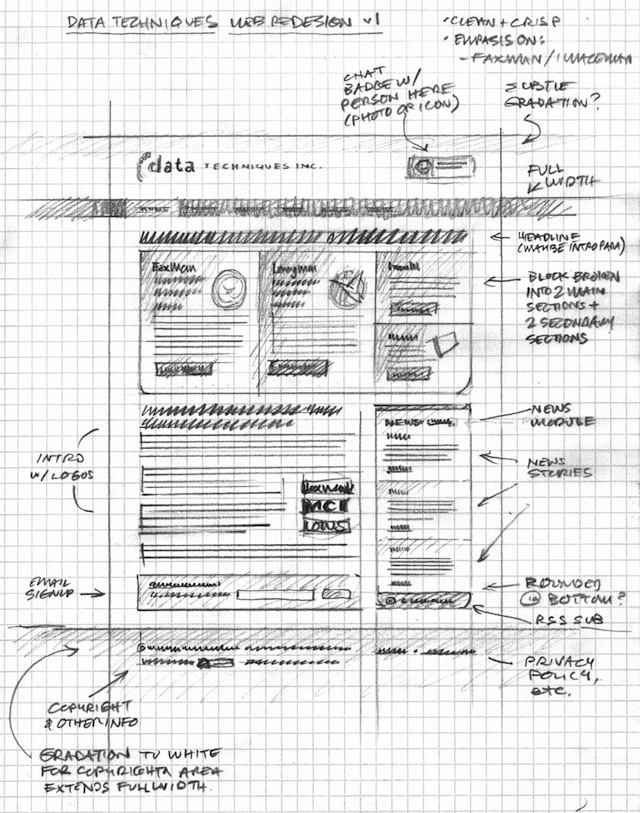
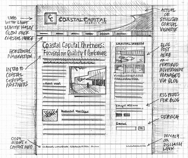
A wireframe sketch is the initial hand-drawn design process, using paper and pen/pencil, of what a website design will look like. And to help you get inspiration as well as effective reference points, this article features 20 impressive web and mobile wireframe sketches.
But first, you might be wondering why the heck you should create a wireframe sketch of your web design. A wireframe sketch is effective in that:
- You can capture your creative spark and fluidly sketch out your design.
- You can work with your client without committing anything to code, thus saving yourself time and number of actual design revisions.
- You get a relatively quick sample that you can show the client and then work off of – think of is as an outline to an essay.
Basically, creating a wireframe sketch saves you time by reducing the number of revisions you’d need to do, and it helps you stay on track with your design by being a prototype you can work off of.
Hand-drawn Wireframe Sketches
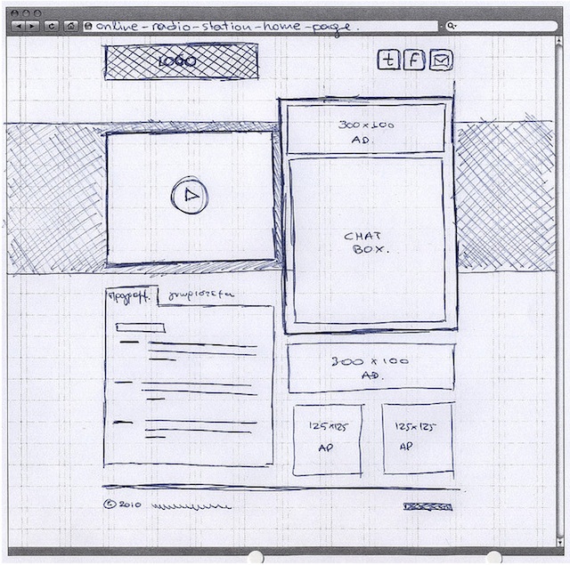
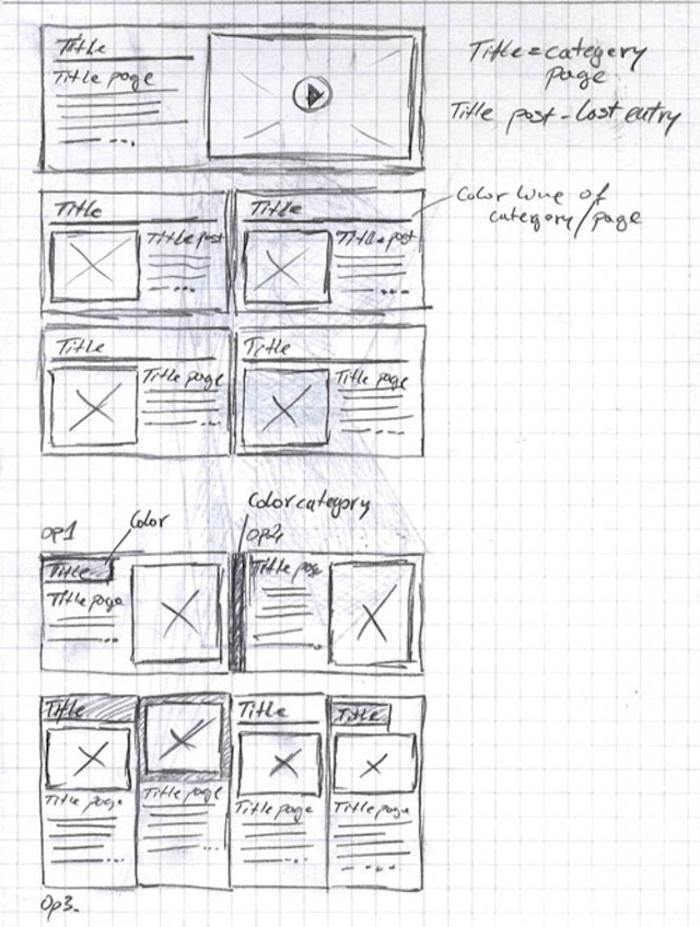
A nice touch with this sketch are the visual cues – such as the play button with the triangle and circle – which make the otherwise-stripped-down sketch detailed. You know that the rectangle is a media player rather than just some content to be decided on later.
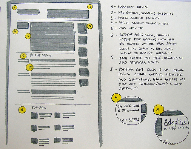
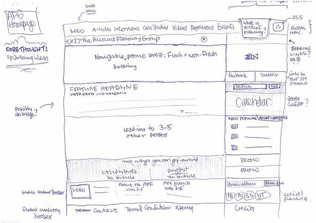
The above sketch uses highlighted numbers and zoom-ins nicely, which makes the entire sketch much cleaner and more readable. The column to the right of the sketch has all of the numbered text descriptions of each element, and the zoomed-in elements give more detail without cluttering up the main sketch.
A complex and detailed sketch that uses illustrations nicely by showing an example of what would be contained in a rectangle and square element. It doesn’t just rely on text or the client visualizing it.
Another nice use of illustrations. Despite the hand-drawn nature of the sketch, the details – the logo, a vivid splash image at the top – give a concrete prototype of what the final design will look like.
Another solid illustration example. The arrow-using descriptions on the sides effectively explain technical details, like the width of the page being the width of the browser window.
A nice grid design sketch. Using perpendicular lines that extend past the design reinforces the grid of the design, especially since hand-drawing a sketch can make a other-wise solid design appear loose and floating.
A clean and crisp sketch that shows a fairly simple web page design in great detail.
This design shows that you don’t have to be an artist to draw effective wireframe sketches. The squares are all warped, there’s not much artistic detail in the elements, and the text is crooked in places.
Despite all that, you get a clear sense of how the design will look like and what each element will be. Ultimately, it’s about creating a wireframe with your sketch, not a finished stylized design.
Another example of a grid design. Though the lines aren’t straight or there aren’t lines reinforcing the grid design, the elements are close enough together that you understand that the tables will be parallel to each other.
Digital Wireframe Sketches
A sketch of a mobile calendar. It’s not only detailed but wisely illustrates a pop-up when you select an element. This way, you can see how the design will function as well as how it will look.
This homepage design gives you a clear idea of how the big elements – image, block of text – will look like without wasting time on “lorem ipsum” text and sample images.
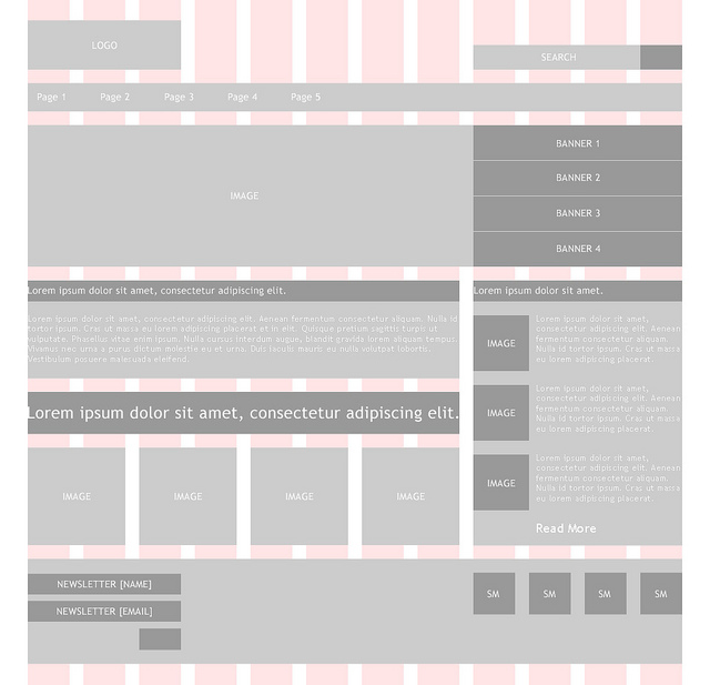
A grid design sketch that reinforces itself with vertical bars. You can see how each element will line up and where it’s located relative to other elements.
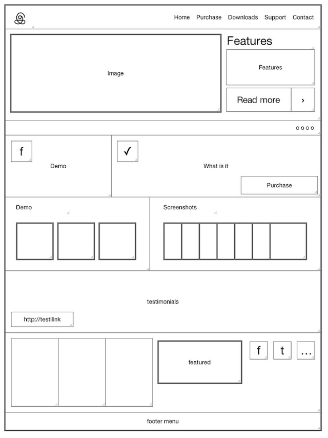
This spare bare-bones sketch shows that, like with the hand-drawn sketches, you don’t need to be a digital artist wiz to create an effective wireframe sketch. A few squares, rectangles, lines, and pieces of text are enough to show how the design will be.
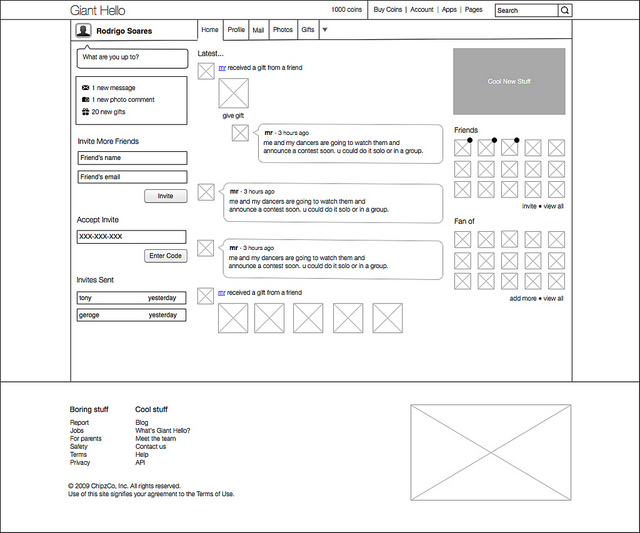
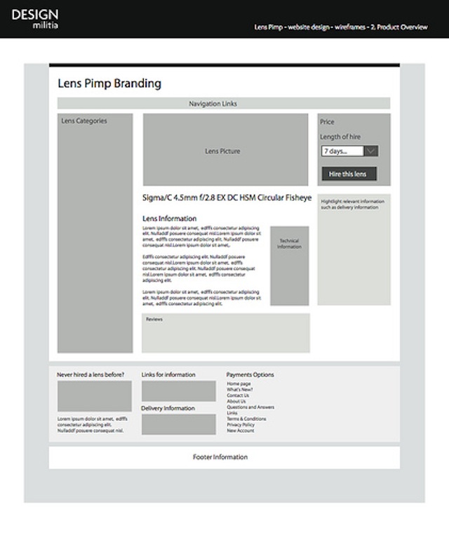
Another example of a spare bare-bones sketch, this time showing a design that’s more complex. As long as the elements are where they need to be, different shades of grey are used to differentiate elements, and some simple text describes what each thing does (when needed), then you’re good to go.
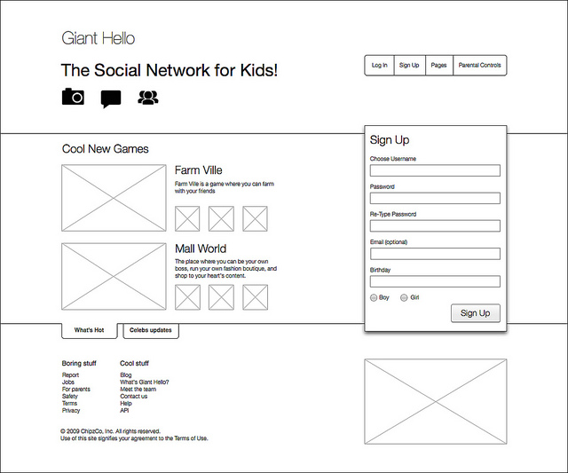
The homepage wireframe sketch of a social network that was shown in the previous sketch (which was the main/activity screen).
Color is effectively used in this e-commerce sketch. The light blue illustrates what are buttons, and the rest of the rectangles in the sketch are either for text input or selectors.
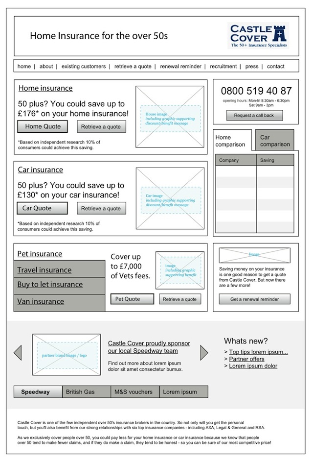
This sketch almost-finalizes all the essential elements (like buttons) while not wasting time on colors, background, and other styling whoseawhatsits.
Shades of grey are used effectively here to differentiate images from the background, and the blocks of text give you a clear idea of how the real content and web page will look like.
This sketch goes so far as to style the text, buttons, and other elements while not wasting time on colors, the background, and sample images. This shows that by completing the 20% of elements that are most important – while ignoring styling the 80% that isn’t – you can get a almost-complete picture of the design with only a wireframe sketch.
Like with the above sketch, this wireframe sketch also focuses on styling only the 20% of essential elements while ignoring the rest. You get a very clear picture of what the final web page will look like without the sketch needing to add colors, backgrounds, and the rest.
Do You Create Web and Mobile Wireframe Sketches?
Over to you: What do you feel are the most effective reasons for wireframe sketching? Feel free to share them in the comments section below.
Related Topics
Top
