Developing apps for the iPhone or iPad can be a tricky process. You need to understand not just the programming libraries, but also design standards and common themes in user interfaces. This entire skillset would require months of study just to build your first live app.
I realize this may seem intimidating, but we all have to start somewhere! And in this guide I would like to introduce the most important nuggets of information to designing 100% perfect layouts. The Apple developers guide is a good place to start, but the content can be very disparaging to those just getting started in the field.
Standard App Icon Specs
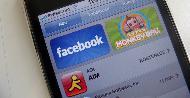
What a better place to start off than discussing the iOS icon sizes. You probably already realize that each published application has a small square icon, almost like a unique logo. Apple has setup a strict guide regarding which sizes you need and which devices they pertain to.
In the older iPhone 3g/3gs the screen resolution was limited at 320x480px. Which seems fairly large for a 3.5 inch display, however the iPhone 4/4S doubled this ratio to 640×960 which means each 1 pixel area represents 1 point on screen (2px regular). This is an important concept to understand when designing graphics for iOS devices.
Originally you only needed to create 3 different icon sizes – 512px for the App Store, 57px for home screen display and 29px for search results. But this number has nearly quadrupled to eleven different icons if you design for iPhone, iPhone 4 retina, and iPad. This gets confusing very quickly so I’ve drafted the small chart below.
App Store
- 512×512 universal
Home Screen Icon
- 114×114 on iPhone 4/4S
- 57×57 last-gen iPhone/iPod Touch
- •72×72 iPad
Search Results and Settings
- 58×58 iPhone 4/4S
- 50×50 for iPad
- 29×29 iPhone/iPod Touch and Settings on iPad
![]()
Now you could stop here, but there is a newer type of document icon added in during iOS 4 and continued into iOS 5. If your application creates a custom document type this icon is applied on all devices, whereas iPad requires 2 separate versions. But of course if you don’t use this feature feel free to skip the additional stress!
Document Icons
- 320×320 iPad Large
- 64×64 iPad Small
- 44×58 iPhone 4
- 22×29 iPhone/iPod Touch
Both the bars found at the top and bottom of each application contain nav links useful for traversing through the many different views. Depending on the type of interface these button sizes will change accordingly.
It’s important to note that although the iPhone 4 screen resolution is 640×960 the coordinate system for pixel placement runs at 320×480. Check out this online chart of standard sizes for iPhone UI elements. Everything is organized neatly, but I have copied over the important bits of info.
- Top Status bar – height 20pts
- Top Navigation bar – 44pts
- Bottom Tab bar – 49pts
- Tab Bar icons – 30×30 pts
The points over pixels unit sizing is helpful to conform with apps from older legacy devices. Sometimes icons from the classic iPhone will blow up to appear blurry on the iPad or iPhone 4, but generally the 326ppi resolution doesn’t distort graphics all that bad.
If you have the patience I recommend creating icon sizes at both resolutions. 326ppi and 163ppi are standard, and when you go to code the application there are markers you can apply to rule out which icons to use. Just append the prefix @2x onto your retina display icons to distinguish between these sets.
Important UI Elements to Consider
Aside from static interface elements the individual page views will update and change dramatically. These different views go by many names and generally include alternative smaller elements.
For example, in your settings page you may include a few toggle on/off switches based on user feedback. Additionally to design a login or registration form you’ll need input fields, as well as notification messages and most likely a submit button. These little tidbits add up over time and it can be messy during your initial mockup phases. Just remember that Photoshop is only a tool, and while you can meticulously perfect each page eventually you have to port these designs into Xcode.
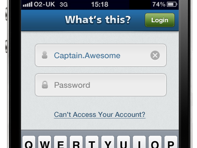
I recommend playing around in your favorite apps and taking screenshots to go through later. These photos can be immensely helpful as you have perfectly-sized replicas to compare with your own work. Some different screens you may consider include UI controls, alerts and modal windows, keyboards, loading animations, and similar ideas.
Metrics and Units
Ultimately these guidelines are just helpful for designers just starting out. Apple does not restrict you in any way to follow these guides, and in fact plenty of iOS apps have been published with entirely different layouts. Think about the many games and side-scrolling apps which have no use for such defined interfaces.
But of the many unique apps out there I’ve found plenty of typical layouts inspirational as well. I really enjoy going through the Apple developer’s guide as they offer much greater insight towards standards in the industry. Don’t get discouraged if you are struggling to understand the exact pixel sizes, fonts, element names, and guidelines to follow.
iPhone apps are very confusing at first and seem to follow their own set of rules. Keep checking out any helpful UI layouts you find and build up inspiration through example in other popular apps. Additionally check out some of the handy resources I’ve shared below to keep you chugging along down the path towards radiant iOS application design.
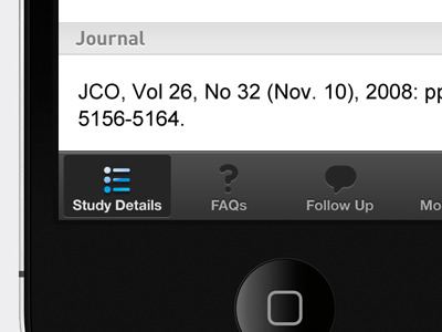
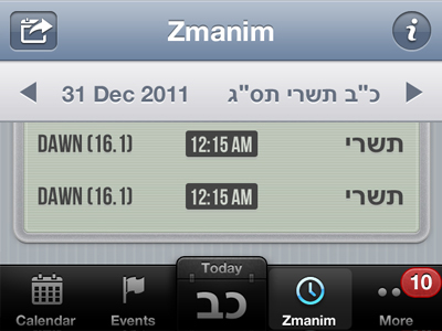
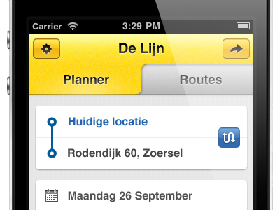
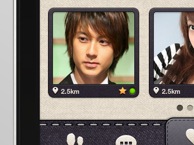
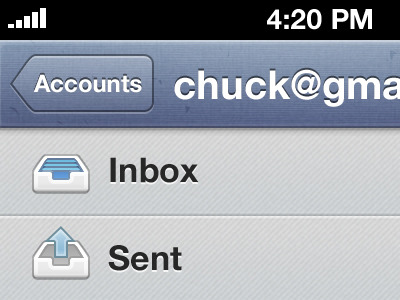
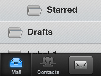
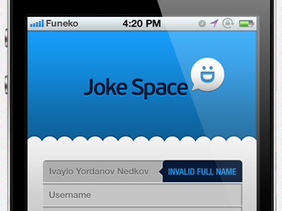
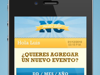
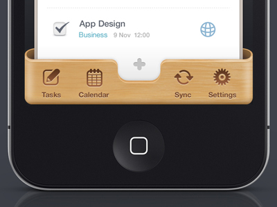
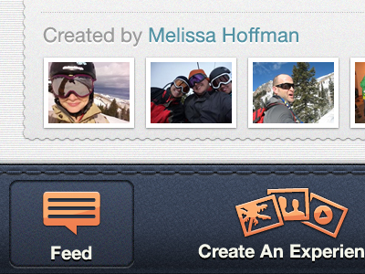
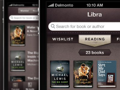
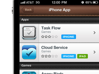
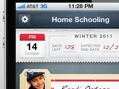
Design Gallery
To conclude I would be pleased in providing a few particularly unique examples of iOS design in the modern era. The social network Dribbble features some of the best designers all around the globe, and much of their work is inspired for Apple-based iOS devices. Check out the showcase below and let us know your comments or questions in the post discussion area.
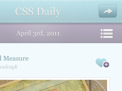
iPhone UI – Users View

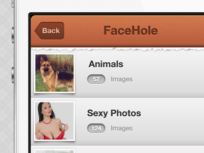
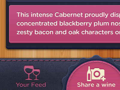
FaceHole App Demo
Chat Window

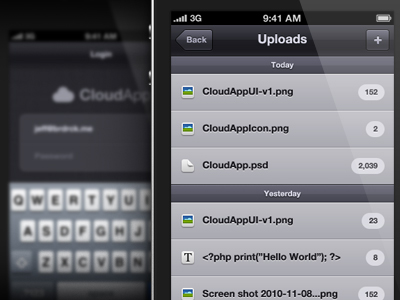
Jokespace Log In
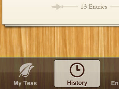
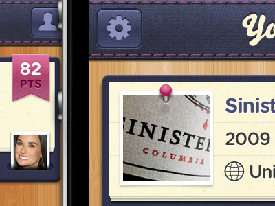
Neomelufen

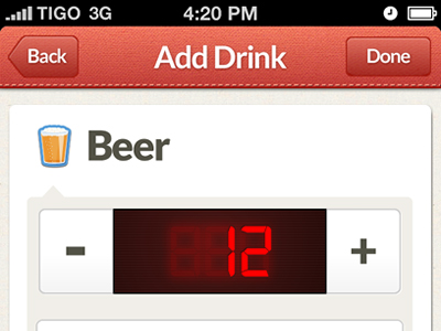
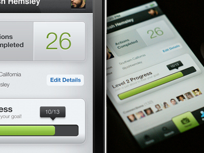
Stapp for iPhone

Helpful Links
- Beginner’s Guide To iOS Development: The Interface – Part I
- How to Design Pixel Perfect Photoshop Files for iOS Apps
- Glyphish – Great icons for iPhone & iPad apps
- Free iPhone Wireframes Kit(PSD)
- Free iPad GUI Kit(PSD)
- A Useful Collection of iPhone/iPad Apps Developer Tools and Resources
Related Topics
Top