Year by year, the e-Commerce landscape is becoming seismically shifted by mobile devices. Since Amazon has launched its shopping app with a mobile reach of 40 percent in 2017, M-Commerce is still gaining momentum.
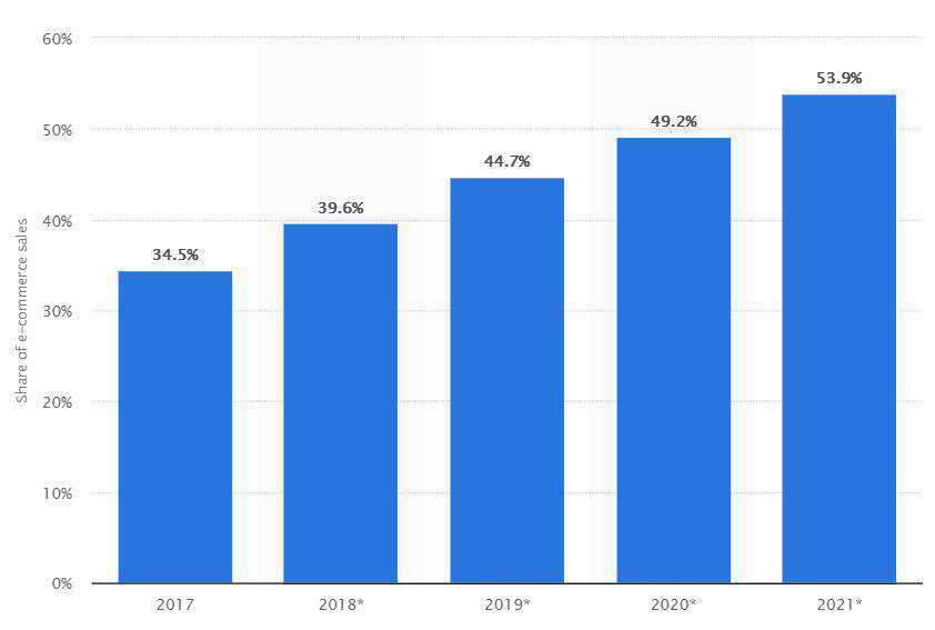
According to Statista, M-Commerce sales are predicted to make up 44.7% of total US e-Commerce sales in 2019, up from 39.6% in 2018. On the charts below, you can see that the mobile commerce tendency is expected to grow in the upcoming years.
It’s becoming more challenging to make an e-Commerce mobile application stand out of the crowd and catch the customer’s attention. People don’t just want to buy anymore, they are now seeking for a visually engaging online shopping experience.
“One of my insights is that design can be a huge weapon to make your company look cool and build brand loyalty.” – Ted Chung, CEO of Hyundai.
This is especially true when it comes to e-Commerce design directly related to sales. In order to create a fresh and memorable shopping experience and help a brand to build customer loyalty, many designers should rethink their approach to M-Commerce UI/UX.
After long hours of researching and interviewing mobile app design and development companies, we defined 6 essential tips that will help you create a better mobile shopping experience.
1. Simple, but crucial truth: think mobile-first
Due to the poor mobile user experience which usually results in high bounce rate and short web sessions, you can lose a lot of mobile traffic. Google reported that almost 50% of mobile shoppers never come back after one negative user experience.
How to avoid M-Commerce pitfalls? The first thing is to make design decisions driven by data, not by your design instincts. Explore the M-Commerce design analytics created by other UX designer. This will definitely help you save time when creating a smooth shopping experience.
Another thing to keep this in mind: a mobile app user is not a desktop website user, learn how to convert a website into a mobile app. Don’t try to fit all the information from your desktop website into a mobile app.
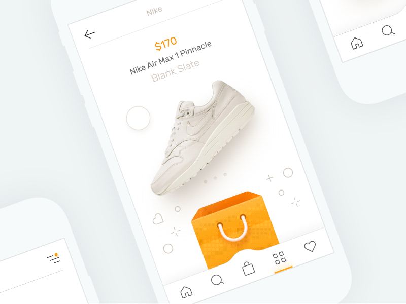
People usually scan a web page to get an idea of what the website offers. This psychology works with mobile apps too. Let the user see at a glance what your mobile app is about. You can use a simple layout with a central image followed by a list of categories below it. One shining example is Jimmy Choo’s mobile app, a famous luxury shoes and bags brand.

The world is moving rapidly and we don’t want to spend the time on unnecessary things. Taking the above-mentioned approach, you will simply save your mobile app users’ time and let them easily understand what kind of products they can expect to find on a website.
2. Be touch-friendly and use in-app gestures
It’s better not to irritate users with insufficient space between the different touch elements within your content. It’s advisable to keep elements nearly 7×7 mm size while making the separators between them at 2×2 mm visually. It makes it easier for users to tap.
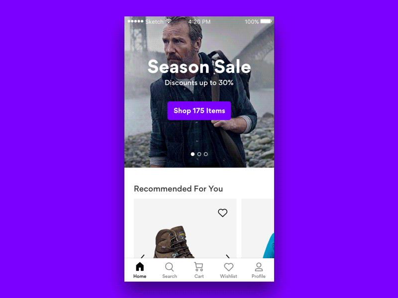
Mobile eCommerce concept by Alex Khoroshok.
The masterful use of in-app gestures in the mobile shopping experience is paramount too. All people are familiar with gestures like double tapping and pinching in order to zoom in to images on mobile.
These gestures play a great role in your e-Commerce success. When people are going to spend their money, they become even more attentive than usual. They are concerned with the smallest details and want to thoroughly inspect the product. And if there is no opportunity to zoom…Oops! Just be ready to miss a prospective customer.
That’s true, he or she was interested in purchasing your product, but, sadly to say, they just went to another store where they can explore a similar product by zooming.
3. Make, but don’t break, your UX with the micro-interactions
People like to “like”, give the assessment, and leave feedback. And they also like to investigate how others react to a certain product. Simply give your users the opportunity to do it with the micro-interactions in your app. Follow human nature, and it will make your e-Commerce app more successive.
Product color selection micro-interaction. Design by Mykolas Puodziunas.
You can use micro-interactions to guide a user through the app in a more intuitive way. Another thing is that smoother and more natural interactions can help reduce shopper anxiety and boost overall psychological comfort.
Micro-interactions can be used for preventing future errors and providing immediate feedback to users based on the activities they’ve completed.
4. Make the mobile app user’s life easier with Auto-Suggestion
The designer’s main mission is to make things convenient, intuitively understood and beautiful. So a simple thing such as an auto-suggestion can help your customers find the products on your store more easily.
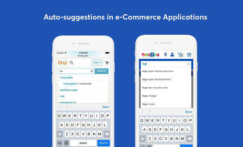
Search with auto-suggestion in Etsy’s and Toys R Us applications.
There is one thing all of us hate – filling forms, especially when it comes to long credit card numbers. You can improve your app’s usability by using card-type auto-detection. This will help to streamline the purchasing process providing immediate feedback for supported card types. Try to automate as many data entry processes as possible. It’ll reflect positively on your conversion rate.
5. Create a feeling of security in your mobile e-Commerce application
Security is a number one thing customers are concerned with when providing their credit card details. Even if your mobile app is super-secure but your UI design doesn’t reflect it somehow, your customers will still feel uncomfortable and insecure.
Make your design convey a feeling of security using lock symbols. They communicate the assurance to customers that their transactions are secure.
When designing the UI of transaction processes use words like “proceed”, “secure”, and “encrypted” to reduce user anxiety.
Don’t forget about the power of color psychology! We are visual creatures. Color is the first thing we perceive and our subconsciousness translates it into some feeling, positive or negative. You can evoke a feeling of trust and security applying the right combination of audience-oriented and gender-specific colors.
6. Build a simple, smooth, and speedy mobile checkout
28% of lost sales happen because of unfriendly checkout processes. A person is ready and willing to pay – don’t make him/her abandon just because the checkout process in your mobile application is too long and complicated.
Let’s consider an example of Zalora’s mobile checkout. There are just three simple steps:
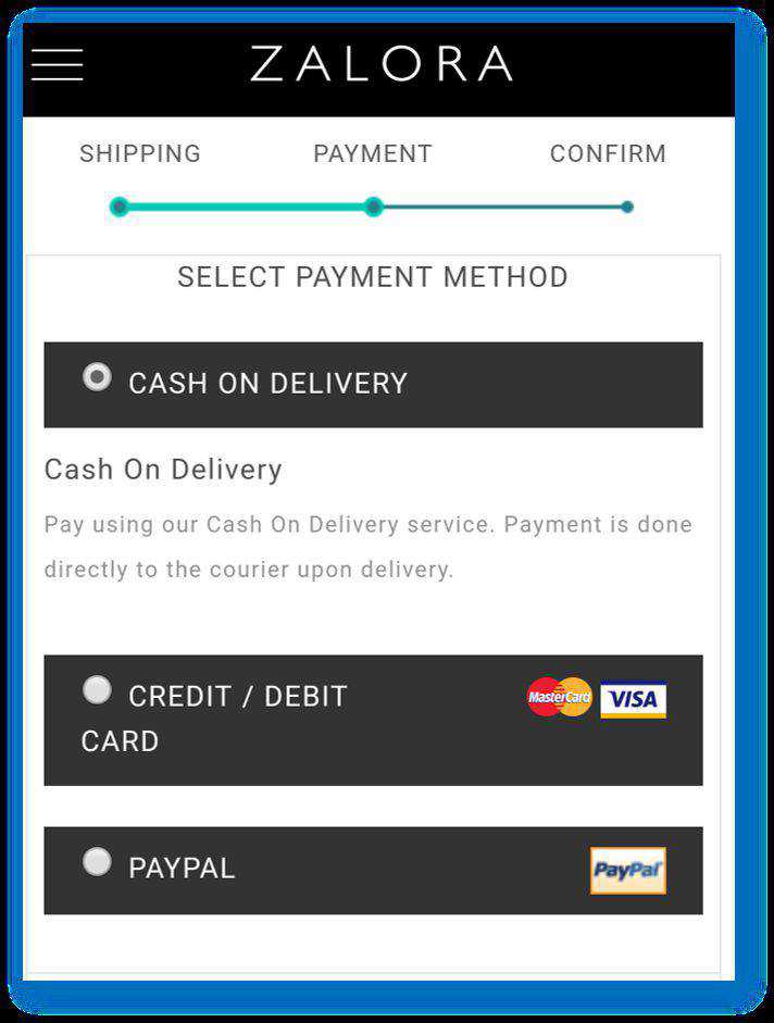
The next most important thing in a mobile checkout is not to ask a user to create an account before purchasing. You can significantly reduce cart abandonment rates by designing a fast checkout process and not asking users to register first.
To provide psychological comfort for a user, use visual representations like progress bars and let users see their progress in the checkout process.
Conclusion
M-Commerce is fastly growing and it’s important to stay ahead with the renovated UI/UX design strategy for your e-Commerce mobile application. The proof is in the numbers: online store owners can’t afford to neglect mobile commerce in 2019.
Optimizing your online store for mobile you will be able to offer to your prospective customers a better omnichannel shopping experience that will positively impact the conversion rates.
When rethinking your mobile commerce, keep security and user experience top of mind.
We hope these design practices will help you see how your M-Commerce is growing in the shortest time.
Related Topics
Top