Mobile applications are on the rise as more consumers switch over to smartphones. Between Apple’s iOS and Google’s Android operating system there are plenty of wonderful apps to browse through. The past year has built up a catalog of exceptional design patterns which will continue over into 2012.
In this article I’d like to spend a bit of time examining some of the more popular app design trends. Graphics designers are jumping on board quickly and appear willing to share their knowledge. And generally it is the users who are responding to the many varying interfaces. Mobile trends have branched off into countless ideas and it’s fascinating to watch the process unfold.
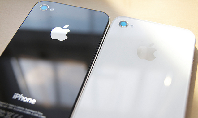
Moving into the new year I’m seeing a lot of beautiful texture designs. There are so many examples to reference, and more app designers are submitting their creations every week!
What I love about texture is that it helps your application stand out amongst the masses. You can quickly grab attention with a customized navigation bar texture. It can even pass off as branding for your app, such as the case with Instagram’s enticing new header bar design.
But this isn’t the only place you’ll find mobile textures. Buttons, labels, and even background displays can be wonderfully pieced together with just a bit of texture. Some of my personal favorite design patterns include wood, metal/metallic, paper, and leather. We have focused on textures in web design in previous articles and many of the same ideas can apply with mobile.
Graphics Display on Startup
You may have noticed that many applications will startup with a customized design image. iPhone and iPod Touch apps are setup with a loader image by default, while Android has supported the functionality in some apps.
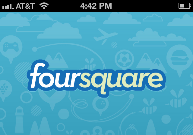
Foursquare has quite a notable design pattern which appears at launch. Many of the graphics are custom vectors – these work perfectly since they are easy to resize for different device screens. Additionally this effect gives your users a preview shot of how the application is designed. I recommend app developers pay careful attention to the splash image since this is the first shot a user sees to pass judgement onto your application.
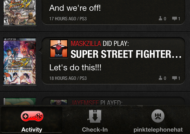
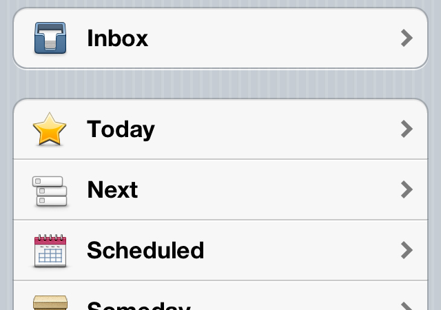
Defined Tab Bar Icons
This feature will mostly apply to iOS users since tab bar elements are notorious with Apple’s UI. These navigation bars are generally aligned towards the bottom of the app and boast anywhere from 2-5 icons. This trend is so catchy because it’s the best way to access multiple screens of data with relative ease.
One of the newer social networking apps ImGame provides a great example of these icons. Their in-house designer put together three unique templates for a gaming controller, video game cartridge, and a player profile icon. Their tab bar is such a great example of how app ideas can be customized and designed.
However I can understand that not everybody is able to create their own icons. When designing for Apple devices you need to consider both standard and retina displays which can be a hassle. This means you’d need two sets of icons both standard and double resolution. Glyphish is my product of choice as it comes attached with a measly $25 price tag and includes 400 unique icons in the set(with updates).
Photoboxes
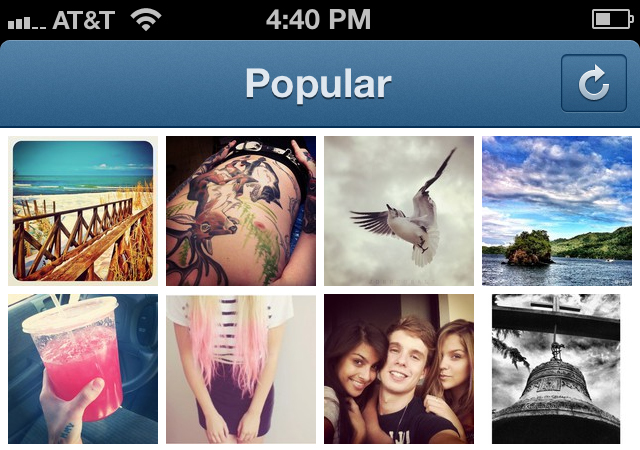
Instagram is still the classic photography app for iPhone users. The app should be released on Android soon – but photo boxes aren’t only for camera-based applications such as Instagram. Granted these are the most populated and well-designed of the bunch, designers have picked up on this trend for the better.
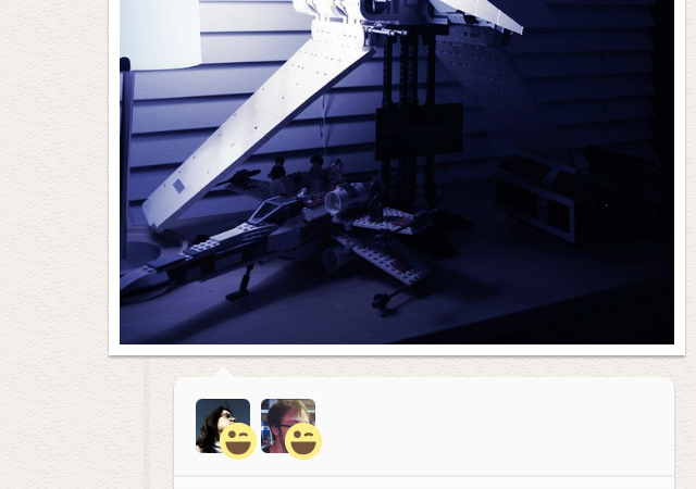
In the recent release of Oink App we caught a glimpse of what Kevin Rose and team have been building. Their use of framed photos is brilliant and appends a sense of personal touch into the design. Each box is given a slight drop shadow effect to stand out on the plain tan background.

Another infamous application Path has also been noted for including these drop-shadow enhanced boxes. Recently their design team overhauled the entire application structure and has still kept with the box-sizing effects. This trend can even work well on other types of media including video or text-based responses.
Bare Minimalism
Flashy graphics and gradients aren’t always the best way to go. I have been using some very outstanding applications which include just a default minimalist approach. One such example is the WordPress app for iOS.
You can add any number of blogs along with your administrator login/password combo. This keeps your credentials stored safely so you have access to all of WP blogs at the tip of your finger. The menus for adding a new blog are also standard boilerplate and very simple to follow along with.
Things for iPhone and iPad has worked hard to keep their interface as minimal as possible. It’s a simple process of accessing your daily to-dos and crossing off tasks as they are completed. You always want to focus on the end-result functionality when building such applications. Then the complex user interface design becomes much less of a worry.
Exclusive Interface Elements
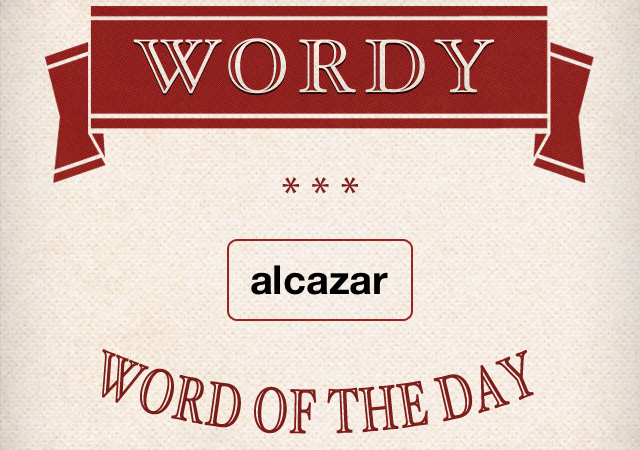
The idea of creating a custom app interface is not unique to 2012 designs. But the ideas pumping out of designers have been more creative in the past few months than I’ve ever seen. The dictionary app Wordy features a beautiful custom layout which is very easy to manage.
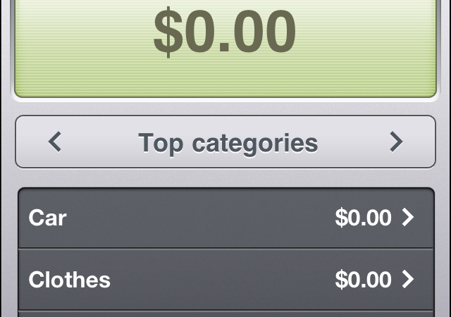
Additionally the application Expenditure has caught my eye. This lets you tally up all of your monthly expenses and put together a rough idea for billing. You can also catalog the months you’ve tallied and look back through an archive of receipts.
Both of these applications were built around their own unique functionality. You really need to pay attention to the benefits your app will provide, then design a user interface to match. It’s certainly not an easy process – design never has been easy. Yet it can be very heartwarming and it’s exciting to notice your interface trends catching on in the community.
Conclusion
This collection of mobile design trends should offer inspiration to those working in the field. There has never been a more exciting time to build software and especially for such a popular(and growing) marketplace. Previously we spent time going over basic mobile iOS design techniques and many more will continue to emerge as we move into 2012. Also share your thoughts and questions with us in the comments area below.
Related Topics
Top