Modern web designers are incorporating innovative new concepts for digital type. In the previous decade we have witnessed the Internet transform into a powerful tool for sharing media all around the world. More specifically digital designers have adapted and web trends continue to change over time.
Text on a page will always be the most uniform way of communication. It’s up to web designers to mold this text in a tasteful and easy-to-read manner. In this guide I’ll share a few tips for captivating your visitors with brilliant online typography. It only takes a bit of time and patience to understand these techniques and apply them into your own layouts.
Design for Practicality
Creating text on paper is a much more dynamic task than building for the web. You are often limited with space and molding text around a set page dimension. Some of these concepts will carry over in web typography, but your average page layout is much more clean-cut.
You don’t want to extend your ideas outside the box so far that it scares away your visitors. Stick with what works and what looks practical. Typically you would plan out styles for your paragraphs, inline quote blocks, a couple different headings, and anchor links. If you have the need for other text elements(such as unordered lists) you should match up their styles with headings and paragraphs as well.
Most commonly your pages will consist of paragraph text broken up into sub-headings. Articles will often sprinkle links, italics, and bold formatting to keep the reader’s attention. Your images may also look nicer with a small caption area. As long as the page outline can be easily skimmed you are in good shape.
Custom Font Faces
The new CSS3 property @font-face allows designers to incorporate their own custom fonts. This has long been a dream of mine thinking back to the days of working to kill bugs exclusively in Internet Explorer 6.
Working with the same set of “standard” fonts can grow weary and a tad boring. Designers need to feel confident in sprucing up their webpage type with new font families. We have briefly explained advancing web font techniques and how you can use .ttf or .otf files on your own. This solution works perfectly in supported web browsers, but there is another 3rd party option.
The ever popular Google Web Fonts has been growing in size with up to about 500 unique families to choose from. With any Google account you have access to this free directory of web fonts. And best of all you can select multiple choices from the interface and Google will output all the code you need to include in your page.
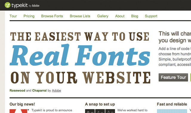
Typekit is another option powered by Adobe. Although unlike Google free users would be limited to a trial library of fonts. You can check out their full list with just over 700 unique typefaces. This plan would cost $50/year which may not be a practical solution to everyone. If you only need one or two unique font choices then I recommend going through Google or hosting them yourself with CSS3 queries.
Experiment with Ideas
Luckily it’s a lot easier to play around in CSS code than other means of development. There are so many unknown properties you can utilize and implement on your typography. Don’t be afraid to step out of your comfort zone and mess around with some unique styles. Change up background colors and rounded corner effects.
Even if your ideas don’t work out you’ll have a better sense of what looks good and what doesn’t. Spend time going over your color scheme options so you can match paragraphs, headers, and link styles together. You want to build contrast between the text color and page background. Additionally check out some of my example CSS properties in the list below:
- font-variant
- letter-spacing
- word-spacing
- text-indent
- line-height
- text-transform
- vertical-align
- text-shadow
Using Big Examples
If you have enough room in your layout I recommend keeping your headers big. As in, super oversized big for <h1> tags. These will be the most important typographic elements on the page and you want them to stand out.
Big jumbo-sized text is a trend often written about and seen in newer design models. It’s a great technique which will absolutely capture attention. But then you need to adequately match up the rest of your page text sizes. Paragraph texts shouldn’t be too small or else your headers will overshadow them.
I actually recommend keeping all paragraph text around 14px-16px or more. Gone are the days where 11px Arial will still look “professional”. It may fit nicely into your layout mold but serves very little practical purpose. Nobody wants to struggle reading smaller texts anyways – but it can be useful as a secondary style class. Smaller texts are great for labels, captions, or quick notes within your main content.
Writing Flow
As important as your individual CSS styles is the idea of your overall page layout design. Your text and paragraphs should flow easily and not feel constrained into the page. Try to keep your ideas brief and summarized to a point.
Your average Internet user does not hold such a large attention span. And this goes double for long pages of text. If you have content broken down into many smaller paragraphs it appears much less daunting of a task to read through. Also try adjusting your line-height and paragraph margins to add some extra white space padding. This goes a long way to increasing the readability of your text.
Design Showcase
Along with these ideas I’ve put together a small gallery of truly captivating web typography. These examples should provide a bit of inspiration when brainstorming for your own layouts. If you have additional suggestions feel free to share with us in the post discussion area.
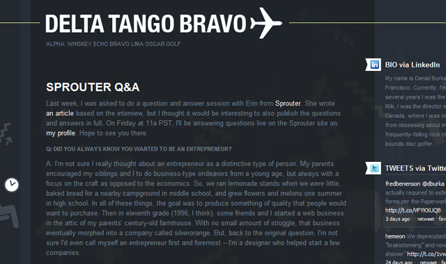
Delta Tango Bravo
Viljami Salminen
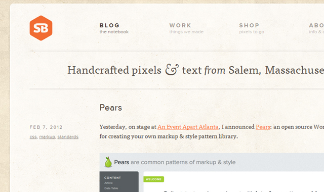
SimpleBits
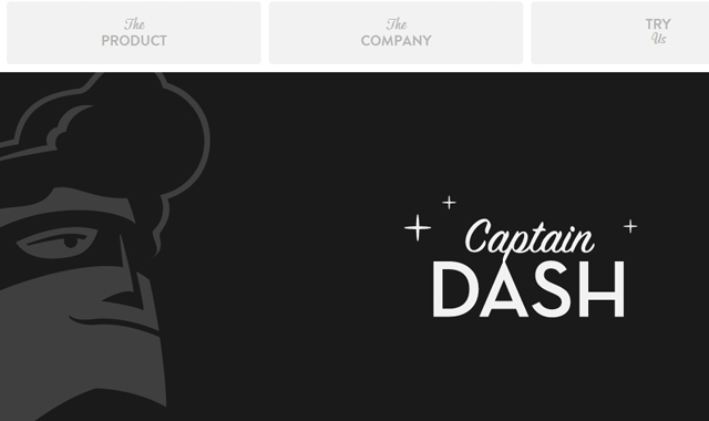
CaptainDash
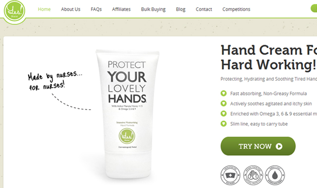
Yes! Nurse
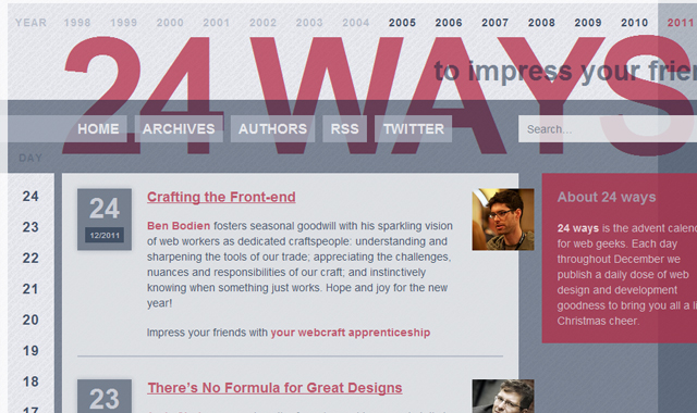
24 ways
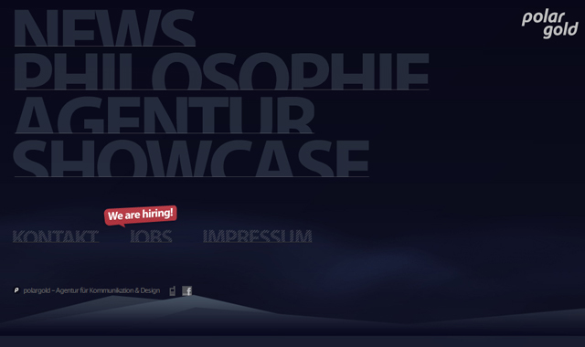
polargold
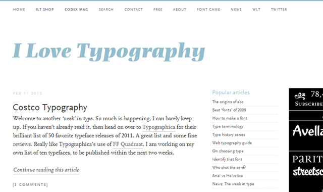
i love typography
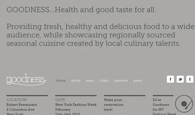
Goodness
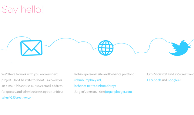
255 Creative
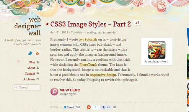
Web Designer Wall
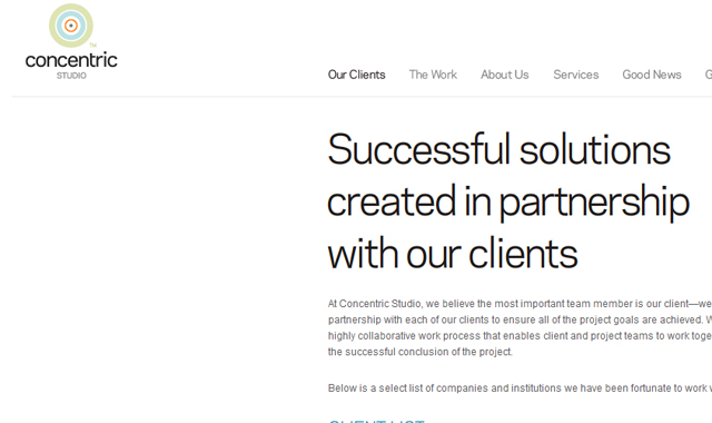
Concentric Studio
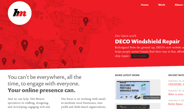
Hot Meteor
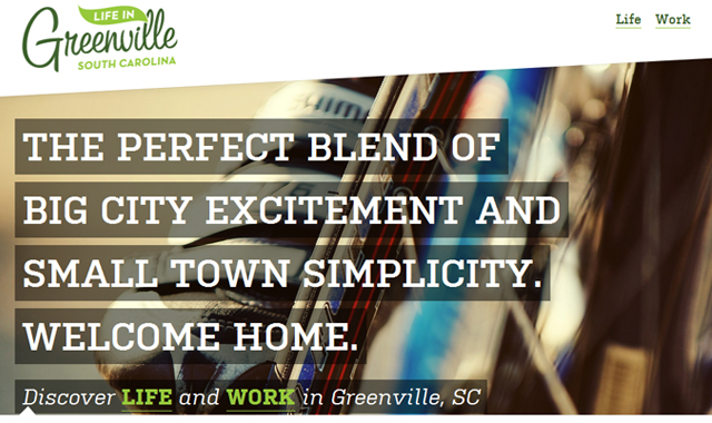
Life in Greenville
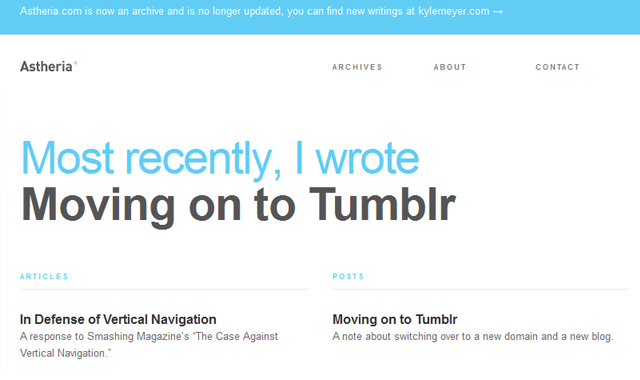
Astheria
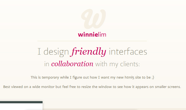
Winnie Lim
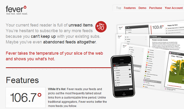
Fever App
InfinVision

Related Topics
Top