There are thousands of books available online for web designers and developers to peruse. Countless languages, topics, and trends have been extensively explored and analyzed, resulting in this vast library of eBooks that cover almost every aspect of web design and development.
The best part? All of these books are completely free to download! We’ve curated this collection of our favorite free eBooks for your convenience.
Whether you’re interested in CSS, HTML, JavaScript, PHP, WordPress, Git, UX, or any other web-related topic, you’ll find something that piques your interest. These eBooks come in various formats, including HTML, PDF, and even ePub, so you can choose the one that suits you best.
General Web Design eBooks
Resilient Web Design
Offers insights on building websites that work for everyone, highlighting flexibility and robustness in web design practices.
Taking Your Talent to the Web
Guides web professionals in transitioning their skills to the web, covering design, development, and strategy.

Web Typography eBooks
UI Typography
Focuses on the role of typography in user interfaces, offering guidelines for readability and style.
Web Typography
Details the art and techniques of typography in web design for readability and aesthetic appeal.
Type Classification eBook
A comprehensive overview of type classification, helping designers choose the right fonts for their projects.

Web Performance eBooks
Designing for Performance
Teaches strategies for optimizing website performance without compromising on design quality.
The Book of Speed
An introduction to web performance optimization, teaching how to make websites faster for a better user experience.

Web Accessibility eBooks
Web Accessibility Guidebook
Offers practical advice for developing accessible web applications, ensuring compliance and inclusivity.
Legible Typography
Dedicated to improving web typography for enhanced readability and accessibility.
Introduction to Good Usability
Explains the basics of website usability, ensuring sites are user-friendly and accessible.
Adaptive Web Design
Teaches designing with progressive enhancement, focusing on accessibility and user-first approaches.
CSS & HTML eBooks
The Magic of CSS
Breaks down CSS into understandable sections, making complex concepts easy to grasp and apply in projects.

Canvas Deep Dive
Offers a thorough exploration of HTML5 Canvas, from basics to advanced techniques for interactive web applications.
Pocket Guide to Writing SVG
A concise guide to crafting scalable vector graphics for responsive web designs.

HTML Parser
Provides a deep dive into the technical aspects of HTML parsing, essential for web developers.
JavaScript & PHP eBooks
JavaScript MythBusters
Debunks common JavaScript misconceptions with clear explanations and practical examples.

Learning JavaScript Design Patterns
Introduces design patterns in JavaScript to write efficient, maintainable code.
jQuery Fundamentals
Teaches jQuery fundamentals for those looking to enhance their web development skills with dynamic content.
Programming JavaScript Applications
Covers building robust, scalable web applications using modern JavaScript techniques and practices.
Developing Backbone.js Applications
Focuses on building single-page web applications using the Backbone.js framework for structured code.
PHP: The Right Way
A comprehensive guide to using PHP in modern web development, emphasizing best practices and effective techniques.

WordPress eBooks
Locking Down WordPress
Offers practical tips for securing WordPress websites against common security threats.

Celebrating WordPress
Commemorates WordPress’s impact over 20 years, offering insights into its community and evolution.

WordPress Plugin Business Book
Guides readers through the process of building and marketing successful WordPress plugins.

WordPress Meet Responsive Design
Discusses responsive web design principles specifically for WordPress themes.

New WordPress Install
Outlines essential steps for setting up a new WordPress site, focusing on performance and security.
WordPress Security Guide
Provides comprehensive strategies for protecting WordPress sites from hacks and breaches.
Git eBooks
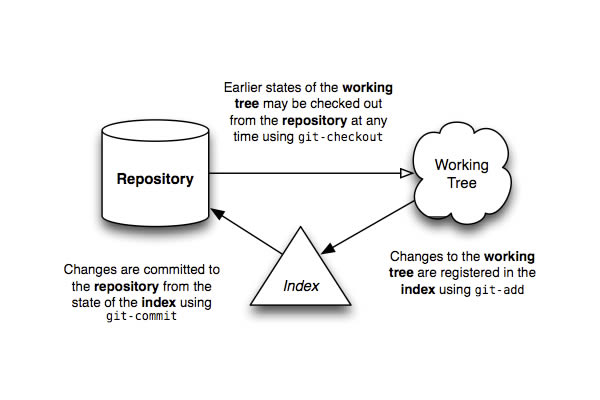
Pro Git
A thorough guide to Git, from basic concepts to advanced usage, for version control mastery.

Git From the Bottom Up
Explains the inner workings of Git, helping users understand the tool deeply for better usage.
User Experience eBooks
Enterprise UX
Focuses on user experience design in large-scale environments, offering strategies for complex projects.

UX Design for Startups
Offers UX design tips and tricks for startups, aiming for impactful user experiences on a budget.

The Book of Modern Frontend Tooling
Explores tools and techniques for modern frontend development, enhancing productivity and code quality.
Research-Based Usability Guidelines
Offers evidence-based guidelines for designing user-friendly websites and web applications.
Getting Real
Discusses a simpler, faster approach to web application development, advocating for less bureaucracy and more creativity.
Search User Interfaces
Explores the design of effective search user interfaces for improving user experience in finding information.
General Design eBooks
Design Execution
Explores the execution phase in design, detailing how ideas transition into tangible outcomes.
Animation in Design Systems
Discusses the use of animation in design systems, enhancing user experience and interface dynamics.
Shape Up
Basecamp’s unique approach to product development, promoting a more disciplined and manageable workflow.
Mobile Game Design
Covers key principles of designing engaging mobile games, with a focus on user experience and monetization.
How to Be Creative
Offers insights on fostering creativity in work and life, challenging conventional views on the creative process.
Email Marketing Field Guide
Offers practical tips for effective email marketing campaigns, from design to analysis.
Pixel Perfect Precision Handbook
A detailed guide on achieving pixel perfection in digital design, emphasizing precision and consistency.
Designing for the Web
Teaches web design fundamentals, from typography to layout, for creating visually appealing and functional websites.
Pay Me or Else!
Offers advice for freelancers on getting paid on time, covering contracts to client communication.
Web Style Guide
Provides guidelines for creating cohesive and user-friendly web designs, covering layout, color, and typography.
Related Topics
Top